| Image |
Comment |
| 12/01/2004 01:15:12 AM |
"The Photo"by JEFFJSBComment: kinda interesting... but the little line of color at the top left corner is distracting. |
| 12/01/2004 01:13:40 AM |
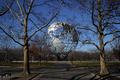
The Seven Continentsby TLL061Comment: one of my favorite subjects, although i don't know if i have any shots quite as nice as this one. hope the lack of obviously visible 7 doesn't hurt your score. |
 Photographer found comment helpful. Photographer found comment helpful. |
| 12/01/2004 01:12:21 AM |
Comb Teethby MikeOComment: cool macro. i like the purple tone/fringing of the shadow. |
| Photographer found comment helpful. |
| 12/01/2004 01:11:40 AM |
Gaming Nostalgia x7by racerraulComment: fun, if a little dark. i'd probably suggest a lighter background to make the edges of the controller and cartriges a little more visible, maybe a more dramatic angle too. also a larger shot, most shots that are smaller then the 640 max take a penalty for their size. |
| Photographer found comment helpful. |
| 12/01/2004 01:08:17 AM |
The Lineupby moswynComment: i like the subject and colors, but think there might be other ways to frame the shot to make it more interesting. |
| Photographer found comment helpful. |
| 12/01/2004 01:06:12 AM |
I don't know.by habbiComment: fun shot, but you should try to set up a background farther away from your subject to avoid distracting shadows. also it looks like you were lighting this primarily with your on camera flash, causing hot spots in the center of the image,. |
| Photographer found comment helpful. |
| 12/01/2004 01:03:38 AM |
7 Red Stripesby eaglebeckComment: nice tight shot. you have to use really fast shutter speeds with flags flapping in the wind to totally freeze all movement. and, the upper right corner is a little motion blurred. the other way to go is to intentionally blur more of the flag with a lower speed. |
| Photographer found comment helpful. |
| 12/01/2004 01:01:31 AM |
Talking Headsby plumber711Comment: 7 11's, i get it! :) technically, i think you boosted the saturation way too much, maybe didn't correct for the type of light you were in and maybe were a little heavy handed with levels or curves. the dimes are almost as yellow as the pennies! |
| Photographer found comment helpful. |
| 12/01/2004 12:59:38 AM |
frogsby speaseComment: lighting seems a bit harsh for a dark-background style shot. i can see some elements behind the frogs, but i don't know what they are and if i'm supposed to see them. |
| 12/01/2004 12:57:35 AM |
Forksby jessfrolioComment: lighting seems a bit dark, but i like the sepia effect and the subject. |
Home -
Challenges -
Community -
League -
Photos -
Cameras -
Lenses -
Learn -
Prints! -
Help -
Terms of Use -
Privacy -
Top ^
DPChallenge, and website content and design, Copyright © 2001-2024 Challenging Technologies, LLC.
All digital photo copyrights belong to the photographers and may not be used without permission.
Current Server Time: 04/25/2024 03:32:02 AM EDT.