| Image |
Comment |
| 11/18/2004 09:40:40 PM |
Counterintuitiveby MarkComment: This is a neat idea, but I have seen far, far, far too many colored pencils, crayons, and markers in these challenges to give this one a decent score. It's not a bad picture, its just not interesting anymore. |
 Photographer found comment helpful. Photographer found comment helpful. |
| 11/18/2004 09:32:04 PM |
i doby sacredspiritComment: This would be much more effective if there was a greater sense of black and white, rather than black and not so black, but nice idea. |
| Photographer found comment helpful. |
| 11/14/2004 02:52:08 AM |
|
| Photographer found comment helpful. |
| 11/14/2004 02:50:15 AM |
|
| Photographer found comment helpful. |
| 11/14/2004 02:43:17 AM |
|
| Photographer found comment helpful. |
| 11/14/2004 02:34:14 AM |
|
| 11/14/2004 02:28:50 AM |
Looking out the windowby geofffoxComment: i love this shot, people might complain about the grain, but i think it works great. good job getting the reflection in the window. |
| Photographer found comment helpful. |
| 11/03/2004 07:58:41 PM |
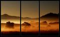
Daybreak by BradComment: Fantatsic tones, the mood is absolutely brilliant in this picture, excellent work. The whole triptych thing adds an interesting twist also. This is one of those photos that would look great as a print that takes up an entire wall. |
| Photographer found comment helpful. |
| 07/02/2004 02:49:08 AM |
Power Inversionby BradComment: This is the best use of effects on a picture that i have seen in a long time, great job. |
| Photographer found comment helpful. |
| 06/28/2004 03:40:06 AM |
|
Home -
Challenges -
Community -
League -
Photos -
Cameras -
Lenses -
Learn -
Prints! -
Help -
Terms of Use -
Privacy -
Top ^
DPChallenge, and website content and design, Copyright © 2001-2024 Challenging Technologies, LLC.
All digital photo copyrights belong to the photographers and may not be used without permission.
Current Server Time: 04/25/2024 12:47:27 AM EDT.