| Image |
Comment |
| 07/26/2004 11:17:08 PM |
|
 Photographer found comment helpful. Photographer found comment helpful. |
| 07/26/2004 11:14:12 PM |
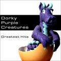
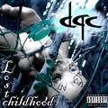
Dorky Purple Creaturesby mandypComment: I love the dinosaur and the egg, but the rest of the composition just isn't working for me. The black and white seem so disappointing with such a fun and exciting focal centerpiece like the dragon. |
| Photographer found comment helpful. |
| 07/26/2004 11:13:00 PM |
|
| Photographer found comment helpful. |
| 07/26/2004 11:06:37 PM |
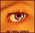
Deep Purple Corneasby ScantyNebulaComment: I know the text and border are purple because of the band name, but I think the contrast might be more effective if they were much darker -- maybe even black. Great photo, though. |
| Photographer found comment helpful. |
| 07/26/2004 11:04:03 PM |
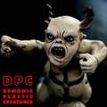
Demonic Plastic Creaturesby mocabelaComment: The photo is technically and aesthetically perfect. My only complaint is the jaggies on the text, which can be easily fixed with anti-aliasing. 9! |
| Photographer found comment helpful. |
| 07/26/2004 11:00:19 PM |
Demented Problem Childby bruskiComment: This one looks like something I'd see on the racks, so well done. I especially like the desaturation of your photo. |
| Photographer found comment helpful. |
| 07/26/2004 10:55:58 PM |
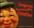
Dangerous Personality Conditionby Faye PekasComment: Cool picture, and good graphic work. I especially like what you did with the title. I'd have preferred no border, or perhaps a border that was the same color as the right side. |
| Photographer found comment helpful. |
| 07/26/2004 10:50:13 PM |
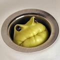
Drain Pipe Creatures by scalvertComment: Well, this one just stopped me in my tracks. Finally, a cover that's completely buyable as a real band name and a professional graphic layout. Easily a 10. Great job. |
| Photographer found comment helpful. |
| 07/26/2004 10:46:50 PM |
Dead Poets' Childrenby Dr.ConfuserComment: I'd like the focus of the photo to be the graves -- seeing the trees as the sharpest object is a bit distracting. As for your graphical editing, you should turn on anti-aliasing on your text, as it'll help make everything fit together better. |
| Photographer found comment helpful. |
| 07/26/2004 10:45:28 PM |
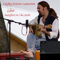
Digby Peters Cameronby SammieComment: I buy it -- good job :) The line spacing and horizontal tabbing on your title throws me off a bit. Work on the graphical editing part. |
| Photographer found comment helpful. |
Home -
Challenges -
Community -
League -
Photos -
Cameras -
Lenses -
Learn -
Prints! -
Help -
Terms of Use -
Privacy -
Top ^
DPChallenge, and website content and design, Copyright © 2001-2024 Challenging Technologies, LLC.
All digital photo copyrights belong to the photographers and may not be used without permission.
Current Server Time: 04/17/2024 09:57:25 PM EDT.