| Image |
Comment |
| 01/10/2006 09:11:41 AM |
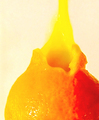
Burst of flavorby PatrolComment by digitalknight: wow, that's cool. I never would have thought of that, a darker background would have made that "pop" a little better perhaps, neat idea |
 Photographer found comment helpful. Photographer found comment helpful. |
| 01/09/2006 09:49:50 PM |
|
| Photographer found comment helpful. |
| 01/09/2006 11:55:44 AM |
Burst of flavorby PatrolComment by adine: Good idea - the subject a a great match for the challenge. Wish the focus was better and the background were whiter. The raised contrast and color saturation has created a wierd ine between light and shaddow on the orange. |
| Photographer found comment helpful. |
| 12/07/2005 08:42:52 PM |
|
| Photographer found comment helpful. |
| 12/06/2005 10:15:17 AM |
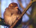
Just chillin'by PatrolComment by MrsFuzzButt: Nice composition and color. Focus is good. It's a nice shot overall, but compared to some of the other entries it just doesn't have the impact they do. An above average shot though and a 7 from me. |
| Photographer found comment helpful. |
| 12/04/2005 12:06:15 PM |
|
| Photographer found comment helpful. |
| 12/01/2005 09:05:30 PM |
Just chillin'by PatrolComment by macrothing: 7 - Very nice, nice complementary background color and 'bokeh' too. Criticism; definitely 640 width would have helped this. Sharper (though the detail in the feathers is good), and perhaps a slight crop adjustment (eliminating the minor distracting elements - thin tan/brown line on left and possibly the fork in the branch top right, etc), may have made this even better. |
| Photographer found comment helpful. |
| 10/09/2005 10:32:43 PM |
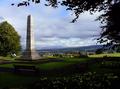
For those who never came homeby PatrolComment by Jutilda: Very pretty shot. I like the placement of the monument and the figures. The dark lawn might be a tad brighter by removing the black in the selective color adjustment (green). Just a thought. |
| Photographer found comment helpful. |
| 10/06/2005 03:05:52 PM |
|
| Photographer found comment helpful. |
| 10/04/2005 06:50:16 PM |
|
| Photographer found comment helpful. |
Home -
Challenges -
Community -
League -
Photos -
Cameras -
Lenses -
Learn -
Prints! -
Help -
Terms of Use -
Privacy -
Top ^
DPChallenge, and website content and design, Copyright © 2001-2024 Challenging Technologies, LLC.
All digital photo copyrights belong to the photographers and may not be used without permission.
Current Server Time: 04/25/2024 09:54:49 AM EDT.