| Image |
Comment |
| 03/09/2006 11:45:59 AM |
Bubba Bubbly - DNMC? You may be a redneck.by cislanderComment: Greetings From The Critique Club!!
Initial impact: Colorfull but what challenge is this for?
Meeting the challenge. It took me a moment to catch it but I will agree that it is quite the "odd couple".
Color: Lots of color on the red cups but I thing a bit more light maybe shining through the bottom of the bottle would help pop out the greens and show off the bottle a bit more.
Lighting: Not to bad but with the bottle light and a back light to even out the reds and shadows it would have looked crisper and a little more catching IMO.
Sharpness: It is a fairly crisp image but it looks like you DOF may have been a little shallow. The daqrker back cups look to be a little OOF.
Composition: To crowded and busy for me perhaps just one cup tipped over beside the bottle would have delivered a more wowerfull message. The beauty of the bottle is lost in the clutter of plastic.
Over all: Not a bad shot. Technicaly it pretty good, it has some appeal in it's conveying a message and telling a story. Wich are always huge pluses in my book. The dirty nature and shadows of the cups makes the the image unapealing. It definately conveys the message and challenge well But it lacks the "eye candy" appeal to realy go further with DPC voters. Best of luck in future challenges.
Tristalisk
|
 Photographer found comment helpful. Photographer found comment helpful. |
| 03/09/2006 11:31:24 AM |
My Waiting Angelby Little KingComment: Another well thought out reason to put scantly clad women in a photo. Thank you.. Good lighting, Good focus, exelent color, the composition works well. The wings, look good, enjoyable image, and fits the challenge. 10 |
| Photographer found comment helpful. |
| 03/09/2006 11:29:05 AM |
|
| Photographer found comment helpful. |
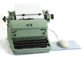
| 03/08/2006 03:06:21 PM |
Decades Apartby LN13Comment: Greetings From the Critique Club!!!
Initial Imapact: WOW thats good!!
Meeting the Challenge: I didn't even have to look to see that this was clearly for the Odd couple challenge.
Focus: Dead on. It can't possibly get any better than this.
Color: I like the drab green But I feel that the mouse and pad Could use a bit of color to help it feel even more "modern". The tonal range and colors that are present are all perfect.
Composition: Oce again looks great.
Lighting. This is the only area I can spot any technical aspects that could be improved. I don't like the shado on the left of the typewritter. I think Using another light from the left to remove it would have moved this great shot up another knotch.
Overall: Not a real exciting subject. Or necessarily pretty. This will probably keep this image away from the ilusive ribbon, but I can easily see this as a stock image or a poster. This image make lack in aqppealing to the masses but it is technicaly a spectacular photo.
Keep up the great work!! I look forward to voting on more entries like this one.
Tristalisk |
| Photographer found comment helpful. |
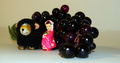
| 03/08/2006 10:17:41 AM |
clothed for the junctureby floydroweComment: Greetings From The Critique Club!!!
Initial impact: Why??
Color: There is not a lot of color in this photo but The concept is sound. Placing almost all of the color in the center does force the eye to look at the figure in the middle
Focus: The focus is very good, but I feel that you Depth of Field is a little shallow. I think that in this instance it would have worked a bit better to have A nice crisp focus for the full depth of the photo.
Contrast: The contrast looks to be good. I can't see anything in this area that could be improved.
Lighting: This is one of the weak areas in this photo IMO. It looks like you were trying to get a solid white background, but instead you ended up with a lot of greys and off whites. T fix this you would need to move your subject away from the background a little more and light it separately. Shop lights or a good flashight will accomplish this if you don't have access to studio lights and such. As for lighing the subject. When shooting on a white surface you ussualy want to have the appearance of the subject floating in free space. This is accomplished by removing as many shadows as possible. And making sure you subject is as vibrantly lit as possible. In this instance I would have tried using two more loghts from either side as low as possible. This would allow the light to illuminate as much of the white surface as possible giving you the least shadows. With those three lights and you cameras flash the subject would have apeared to be floating in white.
Subject: It looks to be a random pile of objects to me while each one is interesting in it's own right I can't see a relationship between the items. I realize this is an odd couples challenge, but I feel that there should be some reason or relationship between the different subjects. Why were the grapes and green rose added? What did they add to the photo. What is the Odd couple relationship between the pink dol and the stuffed lion? I was unable to get a story or meaning behind this photo. I feel that if there was one it may have been a bit too obscure for me and the other viewers to make the connection.
Best of luck in future challenges, and remember perfection comes with perseverance.
|
| Photographer found comment helpful. |
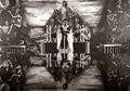
| 03/06/2006 12:49:40 PM |
Pastorby BrinComment: Greetings From The Critique Club!!!
Initial inpact: WOW!! What a powerfull and dark image!!
Contrast: Good contrast whites, Blacks and everything in the middle.
Composition: Normaly I don't like the main subject to be in the ddead center of the image. But in this situation I think it works well. The reflections frobably would not have looked quite as impressive otherwise.
Story: I feel this image tells a story and keeps the viewers interested. The back ground is a spectacular use of freco's and the "dark" preist realy seems to go with the mood the the frescos and the overall darkeness of the image. This is definately not you typical pretty church shot. It is easy to imaging the preist ranting and raving about fire and brimstone. Very effective photo.
Focus: Dead on focus. Nice crisp image through out. There isn't much more to say than that about the focus.
Complaints: It took me second to find the preist amidst the rest of the spectacular details. I perhaps a darker lit back ground with a bit of a spotlight on the preist would have helped with this.
Overall a very nice image. I would have voted this one very highly had I voted on that challenge. Nicely done. I look forward to seeing more of these breathtaking photos from yet another Icelander:)
Tristalisk
|
| Photographer found comment helpful. |
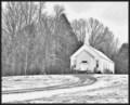
| 03/06/2006 11:37:20 AM |
White As Snowby RockBruiseComment: Greetings From the Critique Club!!!
Initial Impact: I like it....
Color..... umm I guess this catagory is a bit poinless in this photo.
Focus: I like it nice and crisp lines everywhere. The road, the church, the tress all in perfect focus.. This alone wins a few points in my book.
Contrast: I see that most think this could have used a bit more contrast. I agree with them to an extent. I like the monotone and gey feel of this image. But it does feel a little flat. I think a little burning would make everyone hapy. Maybe burn the sky a little to bring out the clouds a bit more. And just a light pass with the burn tool over the trees to give this more depth using dark to ligh with a midline.
Composition: I like it.. Rule of thids was used. It has a nice balance and natural feel. I even like the border.
Overall I voted this image pretty high. I gave it a 7 during the challenge. I think with a little use of the burn tool this could have easily received an even higher score. Wonderfull photo.. I look foerward to seeing what you come up with next..
Tristalisk |
| Photographer found comment helpful. |
| 03/06/2006 10:37:48 AM |
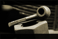
The pipeby AngelisComment: Greetings Form the Critique Club!!!
Initial impact: I like it!!
Meeting the challenge: Yep no issues what so ever.
Color: Very nice I think this was a perfect photo for duo-tones. The mild sepia colr realy adds a lot the the character of this photo and sets an antique and emotional overlay to it all.
Focus: Just about perfect. I think you DOF was jsut a touch shallow. I would like to have had the entire pipe in focus. But your DOF falls short and the end of the pipe looses a little focus. Other than the end of the pipr the focus on this shot is wonderfull. Crisp and sharp details and outlines. The Shalow DOF nicely blurring ou the back ground. Very very nice.
Composition: I like the tilt of the photo even though it feely a little ackward. I don't however like the huge black "border?" on the top and bottom of the photo.
Contrast: Once again. Another very nice attribute of this phot. Great contrast. This photo utilizes the full spectrum of the scale. With black black, white whites, and a smooth and lovely variety of all the greys in between.
Overall: loos the border and I have only a very minor complaint about the DOF. Very imaginative and enjoyable photo.
Great job. I look forward to seeing more of this caliber worrk in future challenges. |
| Photographer found comment helpful. |
| 03/02/2006 10:00:32 AM |
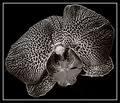
Spider Beauty Orchidby artvetComment: Greetings From The Critique Club!!!
Initial Impact: Freaky, creepy, cool, I like it!!!
Contrast: This photo has it in spades!Lots of wonderfull contrast.
Composition: The flower seems cramped. I think a little looser crop or eleimation of the border would help this image breath a bit.
Focus: Looks to be a pretty sharp image, but towards bottom center of the flower there is a grey "tongue" it looks to be OOF I think this is more because of texture than focus. But it still "appears" to be slightly OOF. Otherwise nice crisp image with a smooth solid edge.
Overall: This is a pretty good shot but I feel it could be greatly improved by giving it breathing room. As t sits now it feels a bit too "in your face" to enjoy as it should be. |
| Photographer found comment helpful. |
| 03/02/2006 08:41:32 AM |
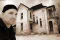
Broken Windowsby ColeyComment: Greetings from the critique club!!!
Initial impact: creepy....yet beautifull.
Color: Very nice use of duo tones. I feel that the classic sepia was a bood choice for your color.
Contrast: Very nice. You have the whites the blacks and everything in between.
Focus: The house looks to be in perfect focus, however the model looks be just a touch soft.This might have been intentional, or even unavoidable due to the DOF. But I still think it would have looked a little better with a crisper focus.
Subject: Ok not exeptionally exciting but the house is interesting enough. The house has great tones. But probably would not have carried the shot by itself. (at least from the perspective and vantage point). The model looks decent. Together they work a bit better but. I can't really seem to find a conection between the two subjects. If the model had been raking the yard, painting or somthing I could have seen the relationship. But as is it just feels like two different photos.
Lighting: Nice and creepy..no complaints
Overall: This is a good shot. Other than the relationship problem I would have no qualms with framing this peice and showing it off proudy. Very artistic, technicaly sound, and pleasant photo nice job!!
|
| Photographer found comment helpful. |
Home -
Challenges -
Community -
League -
Photos -
Cameras -
Lenses -
Learn -
Prints! -
Help -
Terms of Use -
Privacy -
Top ^
DPChallenge, and website content and design, Copyright © 2001-2024 Challenging Technologies, LLC.
All digital photo copyrights belong to the photographers and may not be used without permission.
Current Server Time: 04/24/2024 10:23:53 PM EDT.