| Image |
Comment |
| 04/30/2004 09:18:48 PM |
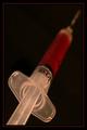
The Appropriate Doseby LENWOODBLUZComment by cyniczny: I think maybe this is more perspective than proportion, but I really like it! Border adds instead of distracting, like so many do. Also, I like the low lighting, as it enhances the "mood" of the subject. |
 Photographer found comment helpful. Photographer found comment helpful. |
| 04/30/2004 09:37:14 AM |
|
| Photographer found comment helpful. |
| 04/29/2004 06:15:28 AM |
The Appropriate Doseby LENWOODBLUZComment by lakritstroll: I would have preferred deeper DOF but like the light, the angle and the framing
Now, appropriate is not the same as proportionate (which it could be if one of the object's properties was related to something else ... did I miss what that other something is??) |
| Photographer found comment helpful. |
| 04/28/2004 11:00:29 AM |
The Appropriate Doseby LENWOODBLUZComment by autool: Composition: Subject Placement, Cropping, Background 6
Technical: Focus, Exposure, Lighting, Processing 7
Appeal: Is it Interesting, Motivating, Etc.? 4
How well does it meet the challenge: 3
Total Averaged Rating 6 Autool
Are you not thinking of portion instead of proportion? |
| Photographer found comment helpful. |
| 04/28/2004 09:40:41 AM |
|
| Photographer found comment helpful. |
| 04/18/2004 01:21:35 PM |
|
| Photographer found comment helpful. |
| 04/18/2004 11:15:51 AM |
|
| Photographer found comment helpful. |
| 04/17/2004 10:16:43 AM |
|
| Photographer found comment helpful. |
| 04/17/2004 12:01:57 AM |
|
| Photographer found comment helpful. |
| 04/16/2004 12:42:59 PM |
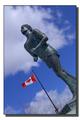
TERRY FOX --- Marathon Of Hope Anniversary April 12, 1980by LENWOODBLUZComment by redmoon: Wowser! Talk about obscure reference… Admittedly being a little bit pedantic, but isn’t marathon running more about endurance than strength? Minor quibble, I suppose. The image is a goodun’. From this viewpoint the runner looks a bit constipated, but the lighting including the sky is really rather pleasant, and the inclusion of the Canadian flag with pole is really a very nice touch. The border is a bit too sophisticated for my liking, and I might have been tempted to crop out bottom to get rid of the light column at the foot of the picture. The bold depth of colours is very good and overall it's an appealling image. 7.5, which I guess means an 8. |
| Photographer found comment helpful. |
Home -
Challenges -
Community -
League -
Photos -
Cameras -
Lenses -
Learn -
Prints! -
Help -
Terms of Use -
Privacy -
Top ^
DPChallenge, and website content and design, Copyright © 2001-2024 Challenging Technologies, LLC.
All digital photo copyrights belong to the photographers and may not be used without permission.
Current Server Time: 04/19/2024 05:41:06 PM EDT.