| Image |
Comment |
| 05/02/2004 06:30:13 PM |
Concrete Proportionsby DonatienComment by rananculus: One of the strongest compositions of the contest, even though I don't want an apartment anywhere near. Contratulations on a fantastic urban theme. I'm wondering about just the hint of water in the lower right. I find myself wanting more or less, not quite sure. I think that I might have cropped a little tighter. I'm also finding myself wanting to know more about the skyline above. I think I might have traded the water below, for more of the vista above. Very nice shot. Good luck!!! |
 Photographer found comment helpful. Photographer found comment helpful. |
| 04/29/2004 06:47:28 AM |
|
| Photographer found comment helpful. |
| 04/28/2004 05:07:44 PM |
Concrete Proportionsby DonatienComment by melismatica: This is kind of a ho-hum cityscape. Those concrete tanks and the brick building in front of them don't hold enough visual interest to be a focal point. The trees in the foreground are just distracting and out of focus. I see potential for an interesting shot in the buildings and the river in the upper right quadrant. |
| Photographer found comment helpful. |
| 04/28/2004 01:32:26 PM |
Concrete Proportionsby DonatienComment by alanbataar: The unsharp masking is pretty overdone -- if you're using photoshop, I'd say that anything between 40-80 is enough for the sizes we use here (USM is resolution-dependent), and depending on the image, tinkering a biit with the radius. |
| Photographer found comment helpful. |
| 04/28/2004 12:52:17 PM |
Concrete Proportionsby DonatienComment by autool: Composition: Subject Placement, Cropping, Background 6
Technical: Focus, Exposure, Lighting, Processing 6
Appeal: Is it Interesting, Motivating, Etc.? 4
How well does it meet the challenge: 3
Total Averaged Rating 5 Autool
|
| Photographer found comment helpful. |
| 04/25/2004 07:33:45 PM |
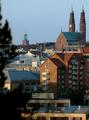
Stockholm Sunsetby DonatienComment by orussell: Very nice and crisp. Great DOF. Sometimes I like trees as borders but I think in this case I would have left it out/recomposed. The rest of the scene is so pleasing that the trees distract IMHO. |
| Photographer found comment helpful. |
| 04/24/2004 11:47:44 PM |
|
| Photographer found comment helpful. |
| 04/21/2004 02:21:36 PM |
|
| Photographer found comment helpful. |
| 04/21/2004 08:55:53 AM |
Silhouette Driveby DonatienComment by BobsterLobster: Interesting shot, but the composition is a bit off to me. It looks like you couldn't decide whether to centre the golfer in the frame or not. I'd crop tightly to his left, leaving plenty of negative space for him to shoot/look into. The blurred trees don't really work for me. I'm not sure about the graduated burnt out sky behind him... it looks a tad accidental rather than planned. A great idea though, and the silhouetted pose is a good one. |
| Photographer found comment helpful. |
| 04/20/2004 02:37:53 PM |
|
| Photographer found comment helpful. |
Home -
Challenges -
Community -
League -
Photos -
Cameras -
Lenses -
Learn -
Prints! -
Help -
Terms of Use -
Privacy -
Top ^
DPChallenge, and website content and design, Copyright © 2001-2024 Challenging Technologies, LLC.
All digital photo copyrights belong to the photographers and may not be used without permission.
Current Server Time: 04/25/2024 02:00:08 PM EDT.