| Image |
Comment |
| 05/17/2004 12:07:15 PM |
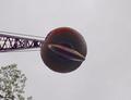
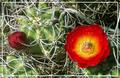
Headache Ballby DrakeComment: Very centered, but a bit on the dull side with the sky being all gray. Did you try other angles too, to bring in more/other subjects but with the headache sitll in center? |
 Photographer found comment helpful. Photographer found comment helpful. |
| 05/17/2004 12:01:28 PM |
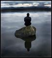
Evening meditation!by NazgulComment: Very nice and compelling image, but the birdie stuff on the rock is disturbing. Not your fault it's there but I think you could have cloned it away if you'd really wanted? Border works nicely on a centered subject I think. |
| Photographer found comment helpful. |
| 05/12/2004 06:29:10 AM |
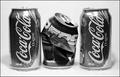
Fierce Competition!by doctornickComment: Nice thought and good for the subject, but I get the feeling the b/w hides a less than perfect shot? Would have wanted it in color I think. Also it's very centered and staged. I think you could have worked with the dof better and added depth, perhaps putting the cans in a diagonal? Shaprness on the front of the cans is very good, perhaps at the cost of too much contrast / exposure at the top. The shadows behind the cans work, although working in different directions, again adding to the "staged" feeling.
Next setup, try thinking a bit outside the frame. Not all of the subjects have to be all-in and in focus. Closest can could have been partial and out of focus, perhaps only the pepsi in focus towards the middle and then a faded out last can behind? Several pepsis out of focus with only one coke standing "focused and proud" in the middle or the other way around? Try different approaches and crops. |
| Photographer found comment helpful. |
| 05/12/2004 06:08:37 AM |
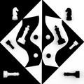
Some Things Are Just Black and Whiteby bruskiComment: Nice effort (I assume it involved quite some work). Would have wanted detail in the black chess pieces as in the white ones, but I can understand how that was really hard to accomplish. One of the best challenge interpretations so far. Nice with an image not involving fire and ice :-) |
| Photographer found comment helpful. |
| 05/12/2004 06:01:00 AM |
Punishments and Rewardsby snowleopard10101Comment: You would have done a lot better without the frame on this one I think. It takes away from the pleasing bent chaos of the thorns (adding dissorder and confusion instead) Being that thick and dominant it also takes the eye off the image and all you see is the frame. Frame gone, it's a nice shot with a decent interpretation of the topic. I'll leave you a 5 clicking close to the 4.. Border gone, I'd probably clicked the 6. |
| Photographer found comment helpful. |
| 05/12/2004 02:18:13 AM |
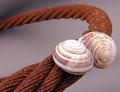
Rusted loveby ivashComment: Yikes, I had you way up there in the top. You got thoroughly robbed in my oppinion. I know now that you have other ribbons and stuff to fall back on so I guess you can smile about it, but still.. |
| Photographer found comment helpful. |
| 05/10/2004 12:45:57 PM |
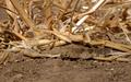
Natural Camoflaugeby autoolComment: Good thing you had the title. Took me some time to find it anyway. Not sure he(?) makes a good picture but marks up for orginality / good find. |
| Photographer found comment helpful. |
| 05/08/2004 07:42:23 PM |
|
| Photographer found comment helpful. |
| 05/08/2004 07:39:14 PM |
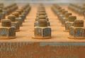
Spring has Sprungby willtataComment: It's rust, but it tells no story since I can't tell what it is and there's no context. It passes by with little interest.
Technically you've got a decent shot but it's not art in it self and that leaves me with the feeling that I don't get it. Somethings missing. |
| Photographer found comment helpful. |
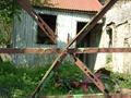
| 05/08/2004 07:33:47 PM |
gate viewby JACKIE BIRDComment: I get the feeling the smaller image size hides a slightly blurry image that is way too centered in it's composition. The rusty bars seems more in the way than anyting else. Perhaps with better focus on the rusty part and less depth of field to take away the curiosity from the buildnig and surroundings? I'd used the allowed 640 pixels in this shot. |
| Photographer found comment helpful. |
Home -
Challenges -
Community -
League -
Photos -
Cameras -
Lenses -
Learn -
Prints! -
Help -
Terms of Use -
Privacy -
Top ^
DPChallenge, and website content and design, Copyright © 2001-2024 Challenging Technologies, LLC.
All digital photo copyrights belong to the photographers and may not be used without permission.
Current Server Time: 04/15/2024 11:55:49 PM EDT.