| Image |
Comment |
| 05/31/2004 04:08:57 PM |
|
 Photographer found comment helpful. Photographer found comment helpful. |
| 05/31/2004 03:16:25 PM |
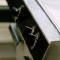
Just a stoveby LesyaComment by justine: I see the three knobs but don't think this hold much interest for the general viewer. I'm not sure what it is your showing us....with this shot. |
| Photographer found comment helpful. |
| 05/31/2004 01:13:28 PM |
|
| Photographer found comment helpful. |
| 05/27/2004 11:46:46 PM |
Boy in playgroundby LesyaComment by OneSweetSin: Critique Club
Very cute photo, that expression is well captured. Definately meets the challenge. Only thing I really notice is the yellow has left the baby looking a bit sallow, and thus a little less appealing than if it had been done with another could near the baby.
Overall it is very darling and still a keeper. |
| Photographer found comment helpful. |
| 05/22/2004 11:13:46 AM |
Boy in playgroundby LesyaComment by awpollard: Good shot. Even with all the colors going on here the child's emotion keeps us focused in the center of the shot. Very good shot. |
| Photographer found comment helpful. |
| 05/19/2004 04:53:12 PM |
|
| Photographer found comment helpful. |
| 05/19/2004 07:27:51 AM |
Boy in playgroundby LesyaComment by BobsterLobster: Great portrait, if not entirely flattering! That is one worried looking boy... Great colours and saturation. Shame the tips of the fingers are chopped off. |
| Photographer found comment helpful. |
| 05/18/2004 10:54:33 AM |
|
| Photographer found comment helpful. |
| 05/17/2004 07:09:38 AM |
Boy in playgroundby LesyaComment by Olyuzi: Wonderful composition, but flesh tones could use some color balancing to get rid of the yellow cast. |
| Photographer found comment helpful. |
| 04/25/2004 03:26:48 PM |
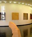
Art Gallery at Long Island Universityby LesyaComment by Neuferland: Greetings from the Critique Club!
Overall this is a great shot, the clarity, the curver of the ceiling and floor, they lead you around the shot, the piece in the center to bring you back in. The reflection on the left, to me, is the only way I would be able to tell that this was taken through a window and to me, takes more away from the shot than helps it. If there was a frame on the left or right that could have defined the shot for me, I think I would have liked it much better.
As for the shot overall, there is not a lot of interest to really hold me here for long. THe lines are great and composition is very well done but the subject matter is a bit on the dull side. Not sure if cropping would help or not.
Good Luck In Future Challenges!
Deannda
DNeufer@stny.rr.com if you have any questions or want to discuss this further! |
| Photographer found comment helpful. |
Home -
Challenges -
Community -
League -
Photos -
Cameras -
Lenses -
Learn -
Prints! -
Help -
Terms of Use -
Privacy -
Top ^
DPChallenge, and website content and design, Copyright © 2001-2024 Challenging Technologies, LLC.
All digital photo copyrights belong to the photographers and may not be used without permission.
Current Server Time: 04/24/2024 02:35:29 PM EDT.