| Image |
Comment |
| 10/10/2005 06:06:42 AM |
The Point Reyes, Cherished Landmarkby sfaliceComment: A very good image, shot from an angle that accents that it is a landmark to be looked up at as well as looked upon. While I'm sure you could have taken the image from an angle that displays it's fate more clearly -- I like this perspective as it clearly shows the sea-worth vessal it once was.
This is accented by the rest of the shot. The out of focus grass in front brings to mind a rolling sea that compliments the angle nicely. However, I am of mixed feelings about the sky. I tend to agree with the commentor below -- the sky is a bit over-powering for the muted tones of the main subject. But at the same time, while lowering the saturation of he blues (I tried it) gives a more pleasingly even tone over the entire image, it also shifts the image away from a testament to what the ship once was. With the sky as it is, the sensation of what once was is much stronger.
The only real downside for me is the general softness of the image. This is in disagreement with the brightness of the sky and the general feeling of the shot. You state you did sharpen, but as you did so in the middle of your workflow I wonder if resizing didn't steal some of the sharpness from you. If so, an extra sharpening after resizing would have brought it back.
David
Critique Club |
 Photographer found comment helpful. Photographer found comment helpful. |
| 10/02/2005 03:46:43 AM |
Let The Vacation Begin..........by jrjrComment: The first thing that strikes me about this image is the warmth of it -- really invites a person in.
This has a very good composition, with the perspective placed the Sun very near the vanishing point. the leading line of the rocky land leads me to the setting Sun -- but then brightness pushes me back out, onto the ship which leads to the land the the cycle continues. This keeps my attention moving from one part to another, never resting and growing bored. The result is perfect for the challenge, I feel the pull to walk along the rocks -- but that won't get me to the destination, so maybe the ship will.
As a matter of personal taste I think the lower portion of the image needs to be brightened a bit and the entire image could be sharper -- but these are at best only slightly disagreeable.
Maybe I just need a bit more light for the journey.
David
Critique Club |
| Photographer found comment helpful. |
| 09/27/2005 05:30:34 AM |
|
| Photographer found comment helpful. |
| 09/27/2005 04:55:29 AM |
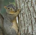
A Tree Huggerby CamComment: These little buggers are fun, aren't they -- but, I would have went with a tighter crop, ending just below the elbow |
| Photographer found comment helpful. |
| 09/27/2005 12:23:27 AM |
|
| Photographer found comment helpful. |
| 09/27/2005 12:21:09 AM |
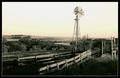
Nebraska Windmillby jmosherComment: Excellent composition -- and I love the toning.
However, most of the image is at the extreme tones -- bringing the exposure of the shadows at the bottom up and bringing the highlights at the top down does wonders for the image. Don't get me wrong, it's nice the way it is, but there is so much detail hiding in the shadows and highlights that only help the image when brought out. After this, add contrast to taste and it would have gotten a 9 from me (with contention for 10 on a second pass), but as it is -- 7. |
| Photographer found comment helpful. |
| 08/01/2005 07:37:34 AM |
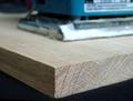
Unsanded Oakby neophyteComment: You've got good, strong lines in this, which is good -- but, by being nearly balanced left and right, they unfortunately don't lead the eye anywhere. Changing the perspective to a more dynamic shift in balance, enough to create a strong diagonal with the edge of the wood would (hehe) create a greater sense of depth to the shot and give the viewer's eyes incentive to move across the image. This could further be reinforced by moving the sander away from nearly directly above the corner of the wood.
The other thought I had is to add more contrasting subject matter. I don't mean in terms of light, but rather in terms of creating a dichotomy of subjects. To be precise, the subject is unsanded oak -- by adding a sample of sanded oak to the scene the unsandedness of the oak is set in greater contrast against what it could become.
This dichotomy is already present, created on a predictive level by the inclusion of the sander. This gives the image momentum into the future -- leading the viewer to predict what is to be done to the wood. This tells me you had this in mind (at some level) when composing the image.
Most of the elements are present, but I feel the image would benefit from a more obvious and forceful control of the viewer -- both within the scene and in their predictions.
David |
| Photographer found comment helpful. |
| 07/14/2005 02:24:06 PM |
Paige.jpgby sheapodComment: This is very well exposed and loses no detail in the highlights and shadows. It doesn't use the entire range of tones however so moving the left and right sliders in the Level dialog helps -- and if done to each channel individually it also helps to remove the slightly green cast.
All in all, it is nicely done. |
| Photographer found comment helpful. |
| 04/11/2005 02:57:15 PM |
Mourning Reflections in Graniteby theSajComment: The image is great, but just misses the mark of what you stated as your goal. I feel the goal of 'to capture the feel of those who remain behind in mourning' would have been better served if there was something in the frame to indicate it was a memorial/tombstone. Move the young lady a bit to the right and include any writings that may be there in the negative space on the left, and I for one would have seen your intention more clearly.
David |
| Photographer found comment helpful. |
| 02/05/2005 05:19:14 PM |
Light Raysby StagoleeComment: Nicely captured rays of light, but the contrast seems a bit flat. |
| Photographer found comment helpful. |
Home -
Challenges -
Community -
League -
Photos -
Cameras -
Lenses -
Learn -
Prints! -
Help -
Terms of Use -
Privacy -
Top ^
DPChallenge, and website content and design, Copyright © 2001-2024 Challenging Technologies, LLC.
All digital photo copyrights belong to the photographers and may not be used without permission.
Current Server Time: 04/24/2024 07:52:17 PM EDT.


![my d50 is here! (And my point of interest [d50] is placed on the intersection of the lines :D](https://images.dpchallenge.com/images_challenge/0-999/380/120/Copyrighted_Image_Reuse_Prohibited_233915.jpg)