| Image |
Comment |
| 02/08/2005 11:42:56 PM |
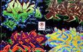
NoParkingby BruBComment by Bear_Music: Hideous inline, WHY did you do that? Wonderful, vibrant image that stands out from the mass of this challenge. |
| 02/08/2005 06:42:09 PM |
NoParkingby BruBComment by mycelium: great colors. nice use of a centered composition. border is nice too. i expect to see you in the top 10 tonight :) |
 Photographer found comment helpful. Photographer found comment helpful. |
| 02/07/2005 09:14:43 PM |
NoParkingby BruBComment by Anachronite: tough decision on the vote.. your photo, while it has a sign in the middle of it, is really nothing more than a photo of someone elses art work. However, having a sign in it does mean it meets the challenge and the sign is not someone else's work... so we have quite a conundrum where a vote is concerned.... (pause) ok after a brief pause I find myself drawn to the striking images painted by the other artist(s), not the sign, which should be the main subject... I feel since in my own humble opinion, the grafitti has too strong of a presense not to be concidered the main subject, and therefore is really a severe over use of someone elses work.. it's like you took a picture of someone elses picture.. for me, that doesn't work in this type of challenge... on a technical level, your color, focus, and lighting is great! |
| Photographer found comment helpful. |
| 02/07/2005 08:05:57 PM |
|
| Photographer found comment helpful. |
| 02/07/2005 01:31:05 PM |
|
| Photographer found comment helpful. |
| 02/07/2005 12:34:59 PM |
NoParkingby BruBComment by beckettboots: Beautiful colors and variety - I really like the centered composition with the sign smack in the middle because it brings order to the chaotic colors and shapes. You get a 10 from me. |
| Photographer found comment helpful. |
| 02/07/2005 08:03:30 AM |
NoParkingby BruBComment by blurredvision: I like the balance in this shot. THe white border line adds a nice framing element to the shot. Well Done! |
| Photographer found comment helpful. |
| 02/06/2005 03:22:36 AM |
|
| Photographer found comment helpful. |
| 02/05/2005 11:49:03 AM |
|
| Photographer found comment helpful. |
| 02/05/2005 09:13:09 AM |
NoParkingby BruBComment by Mr_Pants: Funny how the sign has not been painted over. Pleasant selection of colours. |
| Photographer found comment helpful. |
Home -
Challenges -
Community -
League -
Photos -
Cameras -
Lenses -
Learn -
Prints! -
Help -
Terms of Use -
Privacy -
Top ^
DPChallenge, and website content and design, Copyright © 2001-2024 Challenging Technologies, LLC.
All digital photo copyrights belong to the photographers and may not be used without permission.
Current Server Time: 04/18/2024 08:47:51 PM EDT.