| Image |
Comment |
| 04/20/2015 11:03:30 PM |
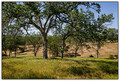
Springtime on the lawnby KMcCComment: What I like:
- The colors are beautiful
What I don't like:
- The tree is only half shown, it's right side missing in the frame.
Overall: I think this shot would look more complete if the whole tree was included. |
 Photographer found comment helpful. Photographer found comment helpful. |
| 04/20/2015 10:58:27 PM |
A place to sleepby hajekaComment: What I like:
- Your camera/ editing did a great job capturing details of the birds
What I don't like:
- DOF is too shallow. In my opinion the background is fairly uniform so I would have stopped up the f/stops. That said, I've no idea how quickly the ducks were moving, so this may not have been possible but they look pretty settled in this shot.
- the poses of the ducks are too bad, as they are both looking away from the camera
Overall: Beautiful detail of the ducks but wish they were looking at the camera. |
| Photographer found comment helpful. |
| 04/20/2015 10:55:43 PM |
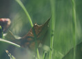
matterby PennyStreetComment: What I like
- The contrast between the dying leaf and the growing green grass
What I don't like:
- The focus is way way too soft for my liking; depth of field a bit too shallow, too
- the brown object in the background.
Overall: Neat idea, but so little is in focus it makes the whole shot seem out of focus. |
| Photographer found comment helpful. |
| 04/20/2015 10:55:15 PM |
Swiftby Yo_SpiffComment: What I like:
- the architecture and contrasting styles of the buildings
what I don't like
- colors too saturated
overall- wish it was framed as a landscape instead of a portrait. Swapping to landscape would allow for darkening of the overall picture to bring back detail to the grass and to the sky (which is a bit light to my eyes). |
| Photographer found comment helpful. |
| 04/20/2015 10:50:57 PM |
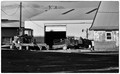
working farm yardby jgirl57Comment: What I like:
- that the picture is black and white and the tractor/ other farm equip as the subject.
What I don't like: I feel like this shot could have been edited a bit different to make it pop. I'd have tried a red filter (either on the lens or in post) to really have the sky and clouds pop. I'm assuming the tractor is green so the tractor would become a bit darker as well making the wheels and writing pop more. Finally the focus is a bit soft
Overall: I love the idea of this shot, but would have edited it differently and perhaps tried for a different angle with B/W editing in mind (foreground is a bit dark.) |
| Photographer found comment helpful. |
| 04/20/2015 10:45:09 PM |
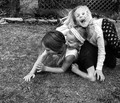
organicby tateComment: What I like:
- The girls' expressions and the angles they create
- Good use of black and white
What I don't like
- Busy background
Overall: wish the camera angle or DoF had been adjusted to make background less distracting. |
| Photographer found comment helpful. |
| 04/20/2015 10:44:13 PM |
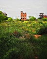
Lawn Mowing
Half Way Thereby ZeusComment: What I like:
- the contrast between the lower field and the upper one
What I don't like:
- The trees in the midground break up the two fields and make the picture a bit busy. I also am not sure if the object between the two trees on the ground is a log or a machine?
Overall: I'm basing my comments in part on the title and the fact that I like the contrast between the lower and upper field. I think the trees are distracting from this difference. If not for the title, I may not have even noticed that the lower field was mowed. |
| Photographer found comment helpful. |
| 04/17/2015 12:05:02 PM |
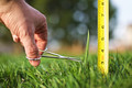
Obsessiveby giantmikeComment: What I like:
- Cute shot
- Okay bokeh
What I don't like:
- hand is out of focus
Overall:
- Cute. I like adherence to the assignment theme. |
| Photographer found comment helpful. |
| 04/17/2015 12:03:28 PM |
Finally...by lei_73Comment: What I like:
- it reminds me of "A Sunday Afternoon on the Island of La Grande Jatte"
- Love love love the color and the angles
What I don't like:
- not sure what was done, but it looks a bit too much like a painting rather than a photograph to me (but, my husband, looking over my shoulder, loves this effect so meh.)
Overall: Love it! Great shot, great capture of the theme. |
| Photographer found comment helpful. |
| 04/17/2015 11:44:14 AM |
Put It Onby GolferDDSComment: What I like:
- The golfer's pose
What I don't like
- the picture is a bit pedestrian
Overall: changing camera angels may have made for a more interesting shot |
| Photographer found comment helpful. |
Home -
Challenges -
Community -
League -
Photos -
Cameras -
Lenses -
Learn -
Prints! -
Help -
Terms of Use -
Privacy -
Top ^
DPChallenge, and website content and design, Copyright © 2001-2024 Challenging Technologies, LLC.
All digital photo copyrights belong to the photographers and may not be used without permission.
Current Server Time: 04/19/2024 11:01:48 AM EDT.