DPChallenge: A Digital Photography Contest You are not logged in. (log in or register
 
Browse Settings
Currently viewing:
Registered Userdkubin

Show comments:

Per page:

Order:

Comments:


Comments Received by dkubin
Pages:   ...
Showing 1 - 10 of ~117
Image Comment
DSC_0062-copy.jpg
11/14/2005 03:52:33 PM
DSC_0062-copy.jpg
by dkubin

Comment by jpochard:
I love maternity portraits. They are quickly becoming my favorite thing to do. (I've done three couples so far.)

I like this overall, but I would make a few suggestions. I agree that it looks more out of focus than simply a soft effect. I like the black and white. I also like the bit of lace on the bottom, but I'm not crazy about the wrap around the top. I think I would have tucked it under the breasts a bit, or layered is a bit more smoothly.

Do you have others to share? I'd like to see them if you do.
DSC_0062-copy.jpg
11/14/2005 03:48:57 PM
DSC_0062-copy.jpg
by dkubin

Comment by JH:
Composition looks okay. Focus looks soft to me. Also, there is some noise in the B&W tones on the left forearm.

Try using the channel mixer in PS to to get a nice/interesting contrasting set of tones.
DSC_0062-copy.jpg
11/14/2005 03:47:15 PM
DSC_0062-copy.jpg
by dkubin

Comment by Rikki:
The focus is soft on this image and slightly OOF. Maybe this was the direction you were headed.

Technically, the tonalities of this image is good throughout. The ring's position being "off" is a minor concern but since you asked, I'll give you my honest opinion. There is a bit of harsh lighting just at the tip of the belly and on parts of the shirt that may be burned slightly to remove it. Overall, the softness tends to lend to a more delicate image of which is truly expressed by this photo. Pregnancy is such a beautiful thing and I am glad that you had taken the time to capture it. This is the time when women are the most beautiful and in their "bloom".
DSC_0062-copy.jpg
11/14/2005 03:46:36 PM
DSC_0062-copy.jpg
by dkubin

Comment by srdanz:
I think that the focus is too soft on the hand. You might have wanted it that way, but it comes across as an imperfection to me. same with the right hand - I guess the feeling of softness is exaggerated by the fact that there are no defining sharp lines on the belly to take over as the main focal point.
What were your parameters? (how far was the camera from the subject? What was the aperture? What was the focal distance used?)

Oh, and rotate the ring correctly. It looks careless...

Message edited by author 2005-11-14 15:47:25.
winter aspens.jpg
05/09/2005 05:01:10 PM
winter aspens.jpg
by dkubin

Comment by bucket:
I love the composition and shadows. A small amount of dodging highlights at @5% might make the foreground trees even more interesting.
Fijian Black Pearls
05/08/2005 01:44:39 PM
Fijian Black Pearls
by dkubin

Comment by zagman:
Greetings from the Critique Club.

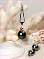
Thank you for entering your photo to the DPChallenge, Jewelry Advertisement.

Very nice capture of the black pearls displayed on sand and seashells.
Great compositional idea's. I am sure that many voters will find this presentation appealing.

Technically a hard shot to pull off. Their is a lot white balance issues to work with. This creates a struggle for contrasting one element to the other. There is also the flash area's that get hit in the foreground. I am assuming that you used a flash, because the pearls have a flash bounce on them.
The use of a more diffuse light and some fill in reflectors might have created a more even exposure and contrast.

Again a difficult shot if you only use normal ambiant lighting. Some of the background area's also lose detail. The ISO 800 settings sometimes gives off a grainy look. But you did a good job here, and those noise and grainy results are not visiable.

Overall a great image. The focal point and background elements make this photo very appealing. The use of some USM, in certain area's of the photo would have made it pop. The use of the white elements against the dark pearls was a great idea. It is also making a statement about where they originate in sea. The title and your framing left no question as to what you are selling. Great job.

Good luck in your next DPChallenge. Sincerely, Zagman.

Photographer found comment helpful.
Illuminated Sculpture
05/05/2005 05:39:18 PM
Illuminated Sculpture
by dkubin

Comment by sofapez:
This would be great for outside looking in. Aside from the lack of light available for the Sculture and the burnout on the bulbs from the lights, this is nice. If you reshoot take cloths to throw over the lights and diffuse the glow. They statue lights do little to light the subject anyway. a remote flash could give you the light you need to illuminate it.
Photographer found comment helpful.
Illuminated Sculpture
05/05/2005 11:17:59 AM
Illuminated Sculpture
by dkubin

Comment by sabphoto:
good white balance and exposure. Lights have slight blow out but nothing to annoying to me. Good luck
Photographer found comment helpful.
Illuminated Sculpture
05/05/2005 12:00:50 AM
Illuminated Sculpture
by dkubin

Comment by Zed Pobre:
Ah, finally a use for modern art: spicing up an otherwise ordinary photograph!

Interesting imagery, but somewhat soft. Blown highlights are a little harsh.
Photographer found comment helpful.
Illuminated Sculpture
05/04/2005 05:48:55 PM
Illuminated Sculpture
by dkubin

Comment by prbetts:
The Sculpture bend into the building
Photographer found comment helpful.
Pages:   ...
Showing 1 - 10 of ~117


Home - Challenges - Community - League - Photos - Cameras - Lenses - Learn - Prints! - Help - Terms of Use - Privacy - Top ^
DPChallenge, and website content and design, Copyright © 2001-2024 Challenging Technologies, LLC.
All digital photo copyrights belong to the photographers and may not be used without permission.
Current Server Time: 04/19/2024 04:40:21 PM EDT.