| Image |
Comment |
| 03/24/2004 08:03:50 AM |
|
 Photographer found comment helpful. Photographer found comment helpful. |
| 03/24/2004 01:06:52 AM |
|
| Photographer found comment helpful. |
| 03/24/2004 12:36:26 AM |
|
| Photographer found comment helpful. |
| 02/24/2004 07:52:52 PM |
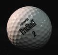
Golf Planetby frodobagginsComment by leaf: this image doesn't really hold my interest. it just seems like a golf ball... reasonable tones. |
| Photographer found comment helpful. |
| 02/24/2004 06:40:11 PM |
Golf Planetby frodobagginsComment by Hye5: Nice, but there is too much dirt on the ball and a few reflections, all of which detract from the image. |
| Photographer found comment helpful. |
| 02/24/2004 01:21:43 PM |
|
| Photographer found comment helpful. |
| 02/21/2004 02:59:11 PM |
|
| Photographer found comment helpful. |
| 02/21/2004 06:00:26 AM |
|
| Photographer found comment helpful. |
| 02/20/2004 12:10:35 PM |
Golf Planetby frodobagginsComment by e301: Neat idea, not great execution. The warmer top-side light is effective, but your fill from the right is too general, and perhaps too far to the front of the subject to provide real shaping. Those bright white reflections of the lamps are a shame too - might be worth experimenting with covering them a sheet of paper, to make the light softer, or even to reflect the light off apiece of white board (styrofoam, as the Americans term it, works very well for that. That should give you a more pleasing illumination, and even if there are still reflections, they should have that more professional feel to them. You have caught some texture here - follow the line of the text to the left and it's really quite well shaped there - if you could get that effct everywhere you'll really notiv=ce the improvement, Finally, it's a pretty ordinary subject, no? Great for experimenting with light actually, but in terms of a photographic presentation, not one of the more intriguing things. |
| Photographer found comment helpful. |
| 02/20/2004 07:37:26 AM |
Golf Planetby frodobagginsComment by admart01: A couple of ideas to play around with - more lighting on the left might throw more of the right into black and eliminate the hot spots/glare that distract from the darkness of the right side, there's a lot of writing here - perhaps a ball with less letters would let me experience the ball more. |
| Photographer found comment helpful. |
Home -
Challenges -
Community -
League -
Photos -
Cameras -
Lenses -
Learn -
Prints! -
Help -
Terms of Use -
Privacy -
Top ^
DPChallenge, and website content and design, Copyright © 2001-2024 Challenging Technologies, LLC.
All digital photo copyrights belong to the photographers and may not be used without permission.
Current Server Time: 04/24/2024 07:48:49 PM EDT.