| Image |
Comment |
| 05/01/2006 03:58:43 AM |
G N A Wby RKTComment: I gave this a ten... love it. Beautiful work.. can't believe it did so poorly. |
 Photographer found comment helpful. Photographer found comment helpful. |
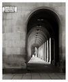
| 02/06/2006 03:03:34 PM |
LLOYD STREET by WaysOfSeeingComment: Awesome exposure. I'd love to see a little grain in this... but I'm sure I'm in the minority. Great job on that tonal range. Judging by your portfolio, you're very strong with b&w, and that makes me happy. Congrats on the ribbon! |
| Photographer found comment helpful. |
| 02/06/2006 03:00:08 PM |
|
| Photographer found comment helpful. |
| 10/31/2005 12:40:16 AM |
Rebelby gaurawaComment: So glad this ribboned... I absolutely love this shot.
Edit: typos :) Message edited by author 2005-10-31 00:46:28. |
| Photographer found comment helpful. |
| 10/25/2005 01:05:49 AM |
Black-eyed Susansby drydocComment: First of all, this shot has some good potential - the flowers are nicely in focus, and the diagonal line adds interest to the shot; where this photograph loses the viewer, however, is in the colour. The white balance is pretty significantly off - you definitely need to go warmer with this one if you're going to stay with colour; the vividness of the yellow colour against the gloom of the backdrop would be very effective if the yellow shade were corrected. Alternatively, this would look great in black and white. For this particular challenge, I'm not really seeing a lot of good grain - there is some colour noise that is more of a detriment than anything else in the greens - again, I would recommend colour correction or desaturation. In this case, the grain doesn't add to the mood, because it is not a true, all-over grain. I do like the composition/crop, however, and with a tish of sharpening this would be as clear as you could want. Colour work is really all this needs. Good luck! |
| Photographer found comment helpful. |
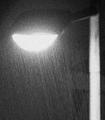
| 10/25/2005 12:52:50 AM |
Lit up rainby pacpintoComment: I'm not sure how others are going to feel about this, since it doesn't really seem to be your standard DPC fair, but I love it - it's very abstract feeling, and it definitely meets the challenge. Good call going with b&w on this, and I like the out of focus feel - great work! |
| Photographer found comment helpful. |
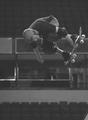
| 10/25/2005 12:51:11 AM |
Neal Hendrixby michael_pComment: Composition is good, and you've got the action very nicely frozen. I'm seeing an appropriate amount of grain; overall, it meets the challenge. However, I'd really like to see this either a) with considerably more contrast, or b) with some colour. Actually, some wild contrast AND colour would look pretty great, too :) As it is, your subject and background are kind of battling each other for attention - and this is a better shot than that! Good luck, this is a nice action capture. |
| Photographer found comment helpful. |
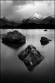
| 10/25/2005 12:04:07 AM |
Twilight Timeby RKTComment: This is just gorgeous. Your toning is spectacular, and the composition is perfect - the contrast is just right, and everything is sharp without going overboard. Beautiful work. |
| Photographer found comment helpful. |
| 10/24/2005 06:33:20 PM |
Mother's Grief...Mother's Joyby DrAchooComment: Beautiful - this is one of the rare occasions where I like selective desaturation. Your toning is perfect here, too - this could easily be too heavy of a sepia tone, but for this contrasty of a photograph, it works beautifully. The grain is perfect - you have a very moody, emotive shot here. Well done. |
| Photographer found comment helpful. |
| 10/24/2005 06:32:10 PM |
ANNO 1738by PhilosComment: This shot has a lot of appeal with the deep DOF and the nice contrast; the grain is well done and suitable to the image. I do, however, feel that the sepia tone is a bit heavy, and it makes it difficult to really get the details.. they're just not standing out like they could with a slightly greener, less saturated tone. Otherwise, this looks great - I love the light. |
| Photographer found comment helpful. |
Home -
Challenges -
Community -
League -
Photos -
Cameras -
Lenses -
Learn -
Prints! -
Help -
Terms of Use -
Privacy -
Top ^
DPChallenge, and website content and design, Copyright © 2001-2024 Challenging Technologies, LLC.
All digital photo copyrights belong to the photographers and may not be used without permission.
Current Server Time: 04/19/2024 06:02:37 AM EDT.