| Image |
Comment |
| 04/29/2005 01:02:28 AM |
View8.jpgby shocknurse1Comment: Very pretty - this is a pleasing photograph; the combination of geometric lines and a lovely vista really works well. Again, I must agree about the foreground/bottom. If you crop out some of the green bits, it would draw the eye much more easily to the beautifully exposed view - the trees are not in shadow, and the sky is not overexposed, which is very refreshing in this type of shot. You may or may not want to dodge the people checking out the view to give them some detail. I really love the upper 2/3 of this photo - just beautiful.
Edit: typo :) Message edited by author 2005-04-29 01:03:15. |
 Photographer found comment helpful. Photographer found comment helpful. |
| 04/29/2005 12:58:20 AM |
Luquillo.jpgby shocknurse1Comment: I also agree about lighting the foreground. You should be able to do a bit of dodging to really make this photograph excellent - or perhaps use layers or selections to edit the curves/levels of the foreground exclusively. At any rate, I really like this one. The composition is great, and the colours are lovely! |
| Photographer found comment helpful. |
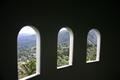
| 04/29/2005 12:56:35 AM |
Tower2.jpgby shocknurse1Comment: Pretty! I would suggest using curves or levels to make the foreground a true, total black. Composition-wise, I think cropping the left side a bit closer to the window would also improve the look of this picture. The exposure is great, though, and the angle allows for the edges of the windows to show nicely, which gives the viewer the sensation of looking out. It's a pity that the entire left window wasn't in the frame. This is a nice picture! |
| Photographer found comment helpful. |
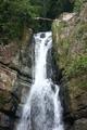
| 04/29/2005 12:53:11 AM |
MinaFalls1.jpgby shocknurse1Comment: An ND filter would really improve this, as it would allow for a longer exposure and a nice, smooth waterfall. The white balance also looks a tad off, but post processing could take care of that; some warming and sharpening would do this one wonders. |
| Photographer found comment helpful. |
| 04/29/2005 12:51:03 AM |
Flower2.jpgby shocknurse1Comment: At first glance, I thought the photo was slightly out of focus, but I think it's merely a matter of compression artifacts. This is a lovely photograph, but it would be improved by a slightly different composition - either centering the flower or putting it further off to one side to make it more visually pleasing. The light behind the petals is lovely, and the water/dew drops look great! |
| Photographer found comment helpful. |
| 04/28/2005 03:20:32 PM |
Lookby saintaugustComment: This is beautiful... bright, but crisp; my only suggestion would be to dodge out the shadows in the white - they distract a bit from her lovely face, and the right hand one almost looks like part of her facial structure. Regardless, this is a lovely shot; her eyes look fabulous, and enough detail remains in her face to make an interesting portrait. |
| Photographer found comment helpful. |
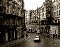
| 04/27/2005 04:21:10 PM |
Curve.jpgby bpickardComment: Ooohhh... so many textures, and more fantastic atmosphere! This is an awesome shot with some great movement showing; everything besides that car is so deliciously sharp and clear, and I love the contrast. Gorgeous. |
| Photographer found comment helpful. |
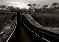
| 04/27/2005 04:17:53 PM |
Orkney-Road2.jpgby bpickardComment: Wow... this is awesome. I love the grain of this, the contrast, and the light level - it looks fantastic. Composition is great, and your choice of toning really works - fabulous work! |
| Photographer found comment helpful. |
| 04/27/2005 04:12:50 PM |
slika18.jpgby yelenaaComment: I like the harsh lighting on this, and the colours are great; it has a bit of a record album feel, for some reason. I wish it wasn't quite so closely cropped/framed, and the necklace clasp is just a bit distracting, but overall I think this is a nice self portrait - maybe not the most practical variety, but visually appealing nonetheless. :) Good job. |
| 04/27/2005 04:08:20 PM |
Picture 010.jpgby shocknurse1Comment: This photo has a lot of potential. With a straightened horizon and a touch of work on the curves, plus maybe some dodging on the boats to make them less in shadow, you could really make this shot appealing - I would say either by upping the saturation or making it black and white. I love boat shots. |
| Photographer found comment helpful. |
Home -
Challenges -
Community -
League -
Photos -
Cameras -
Lenses -
Learn -
Prints! -
Help -
Terms of Use -
Privacy -
Top ^
DPChallenge, and website content and design, Copyright © 2001-2024 Challenging Technologies, LLC.
All digital photo copyrights belong to the photographers and may not be used without permission.
Current Server Time: 04/25/2024 02:01:43 PM EDT.