| Image |
Comment |
| 05/16/2004 09:39:37 AM |
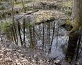
Otherworldby KaDiComment by Count: Cool idea, wish you could have gotten the picture from closer though! |
 Photographer found comment helpful. Photographer found comment helpful. |
| 05/14/2004 11:24:43 AM |
Otherworldby KaDiComment by Neuferland: Not really sure how this meets the challenge, maybe if you had included the trees in this world as well to show the opposite reflection? Not a bad shot but nothing to really hold my interest. I'm thinking this would look good in black and white or sepia, not sure why, maybe the different textures and such? As is, a 3 |
| Photographer found comment helpful. |
| 05/14/2004 09:58:57 AM |
Otherworldby KaDiComment by sailracer_98: I don't find this picture to be particulary interesting. It feels very busy with lots of different elements vying for your attention. I like the focus and depth of field. |
| Photographer found comment helpful. |
| 05/13/2004 12:18:37 AM |
|
| 05/12/2004 08:04:01 PM |
Journalby KaDiComment by kevrobertson: this was my favorite of the challange.
IMO it should have done better.
I love it |
| Photographer found comment helpful. |
| 05/12/2004 07:55:54 AM |
Otherworldby KaDiComment by UNCLEBRO: not sure what the opposite is in the picture.
water and trees?
reflection and leaves?
but still a good picture. |
| Photographer found comment helpful. |
| 05/11/2004 10:00:01 PM |
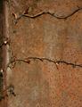
Journalby KaDiComment by L1: I find this shot rather intriguing. It does resemble a journal. And it is the ONLY flower and rust picture submitted that really appeals to me. Great job! |
| Photographer found comment helpful. |
| 05/11/2004 12:54:56 PM |
Journalby KaDiComment by cghubbell: Creative title. I like the idea here, but it's not contrasting enough from the background. I'm not sure how to suggest improvement, only that it would be nice to have the vine stand out more. Also seems slightly out of focus. |
| Photographer found comment helpful. |
| 05/11/2004 09:35:08 AM |
Journalby KaDiComment by autool: Composition: Subject Placement, Cropping, Background 6
Technical: Focus, Exposure, Lighting, Processing 6
Appeal: Is it Interesting, Motivating, Etc.? 3
How well does it meet the challenge: 10
Total Averaged Rating 6.25 Dick
|
| Photographer found comment helpful. |
| 05/10/2004 05:50:17 AM |
Journalby KaDiComment by mandyp: I think this would have more success if it was landscape format and cropped to have the horizontal vines at the top and bottom of the image. |
| Photographer found comment helpful. |
Home -
Challenges -
Community -
League -
Photos -
Cameras -
Lenses -
Learn -
Prints! -
Help -
Terms of Use -
Privacy -
Top ^
DPChallenge, and website content and design, Copyright © 2001-2024 Challenging Technologies, LLC.
All digital photo copyrights belong to the photographers and may not be used without permission.
Current Server Time: 04/24/2024 09:49:42 PM EDT.