| Image |
Comment |
| 01/31/2004 06:18:57 PM |
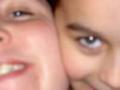
the twins? (Gemini)by Jamie2772Comment: A good idea which has not quite worked.
What I think may have been "soft focus" has drifted towards "out of focus"
If it is a focus problem, it could have been rectified by stepping further back and taking the picture to retain focus and then cropping the picture to the same image.
It is a shame to see a potentially good picture lose it because it has not been taken carefully enough.
In most digital cameras now there is enough resolution to crop a considerable amount without losing image quality.
Try and reshoot it again and compare the difference.
David
|
 Photographer found comment helpful. Photographer found comment helpful. |
| 01/31/2004 06:15:13 PM |
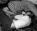
Cancerby GrundleComment: I cannot make up my mind about this one -
It seems it would be better in a more photojournalist category -
It makes me think more of Gemini the twins than Cancer the crab and it just leaves me confused.
The challenge says "Take your best photo representing one of these signs" but even with the title I feel I am not seeing something. Perhaps it is too depply hidden. I am wondering if these girls are upset because someone has "cancer".
In a conventional "Print judging" competition I think this would have fallen at the first judging where a print gets a 2 or 3 second look and then put on the "reject" or "further consideration" pile.
It would have missed out not because of the technie, quality etc but on "does it meet the quidelines of the challenge".
I know there is a great debate on the forums regarding what some people interpret as "meeting the challenge". I however look at the challenges as requiring a very link - it can be obtuse but must still be obvious. I also believe the picture cannot rely on a title to bridge the gap.
There are a lot of voters on here that will balance my rather extreme ideas and so in the long run I do not think your overall score will suffer because at the end of the day its still a good photograph.
David
|
| Photographer found comment helpful. |
| 01/31/2004 06:05:07 PM |
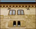
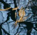
Three of Gem's in the Familyby GPComment: I think the photo is too reliant on the picture to hold it into the challenge rule of "Take your best photo representing one of these signs".
I can see what it does represent but it needs the title to explain it. There is nothing wrong at all with thinking out of the ordinary but the picture should still stand alone.
As the window are on such a perfect line - it is a shame that the two iron flat - washers are asymetrical compared to the windows.
If the picture is cropped to the point of the top of the trhee glass pains - that distraction goes and the picture still retains its point.
|
| Photographer found comment helpful. |
| 01/31/2004 05:59:57 PM |
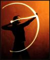
Setting A Heart On Fire by ndsComment: A nice original representation of the archer. It is a shame the subject is stood quite so close to the background - The 2 marks on the bacground are a little distracting.
|
| Photographer found comment helpful. |
| 01/31/2004 01:49:23 PM |
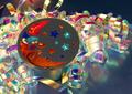
Celebrate the Planets and Moonby TommyMoe21Comment: Good picture - Very beautiful reflections and it looks almost as real as if you are there.
I personally love reflections from gold, silver and stainless steel.
I am concerned about the challenge guidelines though which were "Take your best photo representing one of these signs" and I believe no amount of thought can any of the zodiac signs be found here.
As I have always had to previously judge with strict guidelines I am torn how much lattitude I should give,
To be fair - I think I have to go for the middleground in this case.
I know I am not the only person having problems with challenge guidelines - there is quite a thread running on it.
David
|
| Photographer found comment helpful. |
| 01/31/2004 01:44:26 PM |
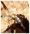
Cancerby sulamkComment: This is going to sound very hard and critical but I hope that you will see my point.
First I recognise this was a hard shot to take - small dark subject - bright background - very harsh sunlight - heavy shadows - angular background - rounded subject and a subject that was either moving or likely to shoot off at any time....Everything was working against you and it would have need a lot of thought to pull it off. What you have ended up with is just a picture of a crab.
If you are on holiday and that is all you wanted then it is fine and pictures like this are great memories but for a competition like this you needed to take some risks.
Some of this will depend how much control you have on your camera - so you may not be able to some of these things. Location may prevent others.
1: Change of viewpoint - get where the crab is facing you - and as close as you can or if thats not possible just shoot half a dozen blind shots - where you have to guess whats in the viewfinder/screen but it looks about right.
2: get down and to the side - with a crabs sideways movement it would appear he was coming towards you and be menacing.
3: Go for the silhouette there may be enough crab out of the shadow for this to have worked.
4: try and get some extra light into the shadow. Almost anything light would have reflected some of that very bright sun into the heavy shadow and lifted the crab out of the blackness.
I always have half a dozen white tissues in my pocket. They can often be used as reflectors if either someone is with you or over the flash to diffuse light when a straight flash would be too hard.
David
|
| Photographer found comment helpful. |
| 01/31/2004 01:31:45 PM |
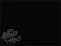
Cancer Charmby ShannonComment: Yep - Excellent composition - The best use of negative space I have seen used for a long time. I am wondering if a highlight on the top end of the claw would have worked. I have put one on in photoshop to see and I think it does - without detracting from all the low-key.
It may be possible to have done it "in-camera" though not easily
David
|
| Photographer found comment helpful. |
| 01/31/2004 01:22:55 PM |
Abstract on water (Aquarius)by mannjuditComment: Very nice use of water as a medium to create beautful reflections and shapes. As a person who has always had to judge very strictly on whether a picture fits a category or not I feel that this has had o rely too heavily on the title to pull it into the category definition.
Other people, I know, are happy to allow the title to be used as part of the judging method.
When sorting through hundreds of prints to judge in a conventional competition, in the majority of cases the title is secondary and in the 2 or three seconds that the first elimination stage often takes (per picture) I think this would have been rejected.
I still like the picture though, it is technically fine and interesting to look at. There are pictures within the picture hence a 6
David
|
| Photographer found comment helpful. |
| 01/31/2004 01:16:58 PM |
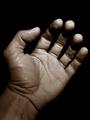
Aries - Friendship and Loyaltyby kuarkComment: Nicely toned picture - but I feel the hands seem to be "awkward". I can't get a grip on Aries, and the connection between frienship and loyalty and the hand. It seems the title is is too reliant on putting meaning into the picture and the picture alone would suggest no link.
The negative space seems a little too dominant - particularly the area between the thumb and finger plus the very dark area underneath the fingertips seems to have seperated the fingertips just that bit too much. They seem to be floating independantly of the fingers. The very dark area then seems to be totally at odds with the fingertips which appear to have burned right out.
David |
| Photographer found comment helpful. |
| 01/31/2004 08:50:34 AM |
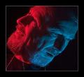
Geminiby rhipsterComment: Nice cropping - I like the apparent dominance of one and submissiveness of the other.
It's a shame that on the second part of the illumination the head was not put a little farther away - to give the head a bit more "thickness" did that make sense!
I also think the blue "face" seems a littlehigher on the "head" than the red one-
The only real problem I have with this is the 3 chains - it gives away what it is. When I did a similar picture some years ago - we taped a piece of chain from the neck to the chest - first on the left then on the right for the second exposure. It then looked like one loop of chain.
We were working with film and double exposure - so it was easire to do it that way.
No of course you would do that in software - but the tape and single chain means
a: you are definately within the editing rules
b: it leaves a better pic than editing
David
|
| Photographer found comment helpful. |
Home -
Challenges -
Community -
League -
Photos -
Cameras -
Lenses -
Learn -
Prints! -
Help -
Terms of Use -
Privacy -
Top ^
DPChallenge, and website content and design, Copyright © 2001-2024 Challenging Technologies, LLC.
All digital photo copyrights belong to the photographers and may not be used without permission.
Current Server Time: 04/19/2024 09:41:29 PM EDT.