| Image |
Comment |
| 11/16/2004 11:53:24 AM |
Something sweet, anyone?by docpjvComment: Nicely composed. I would have lost the bottom part of the image and upped the contrast a little. Their is a definate "flatness".
The highlights along the bottom edge detract fom the highlights on the fruit itself.
Still nice though |
 Photographer found comment helpful. Photographer found comment helpful. |
| 11/16/2004 11:46:07 AM |
Circuitry Cityby JCDeanComment: Good histogram spread from pure black through to pure ehite.
One thing I think would have improved the balance would be to have cropped top and bottom. That would have chopped out the small white wedges top left - bottom right |
| Photographer found comment helpful. |
| 11/16/2004 07:03:52 AM |
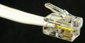
Phoneless Cordby whatdewucComment: A brilliant example of where the title and the picture are one.
I earlier grumblued at one entry re their titling explaining how their title competed with their picture. This though is brilliant. It would make a great poster with the text as part of that. |
| Photographer found comment helpful. |
| 11/16/2004 06:58:19 AM |
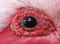
I can see you baby!by StagoleeComment: This may seem a hard crit of a potentially great picture.
- spoiled by the reflection. It looks like the photographer at a window (I assume thats what it is). The title only seems to explain away an accidental image caught in the eye.
If you can imagine this hung on a wall as it is and then hung on a wall with black eye plus a catchlight I think you would see what I mean.
It may be that it was impossible to get the shot without the reflection, in which case - well done.
If I was still judging it would have to go in the "nearly pile" which is a great shame. Of course to hang it on a wall would be easy after some simple PS editing (I know you can't for this challenge" so I will mark it as I would have done without the reflection.
|
| Photographer found comment helpful. |
| 11/16/2004 06:49:59 AM |
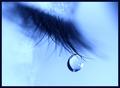
Tear Drop Blues by kosmikkreeperComment: What can I say. If I was still judging for publications this would certainly go "next round".
A shame about the dark area "top right" fantastic DOF and stunning catchlight. I am ignoring the crazing top centre dribbling down which I suspect looks softer in the original and put down to compression.
Love it |
| Photographer found comment helpful. |
| 11/16/2004 06:35:37 AM |
After the Fireby hyperfocalComment: As each picture comes on the screen I force my first thought to be "would I want it to hang on my wall" second thought "Would I use it commercially" third thought "would I pay money to have a print" fourth "is it technically correct" (the fourth does not matter if 1,2 and 3 are met)
This makes a yes in all 4.
Excellent. |
| Photographer found comment helpful. |
| 11/16/2004 06:28:55 AM |
Yummmby BigZenDragonComment: Nearly a brilliant ad shot and one I would certainly have put in the "next round" pile but to be used commercially it would need a much longer depth of field. It may be that you not have the equipment to achieve that, in which case exellent on what you did achieve.
A picture that I would have framed if it was reshot exactly as it is but with different lighting, DOF |
| Photographer found comment helpful. |
| 11/16/2004 05:44:34 AM |
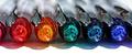
Spectrumby annasenseComment: Great - rich colours - the hi-lights, reflections are all perfectly aligned - lovely detail on the inside top of the pens.
From a photographic point of view it is excellent - exposure spot on. Depth of field just right - point of focus, exact.
For a competition I would definately put in on the list.
As a picture on my wall I cannot say it would get space but that is not the point here. I will definately be looking at some of your other work. |
| Photographer found comment helpful. |
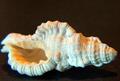
| 11/16/2004 05:30:27 AM |
Seashellby kennytComment: Some of the delicacy of the shell is lost in the highlight - and as it is a static object it could have more DOF in the picture. Either the light directly above it was deliberatly placed or it was shot using available light. It has lots of potential.
If it was shot on a compact with little manual control over lighting then you have done well to emulate this type of still life. If you have a more versatile camera then it needed a little more care setting up and possibly, if you have bracketed exposures, one of the other may look slightly better. Good composition - nice cropping |
| Photographer found comment helpful. |
| 11/16/2004 05:21:37 AM |
Kodak 66 Model IIby coldaComment: Deep solid blacks with pure whites and a surprising spread on the tonal range considering almost everything is black. I find the splodge of light in the top right a little distracting and it competes with the aperture marking highlight behind the focus ring. This would make a good product shot with composition as it is but with dark deadspace at the top of the picture - but for this challenge the composition is spot on |
| Photographer found comment helpful. |
Home -
Challenges -
Community -
League -
Photos -
Cameras -
Lenses -
Learn -
Prints! -
Help -
Terms of Use -
Privacy -
Top ^
DPChallenge, and website content and design, Copyright © 2001-2024 Challenging Technologies, LLC.
All digital photo copyrights belong to the photographers and may not be used without permission.
Current Server Time: 04/23/2024 05:38:26 PM EDT.