| Image |
Comment |
| 11/16/2004 05:34:52 AM |
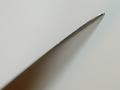
Getting the Pointby d95vetteComment: An excellent demonstration of what depth of field is but picture falls a little flat. As a picture for a book on DOF then yes it is good but as a "decorative/artistic" work it was not quite the. My immediate thought when I saw it was "sharp vs unsharp" and so maybe if this had been a picture of a very sharp blade it would have had the punch to lift it. |
| 11/16/2004 05:30:27 AM |
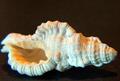
Seashellby kennytComment: Some of the delicacy of the shell is lost in the highlight - and as it is a static object it could have more DOF in the picture. Either the light directly above it was deliberatly placed or it was shot using available light. It has lots of potential.
If it was shot on a compact with little manual control over lighting then you have done well to emulate this type of still life. If you have a more versatile camera then it needed a little more care setting up and possibly, if you have bracketed exposures, one of the other may look slightly better. Good composition - nice cropping |
 Photographer found comment helpful. Photographer found comment helpful. |
| 11/16/2004 05:21:37 AM |
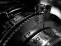
Kodak 66 Model IIby coldaComment: Deep solid blacks with pure whites and a surprising spread on the tonal range considering almost everything is black. I find the splodge of light in the top right a little distracting and it competes with the aperture marking highlight behind the focus ring. This would make a good product shot with composition as it is but with dark deadspace at the top of the picture - but for this challenge the composition is spot on |
| Photographer found comment helpful. |
| 11/16/2004 05:15:00 AM |
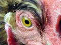
henby br1mcComment: So horrible (scary) its brilliant - It proves what a new angle on something ordinary can do - I would like to see this at the same eye level - It would then probably look as if it was going to come right out of the screen AT the viewer |
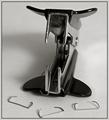
| 11/16/2004 05:12:19 AM |
JAWSby gaurawaComment: Striking picture the second it appeared on the screen. it immediatly looked like a mecahanical insect/bug Brilliant. It was a shame put the staples did look a little "posed". I use a three screen setup - all profiled - and tried looking at it side by side with a few adjustments to pulling the histogram around - to give it more punch |
| Photographer found comment helpful. |
| 10/26/2004 11:21:02 AM |
Implied Linesby stupidcatComment: Very erotic without being at all exhibitionist. Cannot be exactly sure which part of the body it is (not 100%)
Lovely variations of tones in the transverse lines compared to the hard black nertical. Not the type of picture that would normally grab me but this is spectacular. |
| Photographer found comment helpful. |
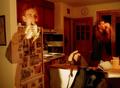
| 10/26/2004 09:43:57 AM |
The Trendy and Chic... Engineering Majorby yeouaComment: At last - one with imagination. I had a bellyful of pencils and apples. Great commercial potential - the only problem is the slight burn-out bottom right and it would be nice to not see the shadow of the left forearm.
When I was selecting pictures for publication I would have this on the possible/probable pile |
| Photographer found comment helpful. |
| 10/26/2004 09:22:24 AM |
The 30 second morning dashby peeteComment: I really can't make my mind up.
I see what you are getting at. The rushing in the morning - drinking - eating etc.
The only problem is the light colour.
Warm colours like this give the impression of slowness and calm and that contradicts (I think) the principle of what you are trying to get across.
I have changed the colour balance in photoshop - to give it a daylight shift and also a flourescent shift and it seems to give it that sense of urgency.
Was your camera set up for auto-white balance?
|
| Photographer found comment helpful. |
| 10/26/2004 09:17:01 AM |
Libraryby ssenguptaComment: I love the colours - the POV and the slight disorder of the chair and 1 book in the otherwise perfectly ordered library. It lacks only one thing (which may show in the original hi-res pic) and that is the exact point of focus. The logical point would be the chair but it seems slightly fuzzy. I found my eyes going up and down the image looking for the precise point. |
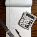
| 10/26/2004 09:13:03 AM |
Math Homeworkby dclarkeComment: My first thoughts were that it looked like a good product shot and had commercial potential - but the triple shadow particularly visible on the calculator spoils it. A soft diffused light top left to get rid of all but the main shadow would make a huge difference. I removed the shadow in PS and it does let the eye concentrate on the other components.
I would like to see an original print. I think that as this would be good commercially - I would think !what is the important part" For me the "texas instruments" text. It seems slightly out of focus and I would get that part pin sharp. |
| Photographer found comment helpful. |
Home -
Challenges -
Community -
League -
Photos -
Cameras -
Lenses -
Learn -
Prints! -
Help -
Terms of Use -
Privacy -
Top ^
DPChallenge, and website content and design, Copyright © 2001-2024 Challenging Technologies, LLC.
All digital photo copyrights belong to the photographers and may not be used without permission.
Current Server Time: 04/25/2024 02:49:52 PM EDT.