|
|
| Image |
Comment |
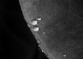
| 07/18/2011 06:28:34 AM | Silver Drops--SEP2by pixelpigComment: It’s a bit silvery in places, but the dullish grey of the leaf is a bit over powering. Though it’s a bit lunar-esque in its shade, so adds a spacey subtext (droplets are little satellites?) which you may or may not have been going for. A bit more deviation in tone might bring it out a bit. The water droplets are naturally the focus, but are too small in detail / too few in number to really impact overall – I also can’t decide if the very narrow depth of field is of benefit or not. I’m erring yes, but really being a bit closer in would have been more effective.
My First Weighted Scoring System ™; composition + technical 1/3, challenge* 1/1, post processing results 1/2, ooooh factor 1/3, originality 0.25/1 = 4.25 – rounded to 4 (* I don’t think it’s possible to not meet the challenge on this one) |  Photographer found comment helpful. Photographer found comment helpful. |
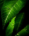
| 07/18/2011 06:10:44 AM | DPC Tutorial - "Move the Light" by idnicby colorcarnivalComment: It’s an elegant but not very striking image. The luminousness of the greens are very appealing, almost fantastical-like and I very much like the effective but restrained burning around the frame that let’s your subject stick out from the screen a bit (unless it’s as taken, then kudos for top lighting). Possibly a bit heavy on the contrast though? The water droplets are a little clichĂ©d, but do add a bit of interest. Composition is a tad cluttered, maybe. It’s an image I think would be better served on a large sheet of glossy paper, rather than suiting the pixel limitations on a screen.
My First Weighted Scoring System ™; composition + technical 2/3, challenge* 1/1, post processing results 1/2, ooooh factor 2/3, originality 0.25/1 = 6.25 – rounded to 6 (* I don’t think it’s possible to not meet the challenge on this one) | | Photographer found comment helpful. |
| 06/22/2007 02:19:22 PM | Watching The Clouds Roll Byby jasonlpriceComment: i can't decide if the apparently missing centre petal bugs me or pleases me. it's an obvious flaw, but then it adds a natural feel to the overall thing. the colours and level of precise detail is amazing, and very pleasing to the eye, especially the very rich blue, yellows and greens. the border is a tad naff, to be honest, and i'm not sure if mr bee really adds to the overall shot. and also te composition is a little bit too much in the corner or maybe the flower head is a little bit too big; either one by the tiniest margin, but still enough to slightly unsettle the overall karma. still very lovely though.
My First Weighted Scoring System ™; composition + technical 2.5/3, challenge 1/1, post processing results 2/2, ooooh factor 3/3, originality 0.50/1 = 9 | | Photographer found comment helpful. |
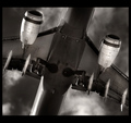
| 06/22/2007 06:39:41 AM | The Underbelly of The Whaleby hotpastaComment: fantastic lighting and level of detail. the sky is also suitably dramatic, and serves to bring out the plane in a more BAM kind of way. some of the whites feel a tad blown, but other than that, it's technically great. i love the crop, and angle of the subject. not sure the underside actually qualifies as a backside, so might have to dock you a little bit there. also, the slightly odd border doesn't seem quite committed enough to that widescreen look, but it's a minor complaint. love it muchly still.
My First Weighted Scoring System ™; composition + technical 3/3, challenge 0.75/1, post processing results 1.75/2, ooooh factor 3/3, originality 1/1 = 9.50 (rounded to 10) | | Photographer found comment helpful. |
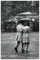
| 06/22/2007 06:13:14 AM | The Shared Umbrella by MelethiaComment: oh i like this; very french nouvelle vague! not sure about the weird brolly, but the trench coats and style is otherwise faultless. if this turns out to be a candid, then my level of deeply impressedness will quadruple, for it feels a very slick and perfected staging. the setting works well (stuff there, but none of it distracting or out of place - the balloons actually contrast with the mood in brilliant subtlety). technically it's excellent, and some of the best grey tones i've seen for a while. a beautiful image - either exceptionally lucky or gloriuosly talented, or a bit of both ;)
My First Weighted Scoring System ™; composition + technical 3/3, challenge 1/1, post processing results 2/2, ooooh factor 3/3, originality 1/1 = 10 | | Photographer found comment helpful. |
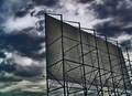
| 06/22/2007 06:00:44 AM | At the Drive-Inby okiesisiComment: i like the idea behind this - good concept! faintly disappointed that this isn't cinematic or quite widescreen enough in feel; drive in theatre's are so dramatic in their own right that a bit of board on scaffold doesn't quite convey - just doesn't have the traditional placement of this kind of thing. the sky is nicely scorched, as is the satuation and what-not, though a little overdone to my tastes. i like it though.
My First Weighted Scoring System ™; composition + technical 1.5/3, challenge 1/1, post processing results 1/2, ooooh factor 1.5/3, originality 1/1 = 6 | | Photographer found comment helpful. |
| 06/20/2007 04:36:42 AM | Cat and rabbit sleepingby TalinanComment: ok. by now, you are possibly fed up with the blurry, out of focus and possibly doesn't meet the challenge comments. this looks like a possible camera-phone shot, or could be the result of too low an ISO number on your camera. if you can, take it up to ISO 400 or so for an indoor shot. quality will drop a bit, but because it needs less light the shutter will be open for less time and will be helluva lot sharper. the shot also suffers from too much clutter (that chair on the right doesn't add anything to the scene) and being so obscured, the cat is not obviously a cat. and, erm, the rabbit looks awake to me.
My First Weighted Scoring System ™; composition + technical 0/3, challenge 0/1, post processing results 0/2, ooooh factor 1/3, originality 0.5/1 = 1.50 (rounded to 2) | | Photographer found comment helpful. |
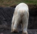
| 06/20/2007 04:31:20 AM | "Bear"ing it all!by JamDComment: nice big polar bear arse! it's cute, and fit's the challenge, but i'm not sure it particularly qualifies as art! technically, it could be improved a bit: the background is hugely uninspiringly dull (looks like a quarry!), and the over-exposed areas of fur is a tad distracting (this could be lessened a bit by nudging the left pointer of the bottom bar under levels). composition lacks something too. in terms of character though, it works really well; the ponderous ploddy nature of the animal is conveyed effectively, and has that candid kind of feel...
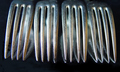
Interesting take on the challenge, though isn't initially obvious. I think the setting up lets the shot down a little bit; the reflective surface at the bottom is kind of unreal looking, giving a portion of the shot a negative exposure type of look. And the positions of the forks appears a tad too random for a still life; one wonders if a more uniformed line or even a more fanned out approach might have been more effective.
The horizontal could do with some adjusting, thereby evening out the area of black at the bottom and not cropping off the top left fork so much. To be honest, the application of a chunky black border might have had the same effect.
My First Weighted Scoring System ™; composition + technical 1/3, challenge 1/1, post processing results 0.50/2, ooooh factor 1.5/3, originality 0.75/1 = 4.75 (rounded to 5) | | Photographer found comment helpful. |
| 06/20/2007 04:14:15 AM | Sixteen Tinesby pixelpigComment: Interesting take on the challenge, though isn't initially obvious. I think the setting up lets the shot down a little bit; the reflective surface at the bottom is kind of unreal looking, giving a portion of the shot a negative exposure type of look. And the positions of the forks appears a tad too random for a still life; one wonders if a more uniformed line or even a more fanned out approach might have been more effective.
The horizontal could do with some adjusting, thereby evening out the area of black at the bottom and not cropping off the top left fork so much. To be honest, the application of a chunky black border might have had the same effect.
My First Weighted Scoring System ™; composition + technical 1/3, challenge 0.50/1, post processing results 0.50/2, ooooh factor 1/3, originality 0.50/1 = 3.50 (rounded to 4) | | Photographer found comment helpful. |
| 06/20/2007 03:49:11 AM | Petal Supportby chesireComment: the colours in this are gorgeous, lovely and bold and very pleasing. the crop works brilliantly well, and i love the level of detail on the green areas. only slight reservations is that i wish the blue was a tad bluer, and the yellow petals were a bit more perfect looking (i.e. without the flecks of dirt and so on - unnatural but more fitting i'd have thought). i do like the luminescense of the petals though - a really nice touch.
My First Weighted Scoring System ™; composition + technical 3/3, challenge 1/1, post processing results 1/2, ooooh factor 2.5/3, originality 0.5/1 = 8 | | Photographer found comment helpful. |
Home -
Challenges -
Community -
League -
Photos -
Cameras -
Lenses -
Learn -
Prints! -
Help -
Terms of Use -
Privacy -
Top ^
DPChallenge, and website content and design, Copyright © 2001-2024 Challenging Technologies, LLC.
All digital photo copyrights belong to the photographers and may not be used without permission.
Current Server Time: 04/19/2024 03:41:57 AM EDT.
|