|
|
| Image |
Comment |
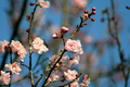
| 09/08/2006 08:55:08 AM | Pastel Pinks and Blues of Springby Shy ClickerComment: already voted on this - gave it 9. this is so pretty, and by far the best flower picture in terms of colour, composition and style. only slight criticism is that i would have liked to have the flowers in the middle of the left half to be less blurry (they in some no mans land between sharp and soft), but that aside, it's really great. this is the sort of thing you could sell to Ikea. the blue is so bright and strong, and really complements the pinks and greenybrowns. very lovely. |  Photographer found comment helpful. Photographer found comment helpful. |
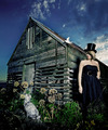
| 09/08/2006 08:50:12 AM | Threeby hjaltiComment: okay, as much as i truly love this image, i really don't get a sense of pastelness in this at all. okay, the girls skin tone is a bit pale, but really, that's incidental. so it doesn't fit the challenge.
i wish it did though, 'coz i'd have tenned this no question. i love the david lynch weirdness about this (though it needs a dwarf!); trying to figure out the narrative here is an intriguing bitch! there's a lot to take in here, but it is so rewarding. i love the building. the cat looking at the bird and the girl looking at the cat is fantastically entertaining, so heirarchical... and can i say: strapless dress and top hat? GENIUS! technically it's great; the composition is certainly unconventional but it is successful, the colours are rich (too rich - should be pastelly), the building has a texture you can see... probably my favourite picture of the year. it'll be unfair to give a 10, so 8. okay, 9. | | Photographer found comment helpful. |
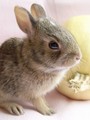
| 09/08/2006 08:36:31 AM | Sensory Pinksby joycobbComment: my goodness, SO cutely adorable! bunny! this is a really cute photograph, and it certainly fits the challenge. there are a few composition issues i have, particularly with the cropping off of the bunny bottom. it also feels too close, and you've seemed to have lost the opportunity of really conveying his tiny size - being in a human hand, or something similar (tea pots are always good) might have been more effective than a similar sized fruit. his ears and back could also do with being a tad sharper, and i can see you in his eye which is a minor distraction. still adorably cute though, and because of the cuteness (and great choice of subject) it bashes my criticism and gropes my heart. 7. aww! bunny! | | Photographer found comment helpful. |
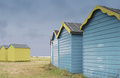
| 09/08/2006 08:25:00 AM | Beach Hut 79by KHoltComment: it's funny, but the title very much invokes such a hippie, time specific feeling. i know it was the year of punk, but still... i did think of beach huts as a possible subject, but couldn't really find any that would fit in sense of colour or be photognic enough. this does the first and is the second. i like the contrast between the blue and yellow and yellow and blue groups of huts a lot, though it does have the affect of unbalancing the composition a bit (to me it feels more natural cropping everything left of the space just left of centre). the skies are effective, as is the lack of people. really like this image very much. 8. | | Photographer found comment helpful. |
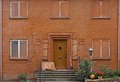
| 09/07/2006 07:16:40 AM | Vestre Strandallé 100by visaksenComment: i gave this a 6. as a choice of subject, i like it; it's obviously structurally knackered, and the amount of delapidation gives the house both a sense of age, and a sense of a sad, unloved history. i also like the pleasing use of symmetry, and how it is bordered by the drain pipes on either side. what tones down it's WOW! is the bland colour of the brickwork that seems to infiltrate everything, including the windows and window frames. changing to b&w and really maxing the contrast might have enhanced the grunginess appeal somewhat. i'd also like to see how a close-up photograph of the number 100 with the house as a softer background might look... | | Photographer found comment helpful. |
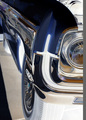
| 09/07/2006 05:59:03 AM | quiet growlby IndigoButterflyComment: i scored this a 6. there are elements of this that are truly visually striking; the elements of chrome, the headlight, the flash of white in the front wing and the body work along the side all work exceptionally well to the negative treatment. what doesn't work quite as well is are the tyres and inside face of the wheel arch. other things that let you down a bit can only be described as clumsy composition flaws; the bonnet being lifted, the dark triangle in the bottom left corner and the line of grey along the right side all look rather regretable and is likely to hurt your final score. | | Photographer found comment helpful. |
| 09/06/2006 10:47:25 AM | Sunday Morningby aznymComment: i love the composition of this, and the style (specifically the specs themselves, the b&w tones, and the clearly defined shade and light) is really visually striking. i just wish the whole image was smoooother. grain i like, but here there seems to be a high level of left over artefacts from possibly too much sharpening. just left wanting for more, really - so it's really good, but not great. 6. | | Photographer found comment helpful. |
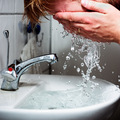
| 09/06/2006 10:39:09 AM | Fresh start (selfportrait)by garlicComment: gave this a nine. it's not perfect; the skin looks a bit red, it might be a bit over exposed, hands and some of face isn't quite sharp enough (compared to the tap), the crop feels a tad tight and the background kind of draws attention away from the action. however, as far as self-portraits go, this is incredibly original and creative, the water looks fantastic (especially love the sense of motion in the basin), the chrome fittings don't show the camera. it's also very, well, not self deprecating exactly, but not an ego trip either, which some SPs have a tendancy to be. it's an openly honest SP, which is weird given you're hiding your face. i like the concept of this a lot and i hope it does well. | | Photographer found comment helpful. |
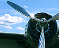
| 09/06/2006 10:22:29 AM | Old Birdby audinutComment: it's really hard to bond with this photograph. the level of over-sharpening, the unattractively grainy noise and the halo effect around everything really puts you off a bit. it's a pity as i would imagine that without the sharpening (if it's blurry, make it more so as a style statment!) the chrome props would be probably be super smooth and lovely (especially with the glare spot from the sun). there is also a lack of context; it's like just photographing a nose in a portrait. i want to know what sort of plane it is, what sort of character it has, how it might have lived, how old is it really, is it civil or military?? it's impossible to tell anything about this from this sort of crop, and i don't think it's arty enough to be considered abstract. sorry.
edit just to add the thumbnail actually looked gorgeously slick, shiny and smooth - if you managed to maintain the appearance of the thumbnail, i think the composition issues i had would be less of an issue because overall this would have been more appealing and more successful. Message edited by author 2006-09-08 04:49:40. |
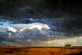
| 09/06/2006 09:37:29 AM | Desolationby angela_packardComment: gave this one a 10. though the effect of the filter initially turned me off, i warmed quite quickly to how it actually really suits the shot. i love the wild west big epic cinematic scale of this picture, the location and size of the building somehow enhancing the remoteness of the shot. the colours are rich and bold, and the feel of the water colour type style gives it a really authentic old look. lovely. | | Photographer found comment helpful. |
Home -
Challenges -
Community -
League -
Photos -
Cameras -
Lenses -
Learn -
Prints! -
Help -
Terms of Use -
Privacy -
Top ^
DPChallenge, and website content and design, Copyright © 2001-2024 Challenging Technologies, LLC.
All digital photo copyrights belong to the photographers and may not be used without permission.
Current Server Time: 04/24/2024 12:27:25 AM EDT.
|