|
|
| Image |
Comment |
| 09/13/2006 03:18:30 AM | Alone I Standby hokieComment: i do like this. the narrow tall crop is quite striking, though for this sort of scale and media, i don't think it can be nearly as effective as a poster sized print in a white walled gallery. bits i really like is the out of focus foreground (looks really cool, actually), the composition of the main subject (dead centre, and on a little hillock, very photogenic!), the blueish tones of the greyscale and how convincingly the still, chilly atmosphere has been conveyed. things i'm not particularly keen on is the excessive amount of white sky (could have lost at least half of it, i feel) and the diffused glow effects round the edge of the tree (either natural or PP, it still takes away some of the defined edges of the branches). overall though, very likeable.
My New Scoring System �; composition + technical 2.5/3, challenge 1/1, post processing results 1/2, ooooh factor 3/3, originality 0.5/1 = 8 |
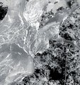
| 09/13/2006 03:07:32 AM | In Outby NiteseadComment: slightly disorientated as it took me a moment to realise it's taken looking up, not down. using the negative trick made the dizziness moreso. i actually quite like the abstract nature of this, and strikes me as something quite creative. the only thing that lessens the abtract feel is that pesky leaf up the top, which looks far too conventional and normal. but i love how the rest of the leaves form a nicely random patterned background to the trunk. visually quite lovely.
new scoring system�; composition + technical 2/3, challenge 1/1, post processing results 1.5/2, ooooh factor 2.5/3, originality 1/1 = 8 |  Photographer found comment helpful. Photographer found comment helpful. |
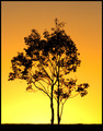
| 09/13/2006 02:56:29 AM | Sunset Twinsby kingsleyComment: D'oh! if you hadn't titled it "twins" i probably wouldn't have noticed that it didn't meet the challenge! the silhouette against the yellow is nice, though the blacks turn orange on some of the branches, which kind of lessens the very asain block wall paper type stamp vibe i got with it. also , the sky at the top of the shot turns a rather unsightly shade of grey, but i guess there was little you could do with that. it's a pretty shot, i like the centred composition, and i like the delicate nature of the tree... just doesn't set my pants alight.
my new system of scoring: composition + technical 2/3, challenge 0.5/1, post processing results 1/2, ooooh factor 1/4 = 4.5 (well, 5) | | Photographer found comment helpful. |
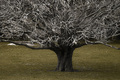
| 09/13/2006 02:49:14 AM | Wickedby LozzaComment: i love the tree itself, i think it's wonderful tolkien-esque with all the spindly branches and the super stumpy trunk. i also really like how the tree is solidly branching out beyond the frame, filling out the top corners so well.
however, i don't think that the selective desat does your photo any favours whatsoever; the b&w tree works, but the odd and unattractive mustardy green grass at the bottom just makes it look weird, and not in a particularly funky stylistic way. if you editted the greens to be less satuated and lighter so more white and pale, i think the shot would feel more balanced and dynamic. composition + technical 2/3, challenge 1/1, post processing results 1/2, ooooh factor 2/4 = 6 | | Photographer found comment helpful. |
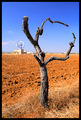
| 09/11/2006 04:59:49 AM | Once was a treeby h2Comment: personally, something like "give me a 'P'!" seems like a more obvious title. the tree here is so human-esque; i love how it really has bodiness and personality. i'm also glad you avoided the temptation to have the wind thing in the background inside the arms of the tree - good composition decision there. other aspect i like is the red soil; very photogenic and almost martian; gives the whole thing an otherworldly kind of look. very nice indeed - 8. | | Photographer found comment helpful. |
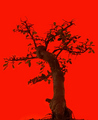
| 09/11/2006 04:34:27 AM | "Autumn's the mellow time." (William Allingham)by obsidianComment: i think this would have been a bit more effective if it was a really solid silhouette; i think the red background would have set that off really well, and a posh wallpaper company might have used it as a print. as it is, it's still rather striking; the red is really lovely and bold. very likeable; 7. | | Photographer found comment helpful. |
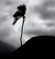
| 09/11/2006 02:33:53 AM | Enduranceby BalkoComment: stunning composition and visually gorgeous. the very well chosen title really expresses the solitude of the tree muchly. the silhouette and greyscale works great, and really, this tree was a super find for the challenge. can't imagine how it could be even minutely improved or made more awe inspiringly likeable, so 10. | | Photographer found comment helpful. |
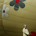
| 09/08/2006 11:03:40 AM | Yellow Jacketby RebeccaComment: this is immensly likeable in most respects, but does suffer a wee bit due to a bit of over processing (either too much noise reduction, or too much over sharpehing, or probably both). it has the unfortunate effect that the girl looks like a very flat cardboard cut out stuck in front of whatever the background is. compositionwise it's great; the negative space is really effective and visually pleasing and intriguing. the posture, expression and character of the girl is really cool and has a sense of candid realness which feels natural. the background is really funky and fun, complements the girls jacket and hair really well. as a whole, this image works asthetically well, and has a great sense of scale. i'd say it half meets the challenge; the jacket seems merely incidentally pastel, and the background is too mustard to really count. overall, i give it 7. | | Photographer found comment helpful. |
| 09/08/2006 09:17:50 AM | Curious...by taterbugComment: i completely got this! and it's much better a submission than a ten a penny sunset. free study entries shouldn't be conventional, shouldn't be something done countless times before, and this was as far as i saw completely unique. so kudos for knowingly not chasing votes! | | Photographer found comment helpful. |
| 09/08/2006 09:04:12 AM | Autumn Breezeby steinarComment: this is really nice. i love the point of view, the lowness of the camera. the angle works terrifically. it has such an intimate, peaceful and gentle feeling. the lighting (all natural?) is fantastic. the landscape looks rugged but inviting... the only pastels i really see is the cardigan, and i'm not sure that it actually qualifies as meeting the challenge in the fullest sense. But it is there so i'll let it pass. a really lovely dynamic shot. 9. | | Photographer found comment helpful. |
Home -
Challenges -
Community -
League -
Photos -
Cameras -
Lenses -
Learn -
Prints! -
Help -
Terms of Use -
Privacy -
Top ^
DPChallenge, and website content and design, Copyright © 2001-2024 Challenging Technologies, LLC.
All digital photo copyrights belong to the photographers and may not be used without permission.
Current Server Time: 04/19/2024 02:52:43 PM EDT.
|