|
|
| Image |
Comment |
| 03/13/2007 07:25:48 AM | Symphony of Balconies by GuGiComment: lovely example of lovely architectural photography. i love the tones of the blues against the black rings, and the very clean design of soffits of each flight. this was certainly a feature designed to impress, and you've certainly done it justice. only very slight grumble is that triangle of white in the bottom corner, but that's just looking for flaws and isn't that noticeable really. no; it's top stuff!
My First Weighted Scoring System ™; composition + technical 3/3, challenge 1/1, post processing results 1.5/2, ooooh factor 3/3, originality 0.5/1 = 9 |  Photographer found comment helpful. Photographer found comment helpful. |
| 03/13/2007 06:39:32 AM | Too much sugarby Gaby_GComment: stuck in two minds about this. there is much i love; the pose, the whole concept, the gorgeous redness of the dress against the greys, the very striking playful colours of the lolly. what i'm not too keen on is the heavy nature of the dodging and burning - the contrast between light and dark round the sweet (i.e. that white halo) gives the appearance of being a bit too processed for me. also, personal taste, i think it might be more effective a step or two further back with the subject filling a bit less of the frame... but it's still immensely likeable, and is certainly a creative take on the challenge.
My First Weighted Scoring System ™; composition + technical 2.5/3, challenge 1/1, post processing results 1.5/2, ooooh factor 3/3, originality 1/1 = 9 | | Photographer found comment helpful. |
| 03/13/2007 05:18:35 AM | Chef's Portholeby RompyComment: what lifts this into something really interesting is the fact that the doors are slightly open. it gives a sense of usage and busy-ness, like it's currently swinging back shut. i also like the metallic sheen to the doors, though certain patches look a little washed out colour-wise. I love the use of blur and a shallow DoF as much as the next visually impaired guy; i think it's use can be deeply effective. Here, the out of focus background works artistically, but in context doesn't seem very useful - it's only from your title we know this is a restuarant.
My First Weighted Scoring System ™; composition + technical 1.5/3, challenge 1/1, post processing results 1/2, ooooh factor 1.5/3, originality 0.75/1 = 5.75 (rounded to 6) | | Photographer found comment helpful. |
| 03/13/2007 04:41:53 AM | The Hands That Never Stopby idnicComment: one can't help that it might have been better placed in the time challenge. i think it's a wonderfully surreal and a dali-esque image that demonstrates that you have a great eye for composition and colour and also you have talent when it comes to using natural light. though, i think the contrast is a tad too contrasty, with the blacks being very black. i love the time piece itself, rich in character and is visually interesting. not 100% sure about this being right for something about circles, though obviously the face is round.
My First Weighted Scoring System ™; composition + technical 2/3, challenge 0.25/1, post processing results 1.5/2, ooooh factor 2/3, originality 0.75/1 = 6.5 (rounded to 7) | | Photographer found comment helpful. |
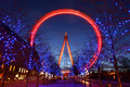
| 03/12/2007 05:15:14 PM | eye in motionby dainmcgowanComment: expertly taken - i've stood in the same spot and never got remotely close to such a great picture from there. you've done a real goodun of a job; the tree lights are joyful and sharp, and the red against the setting sky just looks divine. great motion blur / long exposure without overdoing the light... stunning image.
my first weighted scoring system™; composition + technical 3/3, challenge 1/1, post processing results 2/2, ooooh factor 3/3, originality 0.5/1 = 9.5 (upped to 10) | | Photographer found comment helpful. |
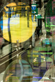
| 03/12/2007 05:07:18 PM | Somewhere between Cherry and Madnessby jaysonmcComment: goodness! a bizarre and absorbing composition! i like this quite a lot, and is quite rewarding. seems slightly too chaotic to truly fit the challenge (to me anyway, any challenge with emphasis on a geometric shape kind of suggests strong clarity of lines). but i do love it as art.
my first weighted scoring system™; composition + technical 3/3, challenge 0.5/1, post processing results 1.5/2, ooooh factor 2.5/3, originality 1/1 = 8.5 (rounded to 9) | | Photographer found comment helpful. |
| 03/12/2007 05:03:38 PM | whooowhby rinacComment: i love this very much. it could, methinks, do with being made just a tad brighter, and possibly the weeist bit more saturation to bring out the nice variety of colours and boost that summery feel, but that aside it's pretty much perfect. the use of blur is fantastically executed, the moment of capture interesting, natural and involving, and is basically a great image. it's odd, the more i look the more melancholy one feels, which is good given the fun naure normally associated with such activities. super.
my first weighted scoring system™; composition + technical 3/3, challenge 1/1, post processing results 1.75/2, ooooh factor 3/3, originality 1/1 = 9.75 (okay, 10). | | Photographer found comment helpful. |
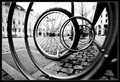
| 03/12/2007 04:57:22 PM | Trappedby tkjaerComment: i like the creativeness of this, and how it so nicely fit the challenge. very well spotted. the way in which our eyes are guided through the nearest circles to the wheel in question is super. other little aspects (the low POV, the great use of perspective, the roads largely free of traffic and pedestrians, the mix of cobbles and the grille) all come together to make a great city scene. and the B&W seems like a good choice as well. nice one!
my first weighted scoring system™; composition + technical 2/3, challenge 1/1, post processing results 1.5/2, ooooh factor 2/3, originality 1/1 = 7.5 (rounded to 8) | | Photographer found comment helpful. |
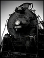
| 03/12/2007 04:52:30 PM | 2913by fordmanf1Comment: i like the black and white tones very much, gives the train a deep sense of oiliness and grease that is somehow fitting. i can see it fits the challenge, though i think the angle of the train, and the crop makes it all sit a bit uncomfortably. the sky seems a bit odd; probably result on unfavouraly dull weather conditions, but it might be worth aplpying the burn on mid tones and highlights to make it feel a little less graded. the engine itself is nice and has character.
my first weighted scoring system™; composition + technical 1/3, challenge 1/1, post processing results 1/2, ooooh factor 1.5/3, originality .5/1 = 5 | | Photographer found comment helpful. |
| 03/12/2007 04:42:09 PM | Copper Chandelierby bigfellaComment: gorgeous - a lovely appealing shot. i love the deep reds, the maner in which the light fitting is illuminating itself. the symmetry is really nice too. great subject choice and very nicely taken.
my first weighted scoring system™; composition + technical 3/3, challenge 1/1, post processing results 2/2, ooooh factor 3/3, originality 1/1 = 10 | | Photographer found comment helpful. |
Home -
Challenges -
Community -
League -
Photos -
Cameras -
Lenses -
Learn -
Prints! -
Help -
Terms of Use -
Privacy -
Top ^
DPChallenge, and website content and design, Copyright © 2001-2024 Challenging Technologies, LLC.
All digital photo copyrights belong to the photographers and may not be used without permission.
Current Server Time: 04/17/2024 10:09:01 PM EDT.
|