| Image |
Comment |
| 03/29/2020 08:14:28 AM |
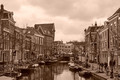
Before the lockdown by JanjaComment: This is 1-a for me and like everything else would have gotten no better than a 5 in a free study. From a composition perspective it's best in the field, I'm just not a huge fan of the processing. I suspect the sky was dull so it didn't pop as a color shot, but I think I might have rather seen it that way. I see the rows of bikes and wonder about the interplay of the colors. I want to know how the buildings differed, what color the boat cover is. I want to explore it more but this treatment doesn't allow it. I read "Before the lockdown" and I want to think of things being bright and cheery. This is more "After the lockdown" in processing.
And there's just too much sky here that just isn't interesting but it's bright enough to keep pulling my eye to it which makes everything else appear darker. I find that if I scroll up to the point where I eliminate almost all roofs I get a far more interesting panorama feel that doesn't suffer as much from the sepia treatment and likely would have really worked as a color shot.
Definitely the best capture of the bunch by a long shot. You just didn't find the photograph in it for me. |
 Photographer found comment helpful. Photographer found comment helpful. |
| 03/29/2020 08:14:11 AM |
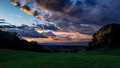
Last Light, Monday by C_Steve_GComment: So this would have been my reluctant 1-b. But it still would have gotten a 5 from me in any other challenge. The good news is that I get what you're trying to show me - it's a lovely sky. But the processing is very heavy handed and way over-saturated. I could live with it in the sky if you'd pulled back the greens. I'd also like to see some of the details in the shadowed areas, both near and distant.
Making a picture has two primary steps - taking the photo and printing it. You took a decent photo, so now you need to work on how you print it. You need to dive deeper into the digital darkroom. The sky is the star here but you did nothing to highlight the supporting players (other than the grass which is essentially a extra here that would be better ignored). Isolate the darker areas and show us what's there, if only a little. Let us see how that little bit of valley rolls out underneath. Learn to use a subtle hand to show the viewer something instead of burying it in shadow and color. Every part of the frame is important even if it's only to barely be there. Give it the attention it needs. Let us look at the little things as the sky draws our eyes back to it. As is, my eye keeps going down to the mass of green. |
| Photographer found comment helpful. |
| 03/29/2020 07:47:19 AM |
Library_pond_entryby hkpdsoComment: So I see a nice little pond with still water and lily pads, and I ask, "Is that all you're trying to show me?" You're shooting into the sun but that type of lighting serves no purpose here - like I'm not getting a ray shooting through the tree or anything so I'm left wondering why you shot from this angle except to get out of the sun. What you're showing us is a blown out sky with what appears to be a road or a parking lot in the distance. I'd throw a 5 at this and move on quickly.
As I've said in other comments when I see a shot like this I'm left wondering what it is you're trying to show us and why do you want us to see it?
Not knowing where you are or what's around you I can at least see that there's something to the right that's catching light from the sun, so why not move to the left around the pond and catch its reflection in the water, or the reflection of the library instead of the empty sky and a couple trees?
A photograph should catch and keep your eye, and there's nothing here that does. It's as if this simply fulfilled a need ("I have to take a shot for the challenge. Oh, this pond is pretty.), but it's not showing us anything. And that's the goal isn't it? Sure, every one of us has stumbled into a breathtaking scene where all we have to do is press the shutter and you're done, but the rest of the time you have the camera in your hand your job is to make a picture!! There's one there but it's hiding and your choice is do you care enough to spend the time finding it? You have the camera in your hand, so it would be a shame not to. |
| Photographer found comment helpful. |
| 03/28/2020 09:51:28 AM |
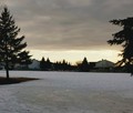
Desolate Timesby Polar7Comment: First question is "Why turn it sideways?"
Because the world is sideways? If so, show me something that's impacted by the shift in gravity. Give me a visual clue that something is 'wrong' or otherwise impacted by the sideways world.
The image is stark and otherwise empty, but if you're going to show me 'desolate' then I want an image that shows me a wide expanse of nothingness and not a narrow view turned sideways. Also I find the cutting off of the shadow of the bench in particular makes it appear as if there's something less desolate there than you're showing me so you had to crop in.
It's not a bad idea but it needs a compositional anchor that seals the deal and lets me know that it's not a title that anchors a snapshot but a photograph with purpose. 5 for me. |
| 03/28/2020 09:41:16 AM |
Social Distancing is easy when the world around you is bleak and unforgivingby RyanWComment: The title seems to justify the photo rather than support it.
What I mean by that is when I read the title I understand what it is you're trying to show me, but as I look at the photo I am forced to ask why it is that you chose this as your way of expressing it? Is it 'bleak'? Kind of. Is it 'unforgiving'? Not so much, because home is just over there - even if it's someone else's home. If you want to make this about social distancing then show me a person I wouldn't want to be close to. Show me the comfort of your spot in the world surrounded by things I wouldn't want to leave that spot for and not the other way around.
From there, as a photograph, because I can't justify the content with the title I look at the processing and say it just doesn't work. You tried to put on a "bleak and unforgiving" look and it just created something that lacks details and or any compositional element that brings my eye to anything other than the strip of sky between the (crooked) horizon and the clouds. 5 or possibly a 4 for me depending on the challenge theme. |
| Photographer found comment helpful. |
| 03/28/2020 09:30:42 AM |
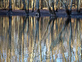
Swamp Land by WildpurpleComment: This would get a 5 from me because it forces me to ask the question "What are they trying to show me and why do they want me to see it?"
There are certainly some interesting elements here, particularly in the way the ripples interact with the reflection, and I get that this is what you're trying to capture. But there's no "And then what?" Others may have said this but this would work much better rotated 180 degrees, giving the "trees" an abstract, painterly quality. As is the lines of the trees lead your eye up to the dark and incomplete shoreline where I have to wonder if I'm missing something in the woods?
Otherwise be careful with the interplay of dark and light areas. The shoreline is too dark and high contrast. Let me see some of the details in the darker areas as textures add interest.
There was definitely something here you could have done something with. It just falls flat for me as is. |
| Photographer found comment helpful. |
| 03/21/2020 09:02:08 AM |
|
| 03/18/2020 09:23:21 AM |
|
| Photographer found comment helpful. |
| 03/18/2020 09:19:45 AM |
Point Sublime Sunsetby johnfrComment: Really wonderful vista but everything is just tonally compressed that it loses all depth. I'm guessing the source here is a JPEG? Too bad, it could have been spectacular. |
| 03/18/2020 09:16:58 AM |
|
| Photographer found comment helpful. |
Home -
Challenges -
Community -
League -
Photos -
Cameras -
Lenses -
Learn -
Prints! -
Help -
Terms of Use -
Privacy -
Top ^
DPChallenge, and website content and design, Copyright © 2001-2024 Challenging Technologies, LLC.
All digital photo copyrights belong to the photographers and may not be used without permission.
Current Server Time: 04/24/2024 08:42:21 PM EDT.