DPChallenge: A Digital Photography Contest You are not logged in. (log in or register
 
Browse Settings
Currently viewing:
Registered UserMrOlafsson

Show comments:

Per page:

Order:

Comments:


Comments Received by MrOlafsson
Pages:  
Showing 1 - 10 of ~18
Image Comment
What are we playing, Sam?
06/02/2005 11:12:07 PM
What are we playing, Sam?
by MrOlafsson

Comment by bananashay:
Colors are pretty washed out, better lighting or increased saturation would help. Also, it's shot a little close to your subjects; I'd like to see the bottom of the electric and possibly more of the hand/arm.
Photographer found comment helpful.
What are we playing, Sam?
06/02/2005 06:54:32 AM
What are we playing, Sam?
by MrOlafsson

Comment by Beagleboy:
Colours seem a bit washed out on this one. Playing with curves or contrast could have helped this image to pop a bit more. Vertical lines in background are also a bit distracting.
Photographer found comment helpful.
What are we playing, Sam?
06/02/2005 01:43:18 AM
What are we playing, Sam?
by MrOlafsson

Comment by dockode:
I don't feel that the image conveys instantly recognizable decision. Good pic, good try.
Photographer found comment helpful.
What are we playing, Sam?
06/01/2005 01:39:43 AM
What are we playing, Sam?
by MrOlafsson

Comment by Montereykiddo:
I'd like to see the guitars about to be played....perhaps being held by the musicians....your relying soley on the title here.....bah!
Photographer found comment helpful.
Is there anyone there?
10/19/2004 04:08:08 PM
Is there anyone there?
by MrOlafsson

Comment by smitea:
excellent tones and comp!
Photographer found comment helpful.
Is there anyone there?
10/14/2004 07:31:14 AM
Is there anyone there?
by MrOlafsson

Comment by MikeO:
A good effort which would have benifited from a touch more contrast. I like the way you have only included part of the child's face.

Photographer found comment helpful.
Is there anyone there?
10/13/2004 01:03:47 PM
Is there anyone there?
by MrOlafsson

Comment by alien2thisworld:
I like this composition
Photographer found comment helpful.
Woe be to him that reads but one book
01/20/2004 11:42:33 AM
Woe be to him that reads but one book
by MrOlafsson

Comment by Harz_Joerg:
Greetings from the Critique Club

Initial thoughts/My opinion
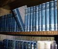
Great resolution, nice looking books, too sad that a flash was used.

Content/Composition
The books themselves look nice due to their colour and nice texture. Taking just one out of the row is also a good choice. Showing a hand taking the books out might have actually been even better.
One compositional element that is important to such an image is to keep the image clean, i.e. showing only the things that are necessary and avoid anything else that does not belong there. In this image it's the lower row of books that is unnecessary. If it is cropped away the image gets much clearer, the book shelve serves way better as leading line and the more rectangular image looks much better.
In principle similar arguments can be used for the shelve itself: the wood disturbs a little too, especially at the very right. However, this could be better addressed using different light.

Camera work -technically
A major issue is the light: an important rule for indoor still-life photography is to avoid direct flashlight: it's simply too harsh, gives bad reflections that cannot be controlled by you and also strong shadows. Taking a simple desk lamp and moving it around the subject to see when the light and shadows look best is not only fun, but makes the whole atmosphere. Of course for doing so, a tripod or another good support for the camera is needed. Focus is set to the book that is taken out and that’s just right.

Digital Processing - Technical
The image could have been sharpened a bit. A well fitting border might be good here too.

Fits the challenge
Yes, very well, the intention gets through even without the title.

Good luck for your upcoming submissions
Photographer found comment helpful.
Woe be to him that reads but one book
01/13/2004 09:25:11 PM
Woe be to him that reads but one book
by MrOlafsson

Comment by tfaust:
Your lighting is a bit harsh where the flash hits on the right side. You might try a different crop, removing the second row of books.
Photographer found comment helpful.
Woe be to him that reads but one book
01/13/2004 06:54:13 AM
Woe be to him that reads but one book
by MrOlafsson

Comment by cvt_:
I've been woe'd lol :)
Nice photo, the shadows seem a bit distracting, and the books glare seems a bit harsh.
good luck!
Photographer found comment helpful.
Pages:  
Showing 1 - 10 of ~18


Home - Challenges - Community - League - Photos - Cameras - Lenses - Learn - Prints! - Help - Terms of Use - Privacy - Top ^
DPChallenge, and website content and design, Copyright © 2001-2024 Challenging Technologies, LLC.
All digital photo copyrights belong to the photographers and may not be used without permission.
Current Server Time: 04/24/2024 01:29:01 AM EDT.