| Image |
Comment |
| 01/14/2004 03:11:37 PM |
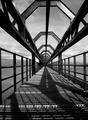
Geometry by kuarkComment: This would have had more impact if the picture was taken whilst you were more centred on the bridge. |
 Photographer found comment helpful. Photographer found comment helpful. |
| 01/08/2004 05:54:48 PM |
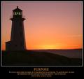
PURPOSE - It is not so much where we stand, as in what direction we are moving...by BeagleboyComment: Critique Club Comment
I must say to start that this is a stunning image. The colours are magnificent and you have still managed to capture detail in the lighthouse and the rocks in the foreground rather then end up with a silhouette against the sunlit sky.
The square(ish) format suits the picture along with the white frame around it and the verse and picture go well together. I only have one problem - the horizon really spoils what could be a perfect picture. Given the December rule set and assuming the picture couldn't be taken again, a quick minor adjustment in PS could have done the trick...
 |
| Photographer found comment helpful. |
| 01/06/2004 05:04:46 PM |
Burning Edgeby alexvoloComment: Critique Club Comment
I like this one, I actually created a similar type picture (without temperature gauge) recently for a local club competition but I must say this one is better than mine!
I love the colour of the gas flames licking up the side and the movement in the needle of the gauge.
To be really critical, the small marks on the burner under the flame are distracting and although rules say you can't edit them out, it may have been better if the background was more out of focus so they weren't as noticable. Maybe you tried this, I don't know. Also, the temperature gauge, in my opinion may have looked better if it you could see the whole of the dial as opposed to the bottom of it being cropped out.
Overall, a very good photo which is very effective and you should be commended for it. Well done.
Please feel free to PM me if you have any queries.
Thanks. |
| Photographer found comment helpful. |
| 01/01/2004 10:50:25 AM |
|
| Photographer found comment helpful. |
Home -
Challenges -
Community -
League -
Photos -
Cameras -
Lenses -
Learn -
Prints! -
Help -
Terms of Use -
Privacy -
Top ^
DPChallenge, and website content and design, Copyright © 2001-2024 Challenging Technologies, LLC.
All digital photo copyrights belong to the photographers and may not be used without permission.
Current Server Time: 04/24/2024 12:05:02 PM EDT.