| Image |
Comment |
| 01/29/2004 10:29:32 PM |
roosterby sacrumastraComment by train: This looks more like a drawing fits the cahallenge but not too good focus or image |
 Photographer found comment helpful. Photographer found comment helpful. |
| 01/29/2004 05:28:19 PM |
|
| Photographer found comment helpful. |
| 01/27/2004 03:44:16 PM |
|
| Photographer found comment helpful. |
| 01/27/2004 03:23:09 PM |
|
| Photographer found comment helpful. |
| 01/26/2004 11:01:55 AM |
roosterby sacrumastraComment by nephrotic: The vivid colours are great but there is something that does not work at all for me. I think that as this could very definately be considered "art" rather than a photograph I think it is going to be either an "I love it" or I hate it. I find the texture of the background disturbing. If it had been solid black I think that would help (for me). HOWEVER - The picture has intrigued me enough for me to want to look at more of your pictures - and so in that case it has worked! Apologies for the lower mark on this one but I am glad I want to look at more of your work |
| Photographer found comment helpful. |
| 01/26/2004 02:03:34 AM |
|
| Photographer found comment helpful. |
| 01/26/2004 12:00:59 AM |
roosterby sacrumastraComment by jenesis: Seems just a little too grainy and a bit washed out. I think if the colors were more vibrant and the focus not so soft this would've been a little better. Good subject though. |
| Photographer found comment helpful. |
| 01/25/2004 10:29:58 AM |
|
| Photographer found comment helpful. |
| 01/25/2004 12:54:27 AM |
|
| Photographer found comment helpful. |
| 01/15/2004 11:37:24 PM |
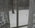
Checking the Weatherby sacrumastraComment by HBunch: Unfortunately, the bar from the window is dividing the photo directly down the middle. I think this could have had more visual power had the bar been on a 3rd. Usually, I don't try to push the "rule of thirds" but I do think it could have worked in this shot. Also, while DOF is important, I think that it distracts a little here by making the left curtain oof and the right curtain sharp focus. I like the point of view, and the shot has emotion. Weather it be that you are looking out and glad your inside *which is my feeling* or looking out wishing you were out there. Something to keep an eye on would be your background. If there is a strong horizontal line, try to keep it horizontal. I realize what you did here was to keep the strong vertical line vertical, which is also good, but your tree kind of looks like it's going to slide off the left side of the world. :) Very good idea for the challenge. Good luck. ~Heather~ |
| Photographer found comment helpful. |
Home -
Challenges -
Community -
League -
Photos -
Cameras -
Lenses -
Learn -
Prints! -
Help -
Terms of Use -
Privacy -
Top ^
DPChallenge, and website content and design, Copyright © 2001-2024 Challenging Technologies, LLC.
All digital photo copyrights belong to the photographers and may not be used without permission.
Current Server Time: 04/19/2024 07:26:18 PM EDT.