| Image |
Comment |
| 06/29/2005 08:07:36 AM |
The Old Windmillby GoldBerryComment by Falc: I think that because the people are in foreground and in focus these are the main subjects. The out of focus windmill blends into the background. Therefore, I don't believe this meets the challenge exception.
Nice enough image though |
 Photographer found comment helpful. Photographer found comment helpful. |
| 06/27/2005 01:55:31 PM |
Wall of lightby GoldBerryComment by Gil P: I just discovered this image, GREAT shot.
very artsy and somewhat provocative, love it.
Technically very powerful use of light and miraculous use of the blinds...with no "zebra effect".
constructive comment: the only thing that "bugs" me is the shadow of the hair...perhaps some cloning out to make the hair seem more "in place". |
| Photographer found comment helpful. |
| 06/21/2005 08:54:01 AM |
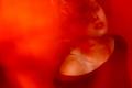
And in the dark she dancedby GoldBerryComment by Artifacts: Unique coloring, action pose and good use of the rule of thirds. Different interpretation of the challenge topic. Overall photographic quality is good.
Your presentation very interesting. The use of blur to convey the sense of action by your model is a very interesting idea that wil work for some viewers but not for others. |
| Photographer found comment helpful. |
| 06/19/2005 01:00:22 AM |
|
| Photographer found comment helpful. |
| 06/16/2005 07:49:57 PM |
|
| Photographer found comment helpful. |
| 06/16/2005 07:15:36 PM |
And in the dark she dancedby GoldBerryComment by LucidLotus: I think I just lost the huge comment I left about your image by making it a favorite! Boo! Alright here we go again. I'm not seeing a connection to darkness other than the title, so I'm not sure what aspect you're trying to portray. Perhaps she's a dream girl? So someone you see dancing while you're asleep? That's the best I can come up with, but its likely not the interpretation you were looking for. That said, I really enjoy this image. It has a wonderful sultry look to it, which the use of the red and the model's expression helps boost. My one suggestion would be to crop a bit off the left side. While I think the red there does make for some interesting negative space, it just seems a bit too much, a bit too unbalanced. Perhaps cropping right where that dark triangle at the bottom left begins to form.. that way you still have an expanse of red but it isn't quite as much or as overpowering. So all in all I'm giving a 7, but I would've given a point higher if I was able to understand your darkness connection from what I was seeing. Still, very well done, thank you! |
| Photographer found comment helpful. |
| 06/16/2005 06:24:10 AM |
|
| Photographer found comment helpful. |
| 03/11/2005 07:50:27 PM |
|
| Photographer found comment helpful. |
| 03/11/2005 07:49:49 PM |
|
| Photographer found comment helpful. |
| 03/08/2005 10:12:08 AM |
|
| Photographer found comment helpful. |
Home -
Challenges -
Community -
League -
Photos -
Cameras -
Lenses -
Learn -
Prints! -
Help -
Terms of Use -
Privacy -
Top ^
DPChallenge, and website content and design, Copyright © 2001-2024 Challenging Technologies, LLC.
All digital photo copyrights belong to the photographers and may not be used without permission.
Current Server Time: 04/24/2024 03:44:20 AM EDT.