| Image |
Comment |
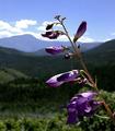
| 07/05/2004 08:26:30 AM |
In the Rockiesby vtruanComment: Image looks ever so slightly oversharpened as the bokeh in your background seem to have hard edges instead of being soft and blurry. Nice composition and leading lines. |
 Photographer found comment helpful. Photographer found comment helpful. |
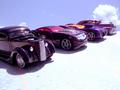
| 07/05/2004 08:25:23 AM |
My Dream Collectionby timganierComment: Bottom right of the foreground is overexposed but adds strong contrast to the dark cars. Perhaps diffusing the light would've given softer highlights. Nice DOF but I would've liked to see the closest car (far left) in focus. Car 2nd from left seems to be the focus of your picture, regardless of the cars surrounding it. |
| Photographer found comment helpful. |
| 07/05/2004 08:22:22 AM |
Hallucinosisby duncesComment: Image appears noisy/grainy and I'm not sure if it adds or detracts to the effect. My eyes are immediatel drawn to the blurry highlights on the model's chest, specifically the large blob, 2nd from the left. I feel as if it takes the attention away from the model's face or eyes, even if they are in focus. |
| 07/05/2004 08:19:57 AM |
Purple is soooooo smooooooooothby PioneerComment: Certainly fits the challenge. I myself contemplated on photographing the same subject but opted not to.
Focus of your image feels a little soft. Background is also distracting and the slanted angle of the box is not effective as the image is too tightly cropped. |
| Photographer found comment helpful. |
| 07/05/2004 08:17:26 AM |
Purple Ballby AlexysComment: I notice some purple fringing but I suppose that's acceptable for this challenge ;)
Would've liked to see a bit wider angle and not so tightly cropped so the viewer could get some perspective or sense of proportion or scale of the image. |
| Photographer found comment helpful. |
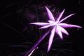
| 07/05/2004 08:15:33 AM |
Sky Flowerby karmatComment: Seems a tad overexposed and oversharpened although that could be the effect of resizing. |
| Photographer found comment helpful. |
| 07/05/2004 08:14:14 AM |
shades of itby jjbeguinComment: Strong contrast and interesting use of negative space. I'm wondering how processed this image is as the reddish areas seem grainy and blown out. |
| Photographer found comment helpful. |
| 07/05/2004 08:12:24 AM |
Purple Fusionby C-town driverComment: Nice idea but the image is cropped a little too tightly, especially on the left side. I'm also wondering why the purple bottle has bits of green in it? Personally, I would've gotten lower in the shot and gave it more perspective, rather than shooting overhead but that could be personal preference. |
| Photographer found comment helpful. |
| 07/05/2004 08:09:58 AM |
Define Purpleby NeuferlandComment: This certainly suggests or depicts purple! Any reason the composition is not centered and slightly to the left? Also, I'm not sure if I like the layout of the bottom 2 swatches (single color cards). Would have been nice to have a consistent pattern. |
| Photographer found comment helpful. |
| 07/02/2004 06:36:16 AM |
Hibiscus Girlby Bran-O-RamaComment: Thanks, I thought this would've done MUCH better than your average flower pic. I suppose people were turned off by the brightness of the flowers and the bluish tone I added to cool off the pic since the flowers appeared "on fire."
Still, I don't know why people insisted that the statue was the focus of my photo when it is desaturated. Yes, it is in focus of the lens but I had clearly wanted it to become part of the background as well, drawing the focal point to the flowers. A balance of nature and man-made, delicate and metallic, yin and yang. I guess I got too artsy. Message edited by author 2004-07-02 06:36:50. |
Home -
Challenges -
Community -
League -
Photos -
Cameras -
Lenses -
Learn -
Prints! -
Help -
Terms of Use -
Privacy -
Top ^
DPChallenge, and website content and design, Copyright © 2001-2024 Challenging Technologies, LLC.
All digital photo copyrights belong to the photographers and may not be used without permission.
Current Server Time: 04/24/2024 05:56:02 PM EDT.