| Image |
Comment |
| 09/12/2005 08:41:17 AM |
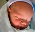
Day 1 Portraitby okiesisiComment: Don't care much for the crosshatching filter that seems to have been applied. |
 Photographer found comment helpful. Photographer found comment helpful. |
| 09/12/2005 08:40:16 AM |
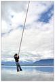
Aerial Equilibriumby SimonjwComment: Cool shot, very fun.. but I don't have a sense of portraiture with this photo, other than the orientation of the camera when this was taken. |
| Photographer found comment helpful. |
| 09/12/2005 08:37:42 AM |
|
| Photographer found comment helpful. |
| 09/12/2005 08:35:26 AM |
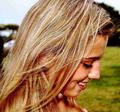
Secret textingby kama0529Comment: This image is so noisy, it hurts my ears. The compression artifacting is unattractive as well. You may optimize your filesize up to 150kb, try to preserve the quality and integrity of the original photo. |
| 09/12/2005 08:33:26 AM |
Salvadoreñaby hopelessoptimistComment: I sense no reason for this image to be cropped to a square. Especially after centering the composition. Too much negative space on the sides. |
| Photographer found comment helpful. |
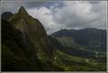
| 05/04/2005 03:48:31 AM |
Pali_Koolau_3994.jpgby KekiinaniComment: Wow... great minds must think alike! You commented on my sunset pic taken in Kaimuki.. then I happen to find this pic in your portfolio which is amazingly similar to the one I've taken.
 |
| Photographer found comment helpful. |
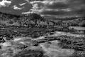
| 03/14/2005 05:08:20 AM |
Homage to Anselby Bran-O-RamaComment: Thanks for the feedback, everyone. The dark line where the mountains meet the sky was the effect of the feathered edge of the brush hitting the mountains while burning the sky. Perhaps I should've backed off a bit or dodged them back to a middle tone. I suppose it put many people off.
I also was tempted to boost the contrast on this image but most of the Ansel photos I studied were similar to this, having a majority of middle tones, a few highlights, and most of the gradation of tones in the sky or clouds.
I spent about 4 or 5 hours dodging and burning, making sure I kept detail in almost all of the shadowed areas. I made an 8x12 print of this image and it looks amazing! 100x's better than this websized version. It also appears to have more tonal range and contrast compared to the monitor as well. |
| 02/17/2005 05:00:01 PM |
Hungerby Bran-O-RamaComment: Originally posted by gloda:
Originally posted by gloda:
This looks and feels like a typical jjbeguin shot. |
Oops...sorry ;) |
With 21 ribbons to his name, no offense taken! |
| 02/16/2005 03:23:04 AM |
|
| 02/16/2005 03:22:28 AM |
Outcast by L1Comment: Congrats, Laurie! You still continue to inspire :) |
| Photographer found comment helpful. |
Home -
Challenges -
Community -
League -
Photos -
Cameras -
Lenses -
Learn -
Prints! -
Help -
Terms of Use -
Privacy -
Top ^
DPChallenge, and website content and design, Copyright © 2001-2024 Challenging Technologies, LLC.
All digital photo copyrights belong to the photographers and may not be used without permission.
Current Server Time: 04/25/2024 10:23:47 AM EDT.