|
|
| Image |
Comment |
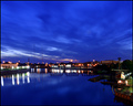
| 07/09/2006 04:16:01 PM | Sixty one secondsby timfythetooComment: At first I saw this and was like "woah....awesome" but after a few seconds it lost some of the wow factor - the background houses seem pretty soft, and lights a tad washed out (so you lose the nice starbursts a bit). THe exposure seems perfect on the santa maria and the right hand side, but not so great in the b/g.
The colours, however, are lovely and rich, but I think there needs to be more of a focal point to the composition. The sky seems to lead you down to the middle of the buildings, but theres nothing there to see. |  Photographer found comment helpful. Photographer found comment helpful. |
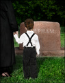
| 07/09/2006 04:04:10 PM | One year later - "Why is daddy still gone?"by timfythetooComment: I really like the atmosphere this conjures up, especially in the context of the challenge title.
I don't like the centredness of the boy, especially as it isn't exactly centred, but certainly not far enough from the centre to be on a third.
The watch is a subtle addition - I don't know whether I personally would be observant enough to notice straightaway, but thats not to mean it doesn't (even subconciously) add to the composition/atmosphere.
I also find the partial name distracting - I don't know whether it would be better with the full name, or a more common name like "Smith" | | Photographer found comment helpful. |
| 07/09/2006 03:26:51 PM | 4th of July can't come fast enough ($350)by timfythetooComment: Really sorry for how late these critiques are...
I like the composition, with the nicely busy fireworks and the simple head centred horizontally. However, I'd prefer more black empty space around the face, which gets lost.
Other than this, I do like the picture - it's not your best but it has a nice quirkiness to it and very well suited to the challenge. | | Photographer found comment helpful. |
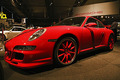
| 07/08/2006 06:43:44 PM | Porche 911by DanSigComment: Sorry to be late on comments
This is a very clean, professional looking shot, and fits the challenge fine. I like the alignment of th word Porsche in the b/g, and the wide angle used. What bugs me, however, is the red on the wheels - I'm assuming they're only that colour from reflections..?
It does seem a touch oversharpened, as others have pointed out.
I think its a very good photo, say, for a magazine (though maybe with a slightly less busy b/g), but I can't imagine it doing much higer than a 5.5 here, just because it doesn't have so much life to it | | Photographer found comment helpful. |
| 07/08/2006 06:30:44 PM | Cat on Glassby MelethiaComment: A flower and a cat on consecutive entries! :-o How unlike you! hehe
Not bad for a having-a-laugh entry, and certainly a good idea. I have to admit I don't like the distracting elements of the composition, although I expect some are needed to give context to the cat. I don't mind the blown highlights immediately, but after a couple of minutes the chest is a little overpowering :P
I do, however, really like the high-key effect on the face (especially with subtly coloured eyes, but because of the composition this doesn't leap out at you.
I admire your courage for entering a cat photo! j/k, but I do genuinely respect the attitude of not worrying about scores all the time. Reading through the during-challenge comments, it seems as though it certainly went down well. Heck, I'm chuffed if I get favourites on the best of my entries lol. Keep having fun, I say (but don't stop the awesome studies I love so much!) | | Photographer found comment helpful. |
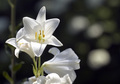
| 07/08/2006 06:19:40 PM | Lilyby MelethiaComment: Again, apologies for the delay
I like how you have the one flower peering right out at you; this seems to give it some "character". The composition works well with the flowers on the left hand side, and the supporting bokeh on the right, Also, the bokeh matches well with the positioning of the 3 main flowers, and the just-visible background stem echos the stem of the main lilies.
I guess there are SO many flower shots around that it doesn't jump out at you, and I don't really think it would have scored much beyond 5.5 even though it is compositionally etc very good - it just doesnt have enough of the punch/originality/whatever that flowers need to do well here (especially alongside >400 entries!)
more typos!Message edited by author 2006-07-08 18:20:15. | | Photographer found comment helpful. |
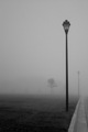
| 07/08/2006 06:04:13 PM | Fog, lightsby MelethiaComment: Hey, sorry this is so late I've got SO behind with critiques.
I have mixed feelings about this one. It really meets the challenge well, but as an image I'm in two minds about it. I do like the sense of desolation that is definitely achieved, but there seems to be just a bit too much flat gray. Maybe a slight cool tone would have avoided this, and/or slight burning to vignette the b/g a little.
I think the composition does work well, but I think I personally would have tried a perspective looking down the street with the lights on the left, fading away (if the surroundings allowed it of course). Its just that the perspective on the streetlights seems to lead out of the frame rather than into it.
typosMessage edited by author 2006-07-08 18:04:42. | | Photographer found comment helpful. |
| 07/05/2006 01:34:42 PM | Morning sun and shadows.by timfythetooComment: I absolutely love the gentleness of this photo; the colours and subtle shades are divine.
If anything I might crop a touch tighter on the right, because for one thing the darkness on the left just fades away, and secondly because the rays of light would be travelling across the whole frame more.
The border fits well, and all in all is a lovely shot | | Photographer found comment helpful. |
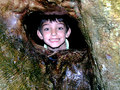
| 07/05/2006 01:27:37 PM | Stuckby KelliComment: I love the composition here and his expression, but the lighting is very harsh. I'd also prefer a little more DOF so that the texture on the treehouse was in focus throughout.
Another suggestion might be to have had his hands visible on the ledge, to give a more "trapped" feel rather than "peeking through" Message edited by author 2006-07-05 13:28:48. | | Photographer found comment helpful. |
| 07/05/2006 01:13:25 PM | Mickey to the Rescueby nards656Comment: Reading through what you've said, it seems as though you have achieved what you set out to do very well.
The colours and the watery reflections give create the "going into a fire" atmosphere, and the composition seems very balanced. However, if I had seen this in the challenge I doubt I would have voted it high, as I don't really "get it" without the explanation. | | Photographer found comment helpful. |
Home -
Challenges -
Community -
League -
Photos -
Cameras -
Lenses -
Learn -
Prints! -
Help -
Terms of Use -
Privacy -
Top ^
DPChallenge, and website content and design, Copyright © 2001-2024 Challenging Technologies, LLC.
All digital photo copyrights belong to the photographers and may not be used without permission.
Current Server Time: 04/19/2024 04:03:27 PM EDT.
|