| Image |
Comment |
| 09/05/2005 02:32:38 PM |
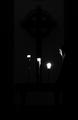
Dawn Lightby DufusComment: beautiful photo, but i feel, as others have suggested, that a square crop might possibly be stronger? (cropping off top) |
 Photographer found comment helpful. Photographer found comment helpful. |
| 06/21/2005 11:28:32 AM |
|
| Photographer found comment helpful. |
| 06/21/2005 11:21:50 AM |
|
| 06/21/2005 11:20:04 AM |
|
| 06/21/2005 11:17:31 AM |
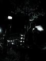
Dark nigth at seaby cleversonComment: i still can't decide if i like this...
the composition's good, nice colours, but the top + bottom seem detached, they don't fit together right.
The movement of the boat's annoying (but necessary, i know...). Maybe you could try this again but combining different exposures. |
| Photographer found comment helpful. |
| 06/21/2005 11:13:57 AM |
Passing Throughby shutterphunkComment: i like the negative space, but the colour of the border is a bit off. I think the border does draw the picture together, but it should be lighter perhaps.
8 |
| Photographer found comment helpful. |
| 06/21/2005 11:10:51 AM |
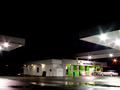
Oasis in the nightby suemackComment: nice composition, but it seems like there's been some camera shake which spoils it. also, what are the blue/red dots on the midright?? |
| Photographer found comment helpful. |
| 06/21/2005 11:09:12 AM |
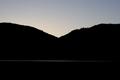
Sunriseby norcalsnoeComment: i'm not sure what i like about this...it just works. the use of thirds clearly helps.
The only thing i don't like so much is how the light on the sea on the left doesnt fade out like that on the right. |
| 06/15/2005 07:49:08 AM |
no light without darknessby ammarComment: i wanna see slightly more space on the top, less on the bottom, but the centred compostition works well except for this.
technically ok...doesnt have any wow
|
| Photographer found comment helpful. |
| 06/15/2005 07:47:25 AM |
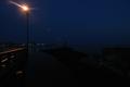
Day Markers at Nightby theSajComment: crop's a bit TOO tight on the left, and i can't make it out completely. I think a slightly longer exposure would have worked better, to bring out the difference between the road light and background darkness.
5 |
Home -
Challenges -
Community -
League -
Photos -
Cameras -
Lenses -
Learn -
Prints! -
Help -
Terms of Use -
Privacy -
Top ^
DPChallenge, and website content and design, Copyright © 2001-2024 Challenging Technologies, LLC.
All digital photo copyrights belong to the photographers and may not be used without permission.
Current Server Time: 04/23/2024 02:55:19 AM EDT.