|
|
| Image |
Comment |
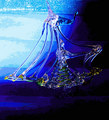
| 07/09/2006 06:35:32 PM | Sailing towards calmer waterby KelliComment: Hmmm...I have to say that this one doesn't really do anything for me. At first I thought you suffered badly from JPEG compression, but I see that you used posterize so that effect was intentional. I'm personally not keen on posterize, but thats just me, I don't tend to like shots that look too heavily processed.
One thing that would really have helped would be if the boat was more obviously a boat - even with the title I'm struggling to figure it out. Also, the composition is very centralized, which makes it much more static |  Photographer found comment helpful. Photographer found comment helpful. |
| 07/09/2006 06:23:14 PM | Growing Wildby KelliComment: This is a beautiful shot, and should have done better I think. The only problem is that the bokeh seems rather arbitrary (and scarce), rather than an integral part that enhances the photo.
However, outside of the challenge topic, I love the colours and the focus/DOF is perfect. Whilst the crop is quite tight, this works quite well I believe.
I agree with others that in order to meet the challenge more you needed a wider pov to include more bokeh. | | Photographer found comment helpful. |
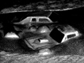
| 07/09/2006 06:19:06 PM | End of the worldby KelliComment: I think this could work really well with the challenge, but looks a bit like a kid's toy, just made out of one piece of plastic, and in this way may have worked better if you made the set yourself.
I think it needed a little more sharpness, and perhaps a slight wider angle - not sure tbh as it doesnt really "grab" me, and even after looking at your original& perspective, I'm still not entirely sure what I'm looking at. Sorry! (As a kinda excuse, I've only ever seen monster truck rallies on the Simpsons! :P) | | Photographer found comment helpful. |
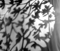
| 07/09/2006 06:10:23 PM | Trees on a fenceby KelliComment: Sorry to be so late with crits
I think you've shown some "photographers eye" in spotting this opportunity, but not fulfilled its potential. I didn't vote in this challenge but would probably voted a 4 - there's not enough going on to keep my interest, especially with the softness. Also, I'm not a fan of the uneven lighting.
One suggestion for editing (I can't try right now as I don't have PS on this computer) would be to boost the contrast and add some colour to accentuate the pattern you found - not sure if this would work well, just a thought. | | Photographer found comment helpful. |
| 07/09/2006 06:05:12 PM | Death of a Kingby tngrndreamComment: Ummmm.... I like the composition here, with the lines of pawns on each side, surrounding the "action". I wish the pieces on the left were slightly different - the frosted glass makes them stand out a lot less than the others.
There does seem to be something going on with blur in the front half, and I personally am not such a fan of the red colour.
While it may seem pernickety, I can't help but notice its an impossible move, so would prefer a checkmate position even if it may not be compositionally so strong |
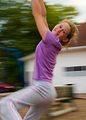
| 07/09/2006 06:00:02 PM | Just a Swingin'by tngrndreamComment: This is a really nice shot. The colours and the expression work really well with just the right amkount of blur to give a happy-go-lucky feeling and technically good shot. I guess if you had managed to get it sharper on the subject, it would have helped, but it is perfectly good as it is.
Not really sure what to suggest here, you seemed to have nailed the technical aspects and captured a shot that is full of life. |
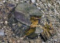
| 07/09/2006 05:56:43 PM | Cut, Slowly Falling Apartby tngrndreamComment: Sorry for the delay in commenting.
I have to admit this is not one of your best. It suffers from a "boring" point of view and flat colours/lighting, making it seem very snapshotty.
You definitely need to get a more interesting angle, to make the stump stand out from the b/g better, but even so, I don't really get a particular sense of desolation from this. I agree with the commenter that said it looks like you just came across it, pointed the camera down and took a shot - this feeling should definitely be avoided |
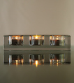
| 07/09/2006 05:44:25 PM | Glass Candle Holder on a Glass Tableby chaliceComment: -trading post-
Whilst there doesn't seem anything "wrong" with this, it doesn't seem to have much punch imho. Theres an awful lot of grey, and I'm not 100% convinced about the focus, although that may be just because of looking through the glass.
I think it would have been a lot stronger with a touch of colour, because the composition does have a nice zen feel to it, and definitely has potential | | Photographer found comment helpful. |
| 07/09/2006 05:30:58 PM | Eye of Godby chaliceComment: Hey, I added this to my favourites straight away even though I didn't have time to comment. This is my favourite of your entries so far, even if not the highest scoring. ITs a beautiful abstract, I love the rich colours and the clarity/sharpness of the patterns in a kinda cubistey way, rather than everything being completely blurred.
Not sure what I could suggest to improve it... possibly (although I know its partly trial and error) it may have been better with more of the yellow bit, which gives it more of an eye/seashell shape rather than the more circular shape.
Definitely underrated, but you can pretty much expect that for an abstract here. You should be very pleased with it nonetheless | | Photographer found comment helpful. |
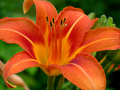
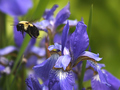
| 07/09/2006 05:06:04 PM | Flight of the Beeby chaliceComment: Sorry to be so late with critiques
I think you've succeeded well in capturing the bee with the flower, and enhancing it with b/g bokeh. The colours and the focus on the flower are good. The main problem here for me is that the bee is soft - I'm not sure if that is motion blur or if the bee is outside the plane of focus. I would also prefer the background flowers to be slightly further away (or shallower DOF) to enhance the bokeh.
Also, a slight change in placement could have put the b/g flowers offset against the f/g flower, making the composition a touch less busy.
I would suggest cropping in the righthand side so that the flower is not centralized. |
Home -
Challenges -
Community -
League -
Photos -
Cameras -
Lenses -
Learn -
Prints! -
Help -
Terms of Use -
Privacy -
Top ^
DPChallenge, and website content and design, Copyright © 2001-2024 Challenging Technologies, LLC.
All digital photo copyrights belong to the photographers and may not be used without permission.
Current Server Time: 04/24/2024 01:03:52 AM EDT.
|