DPChallenge: A Digital Photography Contest You are not logged in. (log in or register
 
Browse Settings
Currently viewing:
Registered UserSerdar_Sari

Show comments:

Per page:

Order:

Comments:


Comments Received by Serdar_Sari
Pages:  
Showing 1 - 10 of ~12
Image Comment
Tower of the Girl
04/23/2006 06:37:04 PM
Tower of the Girl
by Serdar_Sari

Comment by Commando303:
Unforgivably under-exposed, and the under-exposure lends nothing to the shot. A think the image had promise, but, at this point, is simply too poor to get a very high score. Sorry.
Tunnel
03/27/2006 03:45:59 AM
Tunnel
by Serdar_Sari

Comment by bullethead:
Reminds me of the end of Leon!
Photographer found comment helpful.
Tunnel
03/26/2006 09:36:45 PM
Tunnel
by Serdar_Sari

Comment by samchad:
not 'low key' enough
Photographer found comment helpful.
Tunnel
03/24/2006 02:45:14 PM
Tunnel
by Serdar_Sari

Comment by BeeCee:
I'd have liked the man a little farther either direction, more against the wall or against the bright, to avoid the wall line running into his head. Probably back, because his sharp silhouette draws my eye.
Photographer found comment helpful.
Tunnel
03/23/2006 04:27:15 AM
Tunnel
by Serdar_Sari

Comment by hotpasta:
really, this is a very average snapshot
Photographer found comment helpful.
Tunnel
03/22/2006 04:15:09 PM
Tunnel
by Serdar_Sari

Comment by Claya:
I think this would have looked even better in B&W.
Photographer found comment helpful.
Windows
01/07/2006 12:47:03 AM
Windows
by Serdar_Sari

Comment by kari1:
::: Critique Club :::

Hi, I am Kari and am fairly new to the critique club.

Well that is done, your first entry and to do as well as you did ... you need to be congratulated. You have a fantastic eye and you showed us how to use it in capturing this shot.

You made it to the top half of the voting in the challenge. That is great.

Great fun to do a critique on your image but it is difficult if you don't give us any information in your photographers comments. When we do a critique, we go past just the photographic result, that's what voters comments do. The critique looks at what you were trying to achieve, how you wanted it to look and what issues you had in getting the image captured and ready for voting.

First Impression - the most important one:
You met the challenge and created what I think is an effective entry. But as I go through the critique I have picked up on a couple of things that may help with future entries.

Composition:
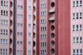
This is a well composed shot. In the comments you received it was mentioned that there is someone in the window - in fact there are several people in this shot ... I believe it adds to the reality of your shot.

Subject:
The subject matter chosen really did meet the challenge. Within the shot there are a number of patterns without any of them being so totally imposing to cut out the others.

Technical (Colour and light):
The lighting used in this shot was good, and did not create any problems for the viewer. I did wonder if these buildings ever came into full light as this may have helped in creating a further definition in the picture.

The lines in the photo itself are not sharp and are slightly out of focus. This can be helped by using your photographic programme to sharpen the lines. Sharpen after reduction of the photo.

Also some thought about changing the contrast may assist in the picture not appearing as flat.

To grow its vote?:
I think this is a good first entry. I would look at using your photographic programme to improve what is already a well taken shot.

Summary:
Well done, keep entering and keep learning.

If you've got any questions about this critique, please feel free to contact me via the PM system.

Congratulations and well done.

Kari
Photographer found comment helpful.
Windows
12/31/2005 12:47:29 AM
Windows
by Serdar_Sari

Comment by GrayGhost:
Very interesting variety of windows and color shades - love it and hope you do well.
Photographer found comment helpful.
Windows
12/31/2005 12:30:49 AM
Windows
by Serdar_Sari

Comment by sherpet:
Soft pink tone works well with these patterns......................
Photographer found comment helpful.
Windows
12/30/2005 07:53:56 AM
Windows
by Serdar_Sari

Comment by hotpasta:
very flat and out of focus. person in the window seems a distraction IMHO
Photographer found comment helpful.
Pages:  
Showing 1 - 10 of ~12


Home - Challenges - Community - League - Photos - Cameras - Lenses - Learn - Prints! - Help - Terms of Use - Privacy - Top ^
DPChallenge, and website content and design, Copyright © 2001-2024 Challenging Technologies, LLC.
All digital photo copyrights belong to the photographers and may not be used without permission.
Current Server Time: 04/16/2024 01:54:46 AM EDT.