| Image |
Comment |
| 11/09/2006 10:18:05 AM |
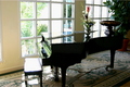
Reflective Pianoby dtouch1Comment by ohanapics: Out of focus and extremely blown highlights which is easy to do when shooting from inside through a window. Normally I don't comment too much on blown highlights but since they are a major portion of the reflection and the reflection is the subject of this challenge I feel it really hurt this picture. |
 Photographer found comment helpful. Photographer found comment helpful. |
| 11/08/2006 11:07:40 PM |
|
| Photographer found comment helpful. |
| 11/08/2006 07:21:50 PM |
Reflective Pianoby dtouch1Comment by beam: Nice creative use of reflective surface. Next time I would work on sharpness. Seems to be out of focus. Also, I would work on the exposure. Higlights in this image seem to be blown out. |
| Photographer found comment helpful. |
| 11/08/2006 03:51:19 PM |
|
| Photographer found comment helpful. |
| 11/08/2006 12:10:21 PM |
|
| Photographer found comment helpful. |
| 02/26/2004 12:17:43 AM |
Midnight Moverby dtouch1Comment by Neil: Greetings from the critique club.
Hits: This was a really good idea for the black challenge. I like the contrast of the black and silver trim. I like the general direction that the composition took. It's very sharp, and there's a minimum of hot spots/glare from the trim.
Misses: My monitor is a bit dark and cannot be perfectly calibrated, but it's as close as possible (it's a Dell 1900FP). This photo still appears a bit too dark. Only the trim detail is discernable, there's no visible bends and form on the black part of the truck. Also, while the composition is in the right direction, the "cutting off" of the trim accessories at top hurts it a bit (though somewhat understandable to try and minimize the sky in the shot). Also, the grille is one of the best parts, and its only partly there, and has some perspective distortion.
Ideas. I think it would have been cool to try and get the grille as the focal point, and the truck as the contrast. Or as is, you might recrop and try to lighten just a tad.
Hope you get a chance to play with this idea some more! |
| Photographer found comment helpful. |
| 02/24/2004 12:17:07 PM |
|
| Photographer found comment helpful. |
| 02/24/2004 08:58:28 AM |
|
| Photographer found comment helpful. |
| 02/22/2004 05:09:50 PM |
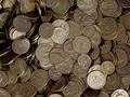
Pocket changeby dtouch1Comment by AFViper: Too random, I think you could use one subject, one coin thats bigger than the rest maybe so that you have a particular subject that stands from the rest, |
| Photographer found comment helpful. |
| 02/22/2004 09:27:52 AM |
|
| Photographer found comment helpful. |
Home -
Challenges -
Community -
League -
Photos -
Cameras -
Lenses -
Learn -
Prints! -
Help -
Terms of Use -
Privacy -
Top ^
DPChallenge, and website content and design, Copyright © 2001-2024 Challenging Technologies, LLC.
All digital photo copyrights belong to the photographers and may not be used without permission.
Current Server Time: 04/19/2024 03:19:05 PM EDT.