| Image |
Comment |
| 09/14/2005 03:42:43 AM |
|
 Photographer found comment helpful. Photographer found comment helpful. |
| 09/12/2005 02:56:28 AM |
Obstaclesby riotspyneComment: Very nice, off-beat portrait.. the gritty texture in the beard/mustache make the chain links work, imo. |
| Photographer found comment helpful. |
| 09/12/2005 02:45:32 AM |
Strike Up the Band!by TranquilComment: Wonderful shot - the high contrast certainly fits the subject well. I'll just jump right into it. I think the blur in the trombone itself is a non-issue, because if the trombone is being played.. there's bound to be some motion, right? Plus, the lack of focus and leading lines help draw the attention to the player.
The cheeks and eyes are great in a semi-comical manner.. the only thing I really notice here is that there seems to be some kind of anomaly (maybe I just am too slow to figure out what it is) underneath the horn at the bottom right corner.. looks kinda wrinkly and I can't figure out what it is.
- Critique Club |
| Photographer found comment helpful. |
| 09/12/2005 12:26:52 AM |
|
| Photographer found comment helpful. |
| 09/11/2005 05:18:18 AM |
Darkness & Lightby tryals15Comment: This certainly could have been a very strong entry if you had provided a bit more light (perhaps such that approximately half of the face is illuminated - or at least the eye). The blur is a good idea, but perhaps slightly less would've worked better with voters (one thing you'll find here is that voters generally prefer things to be as sharp as they can be, within reason). |
| Photographer found comment helpful. |
| 09/11/2005 04:59:02 AM |
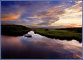
|
| Photographer found comment helpful. |
| 09/11/2005 04:50:47 AM |
Dead & Lostby marvinComment: Surely dead, but I must agree that 'Lost' does not strike me too well.. perhaps the darkness is supposed to convey this?
I have a feeling that your image did not suffer as much on technical merit as it may have on whether viewers thought it fit the challenge or not.
As far as shooting advice is concerned, I would simply suggest filling the frame a bit more so that the skull took up a larger portion of the picture - there is some wasted black space at the bottom and top - cropping this off (or getting in closer) would improve the photo a bit, in my opinion. |
| Photographer found comment helpful. |
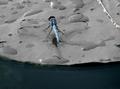
| 09/11/2005 04:47:49 AM |
Dragonfly & Lilypadby ArpeggioAngelComment: Surely a nice capture considering how fast and often these things must move! I've tried photographing live insects with wings.. and it's DEFINITELY not easy.. and to have to watch out for gators too! I would've probably turned around and looked for something else.. ;)
Anyway, on to th e photograph. I think the selective desaturation on the lilypad looks a bit odd, and am wondering if that has anything to do with the patchiness in the bottom left corner? Since this is an advanced editing challenge, I would've considered cloning that patchiness up so that it matched well with the rest of the water. With the lilypad, perhaps a slight desaturation (or change in lightness?) would've worked better.
The detail on the dragonfly is certainly good, so you did well there.
A nice shot either way, but just some food for thought above. :) |
| Photographer found comment helpful. |
| 09/07/2005 10:11:47 PM |
Draganizer-copy.jpgby sheapodComment: To be honest, I like the treatment. I wouldn't say that it really speaks grunge to me, but the colors and textures really seem to come alive here where they don't in the first. Perhaps de-emphasizing (blur? something else?) the ground would add to the impact, but still a drastic improvement as is. |
| Photographer found comment helpful. |
| 09/05/2005 02:42:45 PM |
BW film developerby birgirComment: Wonderful shot, though (how many times have you heard this one so far?) could be a bit larger. |
| Photographer found comment helpful. |
Home -
Challenges -
Community -
League -
Photos -
Cameras -
Lenses -
Learn -
Prints! -
Help -
Terms of Use -
Privacy -
Top ^
DPChallenge, and website content and design, Copyright © 2001-2024 Challenging Technologies, LLC.
All digital photo copyrights belong to the photographers and may not be used without permission.
Current Server Time: 04/23/2024 02:02:10 AM EDT.