| Image |
Comment |
| 11/23/2011 06:57:13 AM |
Eyesby P-A-U-LComment: A bit too saturated - the red sweater takes away the focus, and the vien between the eyes stands out. Also could have used a bit noise reduction. |
 Photographer found comment helpful. Photographer found comment helpful. |
| 11/23/2011 06:55:03 AM |
Confidanteby neenee1999Comment: Too much smoothing of the skin, in my opinion. Great detail in the eyes. |
| Photographer found comment helpful. |
| 11/22/2011 09:12:12 AM |
5 Star by dswannComment: Very lovely colours. I think the crop is a bit too tight (did lens lens go wider?) Alternatively, you could have cropped the plant on the left, the chair on the right, and the window in the ceiling a bit different.
This will score well, though. Congratulations :) |
| Photographer found comment helpful. |
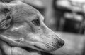
| 11/21/2011 08:43:10 AM |
Focusby ShutterRevComment: Nice DOF and friendly dog :)
However, I don't think the image needed any HDR editing. And - and this is a very personal opinion, I know - pets are extremely uninteresting. I get no story from the photograph.
I think the crop is a bit too tight at the top and left side. |
| Photographer found comment helpful. |
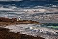
| 11/21/2011 08:37:23 AM |
Surf & Lightby Bear_MusicComment: Beautiful colour in the waves. Still, I think B&W would look awesome here. The colour of the vegetation is a bit bland. |
| Photographer found comment helpful. |
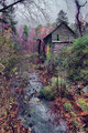
| 11/21/2011 08:03:02 AM |
In her last daysby wetlandComment: Nice composition and I love the barn.
The purple aura at the edges it a bit too much, and the sky in uninteresting.
I feel like the shutter speed is too long to make the water crisp, yet too short to make it dreamy. It might be due to the HDR process. Is this one (i.e. split into -2,0,+2 in PP) or more exposures merged?
Lastly, I think HDR should be applied in situations where it adds to the image - I am pretty sure that you could fit the histogram in one exposure. |
| Photographer found comment helpful. |
| 11/15/2011 11:27:36 AM |
|
| Photographer found comment helpful. |
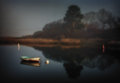
| 11/15/2011 11:26:47 AM |
November Mist, Daybreak by Bear_MusicComment: This is a lovely photo, where the grain - as one of the few in this challenge - actually adds to the overall mood of the photo. If I could choose, the two "boys" should have been left out. |
| Photographer found comment helpful. |
| 11/15/2011 03:33:28 AM |
3by RKTComment: What? Sorry didn't mean to comment in the first place... Anyway, now that I'm at it:
Lovely colors, would have liked a tad vignette. The grain does not add to the impact of the photo IMO - no drama here :) Nice enough shot, though. |
| Photographer found comment helpful. |
| 11/14/2011 02:58:41 AM |
Autumn Tapestryby CNovackComment: Congrats on the red. While the photograph is lovely, the warning sign is kind of annoying :) |
| Photographer found comment helpful. |
Home -
Challenges -
Community -
League -
Photos -
Cameras -
Lenses -
Learn -
Prints! -
Help -
Terms of Use -
Privacy -
Top ^
DPChallenge, and website content and design, Copyright © 2001-2024 Challenging Technologies, LLC.
All digital photo copyrights belong to the photographers and may not be used without permission.
Current Server Time: 04/24/2024 06:00:00 PM EDT.