| Image |
Comment |
| 10/17/2013 10:23:29 AM |
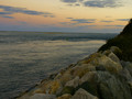
Hold back the waterby whiterookComment: There seems to be a graininess to this photo? I dunno.
It's a little dark. No real color pop or focus area.
Not feeling it.
Gave it a 4 |
| 10/17/2013 10:22:52 AM |
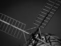
Don Quixote (de la mancha) by HarlequinComment: The tilted angle of the top of the windmill(?) is a little odd... I would have liked to had seen a more "straightened" shot... and it's a lot of "grays" rather than black and white. But theres good clarity. I gave it a 4 |
 Photographer found comment helpful. Photographer found comment helpful. |
| 10/17/2013 10:22:48 AM |
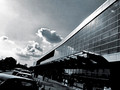
City-of-Glassby artistChanComment: I'm not feeling this shot. Seems out of focus, no real subject. My eyes go from the cars, to the clouds to the building to the people. I guess with that title, it would somewhat fit... but I'm not feeling it. Gave it a 4 |
| Photographer found comment helpful. |
| 10/17/2013 10:22:47 AM |
Catch Her in the Ryeby IrvineJamesComment: Nice glow to the sun.
Good detail on the necklace and dress/shirt... but my eyes are drawn to her necklace, rather than her.
And I'm just not feeling the "play on words" with the title. Gave it a 4 |
| 10/17/2013 10:22:45 AM |
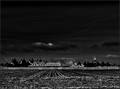
"Something Wicked This Way Comes" by Ray Bradburyby ThingFishComment: I can't decide if I really like this image or dislike it. So for that reason, I gave it a 5.
I like the black and white. The foreground is a little odd... and the festival (???) in the background I would have liked to had seen in more fine detail. Perhaps a different DOF would have worked better? I dunno. Can't quite put my finger on it. |
| Photographer found comment helpful. |
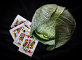
| 10/17/2013 10:22:42 AM |
Tribute to O.Henryby lei_73Comment: Nice detail on the lettuce. Good DOF.
Not understanding how the image and title fit? But I don't read many classic novels.
I gave it a 5 |
| Photographer found comment helpful. |
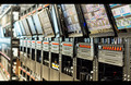
| 10/17/2013 10:22:40 AM |
1984 - George Orwellby FourPointXComment: This definitely seems like 1984! lol.
Like what you've done here. I would have liked to had seen a little more in focus... but perhaps for security reasons you couldn't? I can't tell exactly what this is.
Anyhow... overall this is a good image...
just a little "meh" for me.
Gave it a 5 |
| Photographer found comment helpful. |
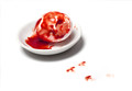
| 10/17/2013 10:22:39 AM |
Brave New Worldby UrfaKComment: A very simplistic image, but still telling.
I like the idea that you had here... but the "blood" looks too fake, and the drops on the ground (which I assume are foot prints), I would have liked to had seen look MORE like foot prints.
Overall, I like the concept, and the title is fitting... just a little different execution.
Gave it a 5 |
| Photographer found comment helpful. |
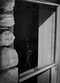
| 10/17/2013 10:22:37 AM |
The Secret Gardenby lunachickenComment: I think this shot may have worked better for the Doors/Windows/etc challenge.
The lighting is odd. It's too much "grays" for my liking. I don't understand the photo and title combination.
Gave it a 4 |
| Photographer found comment helpful. |
| 10/17/2013 10:21:51 AM |
|
| Photographer found comment helpful. |
Home -
Challenges -
Community -
League -
Photos -
Cameras -
Lenses -
Learn -
Prints! -
Help -
Terms of Use -
Privacy -
Top ^
DPChallenge, and website content and design, Copyright © 2001-2024 Challenging Technologies, LLC.
All digital photo copyrights belong to the photographers and may not be used without permission.
Current Server Time: 04/23/2024 08:36:11 PM EDT.