| Image |
Comment |
| 11/12/2003 10:42:52 AM |
The Cat in the Hatby Melly8522Comment by soup: maybe a different choice of hat - something colorful
the cats face is a bit dark - more detail there would have been effective
i see some blown out colors on the face/hat as well. -5
soup |
 Photographer found comment helpful. Photographer found comment helpful. |
| 11/12/2003 10:22:28 AM |
|
| Photographer found comment helpful. |
| 11/12/2003 09:53:04 AM |
The Cat in the Hatby Melly8522Comment by MrsFuzzButt: Would have been better if the cat was IN the hat. I know how unwilling cats are to be models, though ... tried to use mine for a couple shots for this challenge myself and they just would not help me out. :-) |
| Photographer found comment helpful. |
| 11/11/2003 08:04:40 AM |
|
| Photographer found comment helpful. |
| 11/10/2003 01:34:30 AM |
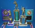
Winning Lifeby Melly8522Comment by Neil: Nice arrangement and someone is very good at baseball. Next time try to diffuse the light through a sheet or something, to minimize reflections. Maybe would have stood out more with a black background; with velvet you would not have had the light reflecting back either; . Lastly, needs a bit more sharpness IMHO. Perhaps just a matter of doing more USM wihen resizing if the original was sharp. |
| Photographer found comment helpful. |
| 11/08/2003 03:52:07 PM |
|
| Photographer found comment helpful. |
| 11/07/2003 02:45:19 PM |
Winning Lifeby Melly8522Comment by Artifacts: This would benefit greatly if the background noise were reduced with NeatImage or another process. Better yet, you would do better to have a more nontraditional arrangement of the awards and a different background. An image like this always is of more personal interest than anything else. Focus on the leftmost trophy is not good. It is more like a snapshot than anything. I entered an award image in a challenge and it did very poorly. |
| Photographer found comment helpful. |
| 11/07/2003 03:03:50 AM |
|
| Photographer found comment helpful. |
| 11/06/2003 08:22:32 AM |
Winning Lifeby Melly8522Comment by Neuferland: Seeing as I was there when you got most of these throphies I can't say this is a new subject to me :) Okay, since this is your thing here are my suggestions, bring the items closer together, you don't have to see the front of each trophy to make it count, maybe go from tallest in the back to smallest in the front and then have a plaque on each side and then the medallions leaning on the front trophy. When this is over we can set this up again and I'll show you what I"m talking about and then we'll bring it in for others to look at. Sorry hun, a 4 from Mom. |
| Photographer found comment helpful. |
| 11/06/2003 12:35:56 AM |
Winning Lifeby Melly8522Comment by Glen King: Nice, but not particular interesting. Lower the camera to even with the heads of the 2 smaller trophys and hang the medals on the background maybe. |
| Photographer found comment helpful. |
Home -
Challenges -
Community -
League -
Photos -
Cameras -
Lenses -
Learn -
Prints! -
Help -
Terms of Use -
Privacy -
Top ^
DPChallenge, and website content and design, Copyright © 2001-2024 Challenging Technologies, LLC.
All digital photo copyrights belong to the photographers and may not be used without permission.
Current Server Time: 04/24/2024 03:29:33 PM EDT.