| Image |
Comment |
| 03/21/2005 12:20:09 AM |
|
 Photographer found comment helpful. Photographer found comment helpful. |
| 02/21/2005 12:31:13 PM |
Bach passionby bicrayComment: The placement of this shot in the results is ludicrous. I stand by my 7. It's a wonderful shot with an interesting and well-told story. |
| Photographer found comment helpful. |
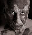
| 02/14/2005 01:47:57 AM |
Layer mask by kiwinessComment: I might as well stop voting now. This is just a phenomenal portrait. Perfect 10. Enjoy your ribbon. |
| Photographer found comment helpful. |
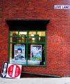
| 02/02/2005 08:07:12 PM |
Down'n'Out on Love Laneby kdkaboomComment: The window and posters are a distraction. The flare in the upper right detracts slightly from the image. The position of the "one way" sign is very good and certainly does remind me of a "down and out" person. I just find my eye leading to the face of Ethan Hawke, then to the "Do Not Enter" sign, then I just wander from there. |
| Photographer found comment helpful. |
| 12/27/2004 01:53:29 AM |
In the December windby jjbeguinComment: Originally posted by Arcy:
This one should have won a ribbon :] |
I agree. It was one of my top picks. :S |
| Photographer found comment helpful. |
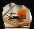
| 12/06/2004 06:09:09 PM |
No, You Go Firstby SkipComment: The composition is good, if a little cliche. Your cheese is looking a little too orange for me...perhaps bring down the saturation 3-4 points. The depth of field is quite good and gets the point across fine. The glares coming off the tile floor are a little distraction, as is the dark grout. I think a really high-key effect, with the floor and background totally white and the OOF (out of focus) portion of the trap blending into the background would have been nice. Overall, a fine effort though...worthy of a 6. |
| Photographer found comment helpful. |
| 12/05/2004 09:26:30 PM |
Before FMby Bela45Comment: I like the angle. It lends an artsy feel to an otherwise bland subject. I think your lighting could have been much improved on this shot. It's seems too flat and muddy, as though I were looking at the radio through a dirty fishtank. This can be a good effect sometimes, but I think it's not appropriate for this radio. The gold-ish material on the radio near the top-left is a distraction to me and adds little to the composition. A tighter crop on just the "TELEFUNKEN" portion, the buttons and the European stations would have been an improvement. It certainly fits the challenge. I just would have liked a "cleaner" lighting setup. Hope that helps. |
| Photographer found comment helpful. |
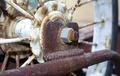
| 12/05/2004 09:25:50 PM |
asian wheelbarrowby docpjvComment: Lighting is a bit harsh here (light areas are very bright, while dark areas are very dark). I think this would have benefitted from a fairly tight crop around the axle nut, leaving out the overexposed hub and keep the OOF (out of focus) rim in view. This would also help the nut to be less centered in the frame, which is hurting the composition. The midtones are good and, therefore, this image might be a good candidate for conversion to black and white. Does not scream "low tech" to me, but what do I know. |
| Photographer found comment helpful. |
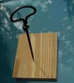
| 12/05/2004 07:52:09 PM |
Handdrillby matispistaComment: Low tech indeed. I'm not sure how much of this remains a true photograph, as it seems to have been converted to something else in post-processing (but forgive me if I'm wrong). It has a somewhat pop art feel to it, but not enough to warrant consideration as such. The colors are nice as the muted brown and cyan are very complementary. It's something I could imagine seeing being painted in watercolor. Perhaps I like this more than I thought when I first looked at it. |
| Photographer found comment helpful. |
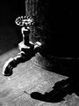
| 12/05/2004 07:48:26 PM |
Old Fashioned Milk Canby neesa108Comment: I wonder what your final score will be because I'm at a loss for how to score your image. I'm quite fond of the composition. Still, I'm just not sure about the high contrast, overexposed nature of the image. I think I'm going to give you a 6. There's just something powerful about the arrangement of the can and the faucet that I like. Still, the blown out highlights are just too distracting to me to score higher. |
| Photographer found comment helpful. |
Home -
Challenges -
Community -
League -
Photos -
Cameras -
Lenses -
Learn -
Prints! -
Help -
Terms of Use -
Privacy -
Top ^
DPChallenge, and website content and design, Copyright © 2001-2024 Challenging Technologies, LLC.
All digital photo copyrights belong to the photographers and may not be used without permission.
Current Server Time: 04/16/2024 02:00:12 AM EDT.