| Image |
Comment |
| 07/06/2005 02:37:09 AM |
Going Up?by mihaibadicComment: A fun and graphically pleasing image. The slight tilt to the left (which can sometimes work nicely) seems to be uncomfortable to my eye. Also, the cropping of the bottom bubble is a smidge too tight. The background is nicely OOF and the grey tones complement the cyan colors beautifully. |
 Photographer found comment helpful. Photographer found comment helpful. |
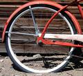
| 07/06/2005 02:27:12 AM |
Western Flyerby RDEittreimComment: I like the cropping work you've done here, but it does not save the rim from being overexposed by at least 2/3 of a stop. The harshness of midday sun can sometimes work to your advantage, but I wonder if some softer, overcast lighting would have been better. Your choice of background and is superb and begins to tell us a story about the bike and it's roots. Perhaps including the legs of a young boy dressed in 50s and conversion to black and white would bring out the rustic feeling of the image. Good effort. |
| Photographer found comment helpful. |
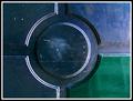
| 07/06/2005 02:23:42 AM |
Spectrumby arsenalComment: Pretty cool image. Without the "bubble", this would be mediocre. As it is, it's quite nice. I wonder what that dark patch in the upper right is though. I understand it couldn't be cropped out, but it's still a distraction. Imagine the bubble without the reflections...I think it would be slight improvement. Still, I give it an 8. |
| Photographer found comment helpful. |
| 07/06/2005 02:18:33 AM |
Duo Maxwellby AmiYuyComment: Not really seeing a circle, but I'll give you the benefit of doubt. The subject is interesting and has attitude, but the hat and the position of the hands seems unnatural. Also, taking an engaging photo of someone wearing dark sunglasses is difficult. Next time, perhaps try to incorporate something with similar style that allows us to see the eyes. |
| Photographer found comment helpful. |
| 07/06/2005 02:16:16 AM |
Crunchy Circlesby MinstrelComment: Your white balance seems to be far too warm (orange), at least on my monitor. The perspective is a little odd and it seems you'd have done better to go either completely topdown or more of a severe angle. As it is, the angle creates a very "normal" perspective as though I were sitting there looking at the cereal. The background material is distrcting and has far too much detail. The spoon could be omitted to greater effect. Decent effort, though. |
| Photographer found comment helpful. |
| 07/06/2005 02:12:37 AM |
yinyangby messerschmittComment: Simple, graphic and well-composed. Still, the image is tilted slightly to the left and is off-center just enough to be uncomfortable to the eye. I like the subtle shift in colors, though, and the texture of the painted molding. 6. |
| Photographer found comment helpful. |
| 04/29/2005 11:03:44 AM |
Simply elegantby PascalComment: Very nice composition. I wonder if a little more light coming from the left wouldn't have helped the image though. It's a bit dark. Good luck! |
| Photographer found comment helpful. |
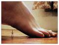
| 04/18/2005 08:33:18 PM |
Danger! Danger! Alert!by mocabelaComment: Hmmm. I really like this! The composition is quite strong and you've managed to capture a closeup of a foot without it looking icky. Couple things:
- the sock impressions on the skin are visible, though not overly distracting.
- the dark material in upper right is distracting
- visible grain gets worse on the right side of the image, though again not too distracting...just noticeable
Good luck |
| Photographer found comment helpful. |
| 04/18/2005 08:28:58 PM |
War of the Tacksby sofapezComment: WTF? Did you setup a mini tack battle on your rear-end? Wow. Props for the um, idea, but it lacks a certain asthetic that keeps from looking in the opposite direction. I type this comment with my back to the keyboard. |
| Photographer found comment helpful. |
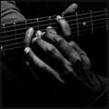
| 04/06/2005 12:09:49 AM |
Helping Hand by aznymComment: This is so wonderful to see at the top of pack. It's further evidence that the whole idea that only "sellout" images and stock-looking photos do well here. This shot is as artistic and beautiful as any I've seen and I commend the voting public for recognizing it as such. |
| Photographer found comment helpful. |
Home -
Challenges -
Community -
League -
Photos -
Cameras -
Lenses -
Learn -
Prints! -
Help -
Terms of Use -
Privacy -
Top ^
DPChallenge, and website content and design, Copyright © 2001-2024 Challenging Technologies, LLC.
All digital photo copyrights belong to the photographers and may not be used without permission.
Current Server Time: 04/25/2024 12:38:52 PM EDT.