| Image |
Comment |
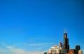
| 10/11/2005 04:38:35 PM |
My Corner of the Skyby JohnTFComment: I can't believe how low this placed. It's a beautiful, graphic image that takes a keen eye to see. Whether you shot it this way or cropped, doesn't matter -- my hats off to you all the same. |
 Photographer found comment helpful. Photographer found comment helpful. |
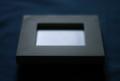
| 09/28/2005 12:40:46 AM |
Frameby bledfordComment: This was a fun experiment. I personally enjoy this abstract image very much and was not shooting for the almost brown ribbon position. My concept was to have a subject that was not really a subject, with a point of focus that fell in the general rule of thirds area, but not so obvious as to be kowtowing to the golden mean.
So, does an image have to be in focus, lacking grain, entirely composed along an intersecting 1/3 line to have a chance in this challenge? Apparently so. Does this image fit the challenge? Most would say it doesn't but I challenge that.
Look for more shots like this and my Rain submission from me in the future, as I've grown bored of the picture perfect stock image for now. I might come back to it, but not for awhile. Cheers! |
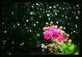
| 08/26/2005 12:45:19 AM |
Pink Bloom in Summer Stormby bledfordComment: Originally posted by maiblossoms:
Wow, I really love this! This is one of my favorites in this challenge. Because it is abstractish, it seems to convey the mood and feeling of rain really well, rather than just the details of what rain looks like. |
Thanks! This confirms my own feelings about the image. I had several other outtakes which were more focused, but this to me spoke more about the feeling of a summer storm and the beauty of a well-lit rainy day. |
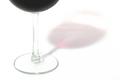
| 07/08/2005 11:50:08 AM |
Wine Glassby m--EComment: Simple and elegant. The image seems about 1/2 stop overexposed on my monitor--the stem of the glass is getting washed out by the highlights. I love the overall high key effect though and your cropping is fantastic. Other than the slight overexposure, I see nothing wrong with this image. 8 |
| Photographer found comment helpful. |
| 07/08/2005 11:48:03 AM |
...penny for your thoughts...by meyersch11Comment: Nice eye to see this. It's a very common image that many can relate to. Not sure if it's my monitor, but the image seems out of focus in areas that matter. The color is fine, if a little on the warm side. I think a white background might have helped to make the pennies pop a little more. Good effort. |
| 07/06/2005 02:44:13 AM |
Rip In Timeby abdrainComment: Very cool and creative use of everyday objects to create a really interesting image. The focus could be slightly better (meaning that the marble is a little fuzzy), though you may have wanted it that way. Overall, a great image that defies the "rule of thirds" in a way that actually pleases the eye. Well done. |
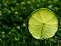
| 07/06/2005 02:41:32 AM |
Refreshingly Limeby jessfrolioComment: This is nice. Cropping work is thoughtful and pleasant. I see just enough of the glass to understand what the lime is doing there. I wonder if you could have thrown the background out of focus even more though. Also, perhaps backing up a bit and making the slice smaller in the frame would improve the shot. The colors in the background complement the lime nicely. A 7 for you! |
| Photographer found comment helpful. |
| 07/06/2005 02:39:23 AM |
Got a Light?by Ice-Tea-1983Comment: This is nice! If only you'd have cropped out the corners I'd be a lot more interested in this image. As it is, the viewer is made aware that those beautiful lines of light have an end and so the mystery is lost. Try cropping those corners and my guess is that you'll like the shot even more. Good eye, though. |
| Photographer found comment helpful. |
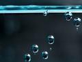
| 07/06/2005 02:37:09 AM |
Going Up?by mihaibadicComment: A fun and graphically pleasing image. The slight tilt to the left (which can sometimes work nicely) seems to be uncomfortable to my eye. Also, the cropping of the bottom bubble is a smidge too tight. The background is nicely OOF and the grey tones complement the cyan colors beautifully. |
| Photographer found comment helpful. |
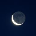
| 07/06/2005 02:35:09 AM |
Earthshineby canyoncatComment: A nicely exposed and centered shot of the moon. Rather grainy and lacking detail though. I realize it's difficult to get a detailed shot of the moon without selling the farm, but this image is weak among the finer examples of astrophotography I've seen. If you want to supplement the image to make up for lack of detail, back off and include something in silhouette like a person pointing to the moon or house on a hill. Having very little compositional or artistic impact, this image must be judged on it's technical merits--an area which it is somewhat lacking. |
Home -
Challenges -
Community -
League -
Photos -
Cameras -
Lenses -
Learn -
Prints! -
Help -
Terms of Use -
Privacy -
Top ^
DPChallenge, and website content and design, Copyright © 2001-2024 Challenging Technologies, LLC.
All digital photo copyrights belong to the photographers and may not be used without permission.
Current Server Time: 04/25/2024 10:44:58 AM EDT.