DPChallenge: A Digital Photography Contest You are not logged in. (log in or register
 
Browse Settings
Currently viewing:
Registered UserHomunculus

Show comments:

Per page:

Order:

Comments:


Comments Received by Homunculus
Pages:  
Showing 1 - 4 of ~4
Image Comment
"From Humble Beginnings to Championships"          Nike
02/28/2005 09:10:17 PM
"From Humble Beginnings to Championships" Nike
by Homunculus

Comment by Skip:
ok, i am voting this challenge in 2 passes. in this pass, you will get a partial comment and a score. then i will come back to comment again. if you have any problem whatsoever with this comment, pm me and let me know. otherwise, take it with a grain of salt...i'm not trying to be a know-it-all, i'm just explaining where i'm coming from in voting this challenge. and, if this comment is NOT helpful (of if you think i'm full of $#!+), don't mark it helpful.

billboards are a science unto themselves. a lot of research has gone into determining just how much information a person can digest and retain in specific time spans. they use this information to develop formulas for determining the number of words and letters to use on billboards, as well as their sizes. they also determine the size and number of visual elements to include.

the graphics/photograph on a billboard are designed to get the point across in a moment. on the road, a driver will have less time with a billboard than a voter will give your image. this is a key element in the challenge: composing a shot that will get its point across quickly and succintly. along those lines, a strong composition will probably have few details and make strong use of negative space.
------------------------
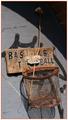
yes, this is a bold and daring take on the challenge, especially given all the discussion leading up to the submission cut off. as a photograph, it is interesting. as an image for a billboard, it is a bit too busy to be able to get your point across at 60 mph. but i'm sure it's not the content that is affecting your score...
Photographer found comment helpful.
Relaxation
09/26/2003 03:43:12 AM
Relaxation
by Homunculus

Comment by BobsterLobster:
I had a quick look at this one in Photoshop, and you really need to do some post-processing on this one. You're not using any of the lighter tones here, and you really need to increase your contrast once you've adjusted your levels. A gamma correction helps as well. Once all that has been done, it's a good picture! 4
Photographer found comment helpful.
Relaxation
09/24/2003 07:53:43 PM
Relaxation
by Homunculus

Comment by Beagleboy:
Nice shot but too dark. A suggestion might be to have your model wear a pale colored- solid (no pattern) shirt so that she would stand out a little more. Also, the dark pillow completely camouflages what seems to be a very beautiful head of hair.
Photographer found comment helpful.
Relaxation
09/24/2003 09:48:55 AM
Relaxation
by Homunculus

Comment by moodville:
The dark and light contrasts well, and her face has a daydreamy quality too. I find her looking at the camera to be a draw, as if she is encouraging the viewer to lay down and rest too. Her face is a little too central, perhaps putting her to one side could emphasis the 'come lay down with me' feel by showing a roomy space for the viewer to fall into. I like it.
Photographer found comment helpful.
Pages:  
Showing 1 - 4 of ~4


Home - Challenges - Community - League - Photos - Cameras - Lenses - Learn - Prints! - Help - Terms of Use - Privacy - Top ^
DPChallenge, and website content and design, Copyright © 2001-2024 Challenging Technologies, LLC.
All digital photo copyrights belong to the photographers and may not be used without permission.
Current Server Time: 04/24/2024 09:14:29 PM EDT.