| Image |
Comment |
| 02/10/2005 08:32:10 PM |
wwii-s.jpgby agrimaceComment: Ideally, I think this would look better with the centerline of the Washington Monument in a straight vertical, and also if the states' columns at the WWII had their sides parallel to the edges of the photo. That would have required you to use not such a wide-angle to prevent the convergence, I think. The states' columns could use a boost of lightening to bring them to center of attention. And the flagpole would be better between a pair of columns. |
 Photographer found comment helpful. Photographer found comment helpful. |
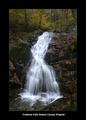
| 02/10/2005 08:25:07 PM |
ctf13f.jpgby agrimaceComment: This is a very nice shot of the waterfalls. I would like to see the mid-tones lightened a little. Also, the border being dark kinda confines the picture (as it would any), so maybe a light-color or white border would open it up a little bit. |
| Photographer found comment helpful. |
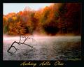
| 02/06/2005 11:44:35 PM |
Hocking Hills Autumnby jpochardComment: Beautiful colors, submerged tree, fog/mist, and peaceful water - I like this shot. In the edge between the trees and the sky, I'm seeing some distortion or artifacts, probably from resizing for the web. Very good shot. |
| Photographer found comment helpful. |
| 02/01/2005 01:29:37 PM |
Concentrationby NinjaMomComment: Overall, I like this photo. Let me humbly share some things that I think I've learned - but take them as they are offered, just a set of opinions.
The areas in this photo that are in sharpest focus are mostly too dark or too light. You may be able to remedy that in the future by using your flash as fill flash, dialing the compensation down so you still are predominantly lit by that great natural light. Also, I think I would have liked to see the pencil in sharper focus.
I'm pretty sure I'm finding out that keeping it simple is essential to "success." Overall, this photo adheres to that philosophy, but removing the object at the student's right elbow and the one to her left would improve the shot.
While some people might not find this kind of shot inspiring, it's a very nice one to tell part of a story, and if simplified, could probably be a successful stock image (I intend that as a compliment). My advice on the scores you received is to not worry about the numerical values in an absolute sense. Realize that you were very near the 50th percentile for "best of the year" in a very competitive site. Congratulations! |
| Photographer found comment helpful. |
| 01/20/2005 09:37:40 PM |
IMG_5223 copy 800.jpgby ButterflySisComment: I like this composition and lighting. The focus appears to lack some sharpness, but that might be from sizing for the web. |
| Photographer found comment helpful. |
| 01/20/2005 09:32:38 PM |
IMG_5348 copy 800.jpgby ButterflySisComment: Superb details you've made visible here! With a lighter background, we could better see the little tonguey thing, like some of your other pictures, but look at that texture on the wing! Very Nice! |
| Photographer found comment helpful. |
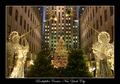
| 01/20/2005 09:28:38 PM |
IMG_5258 copy 800.jpgby ButterflySisComment: That is quite a wide angle! I'm more of a fan of less severe wide angle shots, but you've made me want to go here on my next visit to NYC. |
| Photographer found comment helpful. |
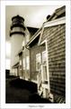
| 01/20/2005 09:25:29 PM |
IMG_4427 sepia copy 800.jpgby ButterflySisComment: This is a great shot, and some cool post-processing. The only nit-pick I could add would be to rotate slightly (or via some other tool) to make some of the verticals on the house straight up & down. But really, you should put this one up for sale on DPCprints! |
| Photographer found comment helpful. |
| 01/16/2005 03:53:47 PM |
Day & Nightby dsidwellComment: I like this treatment a lot. The negative space doesn't detract, IMHO. I've not seen one like it that I recall, and it's just been added to my favorites. Very cool. |
| Photographer found comment helpful. |
| 01/16/2005 12:04:26 AM |
Autumn Leavesby ChrisW123Comment: I like this composition. The textures and colors and shapes are interesting and harmonious. You can almost hear the leaves rustle. |
| Photographer found comment helpful. |
Home -
Challenges -
Community -
League -
Photos -
Cameras -
Lenses -
Learn -
Prints! -
Help -
Terms of Use -
Privacy -
Top ^
DPChallenge, and website content and design, Copyright © 2001-2024 Challenging Technologies, LLC.
All digital photo copyrights belong to the photographers and may not be used without permission.
Current Server Time: 04/19/2024 12:13:47 AM EDT.