| Image |
Comment |
| 01/10/2007 08:31:44 PM |
Sunshineby nards656Comment: Your post-processing her looks a bit over-compensatory, especially around the eyes, where it looks like an unsharp mask or noise tool was used a bit to liberally. Composition is otherwise quite strong. |
 Photographer found comment helpful. Photographer found comment helpful. |
| 01/10/2007 08:30:24 PM |
Unforgiven IIby kiumars_kashaniComment: Whoa those are some bright highlights in her face. I would strongly suggest diffusing the glow on this shot to soften those fine details in her face, which are not very attractive at this proximity. Compositionally, I really like the cropping. 4 from me. |
| Photographer found comment helpful. |
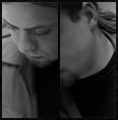
| 01/10/2007 08:29:20 PM |
Shy Boyby cubixComment: Sorry, but this perspective just doesn't work for me. I think I would have liked it far better with just the left panel. |
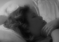
| 01/10/2007 07:40:01 PM |
My Sleeping Beautyby Demento_1974Comment: I'm going to hope this was MEANT to look like it was taken from the inside of a casket. If not, be warned that this looks like a post-mortem shot--probably because the soft focus, her pillow and the background of the bed, not to mention the position of her hands, all remind me so much of a viewing of an open casket. Otherwise, this is a fine piece of work. 6 from me. |
| Photographer found comment helpful. |
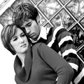
| 01/10/2007 07:38:13 PM |
Sweet Romanceby MissyKayComment: The angling of the shot is fantastic. I think I would like this one so much more if the subjects didn't look so disinterested in one another... Overall, this composition is a well-earned 7 from me. |
| Photographer found comment helpful. |
| 01/10/2007 07:36:44 PM |
gabyby arsenalComment: This is my favorite kind of portrait: the casual candid taken against an undistracting though nevertheless common contextual background. It is so obviously NOT a studio pose that it works far better emotively than something that is obviously contrived. Thanks so much for sharing! |
| Photographer found comment helpful. |
| 01/10/2007 07:35:08 PM |
Blushing Brideby HawesPhotoKCComment: Okay...seriously, I know you were going for a nice effect of isolating the color of the eyes against the rest of this composition, and you've done a fine job of that, but I find the effect very unflattering and...well...a little creepy even. Post-challenge, I might suggest two-toning this in a dark blue to match the hue of the eyes and complement--not isolate--them. Just a suggestion. 6 from me. |
| Photographer found comment helpful. |
| 01/10/2007 07:33:13 PM |
The Bedouin withinby HighNoonerComment: While this is duotone, one might argue that it's not technically black and white. I hope the voters will not do you a huge injustice for that, but I'm inclined to say that I think the brown two-tone (or at least this bright a hue of it) was a poor choice for this subject. There needs to be greater contrast to frame the face. |
| Photographer found comment helpful. |
| 01/10/2007 07:31:17 PM |
Sheby Joey LawrenceComment: Not sure I'm buying the incongruity of a handsomely dressed young woman and a garden hose, but the execution and overall composition of this photo is amazing. 10 from me. |
| Photographer found comment helpful. |
| 01/10/2007 07:30:21 PM |
Smirkyby jenesisComment: Hehe...I love it. Reminds me of something off the cover of a old-fashioned Sears catalog. |
| Photographer found comment helpful. |
Home -
Challenges -
Community -
League -
Photos -
Cameras -
Lenses -
Learn -
Prints! -
Help -
Terms of Use -
Privacy -
Top ^
DPChallenge, and website content and design, Copyright © 2001-2024 Challenging Technologies, LLC.
All digital photo copyrights belong to the photographers and may not be used without permission.
Current Server Time: 04/25/2024 03:03:23 AM EDT.