| Image |
Comment |
| 04/30/2013 10:29:45 PM |
|
 Photographer found comment helpful. Photographer found comment helpful. |
| 04/30/2013 09:20:51 PM |
|
| Photographer found comment helpful. |
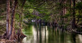
| 04/30/2013 08:35:06 PM |
DSC_3011-Edit1by Ja-9Comment: This is nice but you have your horizon almost dead center, I know it's not perfectly on center but maybe try taking just a tad more of the bottom or top. Also burn that tree trunk sara was talking about. Make it blend in more. I also wish there was a bit more detail in the shadows. I like the trees dark but not so dark as to lose detail (on the front two, the back ones are fine) |
| Photographer found comment helpful. |
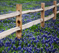
| 04/30/2013 08:31:25 PM |
DSC_3067-Edit1by Ja-9Comment: This one is really nice but the focus is in the wrong spot. The flowers in front of the fence should be in focus as well and so it does weird tricks to my eyes. |
| Photographer found comment helpful. |
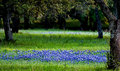
| 04/30/2013 04:52:32 PM |
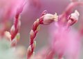
IMG_1972by SaraRComment: I don't love this one for free study, as a macro it is good. But I just don't think it will hold up in a free study. The stem is too centered and the composition is off. |
| Photographer found comment helpful. |
| 04/28/2013 10:02:45 PM |
|
| Photographer found comment helpful. |
| 03/20/2013 10:06:30 AM |
Innocenceby sekarmalathyComment: I think you got hit with the baby haters votes. This should have done better, it was one of my picks for the top 5. |
| Photographer found comment helpful. |
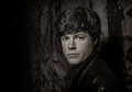
| 03/20/2013 09:53:04 AM |
Jacksonby markwileyComment: I didn't comment on this one during the challenge because it was one of my favorites and I thought it would be near the top. I only commented on ones that missed the mark for me in some way. This is a prime example of a a score that should be higher. I can't comment on improvements because I like it the way it is. But in trying to understand why others didn't score it higher I would say that overall it is dark and some people might not like that. I did though. |
| Photographer found comment helpful. |
| 03/20/2013 09:49:51 AM |
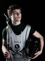
Bring it Onby MarkBComment: Overall the tone is too cool, and he needs some backlighting to make him stand out from the background. Overall the lighting is pretty good but you missed a bit and the jersey and his arms are better lit than his face, so the emphasis goes to those areas instead of the face. One thing to always ask yourself when doing a portrait is: "do my eyes go to his eyes and face first?" if not it's a miss. With this my eyes go to the jersey first. |
| Photographer found comment helpful. |
| 03/20/2013 08:48:33 AM |
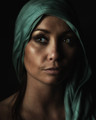
Feminam Humana by MAKComment: This was my pick for the top. Glad to see it did so well. Congrats on the blue. |
| Photographer found comment helpful. |
Home -
Challenges -
Community -
League -
Photos -
Cameras -
Lenses -
Learn -
Prints! -
Help -
Terms of Use -
Privacy -
Top ^
DPChallenge, and website content and design, Copyright © 2001-2024 Challenging Technologies, LLC.
All digital photo copyrights belong to the photographers and may not be used without permission.
Current Server Time: 04/18/2024 12:42:17 AM EDT.