|
|
| Image |
Comment |
| 01/28/2013 06:44:41 PM | |  Photographer found comment helpful. Photographer found comment helpful. |
| 09/13/2012 01:41:29 AM | | | Photographer found comment helpful. |
| 09/12/2012 02:11:55 PM | | | Photographer found comment helpful. |
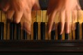
| 08/21/2012 03:08:53 PM | Life is like a piano... what you get out of it depends on how you play it.by p-chanComment by JamesDowning: Greetings from the Critique Club!
My first take-away is the title in particular. Great title. So much meaning can be extracted from it.
Image wise, I like the concept. Obviously something hit voters well, as a 5.95 is in very good territory. Still, I think it could potentially be improved. When I first look at the image, to me it looks rather yellow. I decided to play with it a bit myself, and applied an auto-levels layer at about 70% opacity in photoshop. That seemed to cut off the overtly yellow hue, while not really disturbing the yellow aged look of the keys.
I like the composition. The horizontal layers work well together. There's a nearly abstract quality to it and I really like that you focused in on a unique viewpoint. I do think the out-of-focus lower section detracts from the image a bit. If that had been in clear focus, I think it could have brought out even more of an aged feeling to the image. In an image like this, I think that's what makes it. The piano is representing life. Life is full of stories, memories, etc. which are represented by the scratches, nicks, scrapes, and other patina that grow over the years of use. That very interesting bit of photograph are however rather obscured by the lens blur. I'm actually a bit surprised that at F8 on a DX body it wasn't more in focus. I'd suggest testing a few stops down, f11-f16 and see how that affects the blur. If nothing else, since it's advanced editing, you could stack two photos with the two different focus points to achieve the desired level of detail. Again, this is just thought. Detail there could completely ruin the photo, who knows!
As I stated before, I did import your photo into PS and started playing with it some. As an alternative to making the lower section in focus, I ended up cropping off 75% of the out of focus area. That became a very wide photo, and as I've found, wide crops don't do so well. So that leaves us with two options, both of which I felt were potentially stronger than your original image. (Keep in mind, it's just my opinion.) One option is to add in a letterbox frame. I think it helps emphasize the horizontality of the shot, and ensures the eyes aren't drawn out of frame by the bright hands. Option two is to crop off the left and right most of the frame. This crops off the pinky of each hand, but actually gives a very balanced image, in my opinion. Just enough visual information to let the viewer know what you're doing, while keeping the subject front and center. Of the two crop options, this may be my favorite as it emphasizes the abstract quality of the image.
Again, a great concept, and a nice execution! Looking forward to seeing more from you in the future!
Food for thought.
James Downing | | Photographer found comment helpful. |
| 07/25/2012 07:40:52 PM | | | Photographer found comment helpful. |
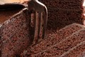
| 07/24/2012 09:22:46 AM | Death by Chocolateby p-chanComment by CNovack: Voted earlier coming back to comment.
Wow, this is a great close-up show off the rich texture of the chocolate cake. I like that you arranged three slices to show off the shapes and texture of the dessert rather than just a very close up shot of one slice. The arrangement adds visual interest and allows my eye to wander up and down to explore the tasty chocolate. The additional element of the fork adds to the imagery for it draws/places your audience into the scene - it is as if I have picked up the fork and am digging in. I do have 2 critiques. First is that I think the fork would look better if it was clean of any chocolate - it plays into the saying 'the first bite is always the best'. I think that giving your audience the impression of getting the first bite will make the mouth water with anticipation of tasting the cake as opposed to an impression that we have already had several bites & and are getting full. Lastly the condensation on the chocolate frosting on the left slice calls gives the top layer a 'bumpy' texture and sheen. Keep the impression of a dessert being rich, silky and smooth. I know picky picky right:-) But the devil is in the details - if you do all you can to make it look dazzling then it will. By lightly brushing the areas with a Q-tip or tissue paper you will absorb the moisture off of the chocolate without wrecking the dessert. | | Photographer found comment helpful. |
| 07/23/2012 05:15:06 PM | Death by Chocolateby p-chanComment by EOSail: I really like your cropping choice and the composition moves the eyes around the image well and there's good depth. There isn't a lot of variation in the color, though. Maybe white frosting would have looked nice and provided more contrast in the image. | | Photographer found comment helpful. |
| 07/20/2012 07:06:06 AM | Death by Chocolateby p-chanComment by Skip: This is a tough challenge to vote. I'm torn between "what are you trying to do here" and "what do I expect here". Further complicating matters is the question "what would I do here".
What I would expect would be a technically strong piece of eye-candy that would present the dessert in a way that I would want to at least sample it, if not order it. Along these lines I'm looking at technicals: backgrounds, distracting elements, exposure, sharpness. I'm also looking for creativity, imagination, and originality, which can make up for less than perfect technicals.
So, where does this leave me with your image?
Not a bad idea, but a couple qualms. It's a little too tight. I see what it is, but it's so in-your-face that it leaves little to the imagination. My biggest problem, though, is the dirty fork. I don't want to eat anything after someone else has had their fork in it. | | Photographer found comment helpful. |
| 07/18/2012 09:16:59 AM | | | Photographer found comment helpful. |
| 07/18/2012 12:35:39 AM | | | Photographer found comment helpful. |
Home -
Challenges -
Community -
League -
Photos -
Cameras -
Lenses -
Learn -
Prints! -
Help -
Terms of Use -
Privacy -
Top ^
DPChallenge, and website content and design, Copyright © 2001-2024 Challenging Technologies, LLC.
All digital photo copyrights belong to the photographers and may not be used without permission.
Current Server Time: 04/24/2024 06:34:00 AM EDT.
|