|
|
| Image |
Comment |
| 12/29/2003 01:39:11 PM | Have courage by tp-fcpComment: Nice photo, but I don't think that the title and text are quite succinct enough. The image needs to be more strongly related to your theme. |  Photographer found comment helpful. Photographer found comment helpful. |
| 12/29/2003 01:37:31 PM | Successby SonifoComment: Very nice composition and use of light. I do think, however, that the title and text is too dominant - so much so that it overpowers the photo when the two should be able to coexist. | | Photographer found comment helpful. |
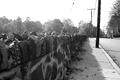
| 12/13/2003 01:30:44 PM | Short Commuteby ronnersComment: Originally posted by Imagineer:
I think the colour treatment here is almost too indistinct, with the stone building being of a subdued colour anyway. What was the purpose?
Interesting viewpoint. |
The main subject is the Pacific Stock exchange, ground central of the dot-com boom which sprang forth from Silicon Valley in the late 90's. The juxtaposition of that and the apartment block is the purpose of the photo. I hope that answers your question. |
| 11/24/2003 06:20:22 PM | Untitledby tomlewis1980Comment: This is an excellent capture tom. To get the seagull just at that moment in flight was great. Nice detail in the feathers as well. | | Photographer found comment helpful. |
| 11/22/2003 05:22:38 PM | Pefumeby CorwynComment: [Critique Club]
Interesting composition, and a very creative use of DOF. I particularly like the fact that one of the perfume bottles has been left in focus, and it subsequently acts to balance the shot.
I'm left looking for some 'logical' sense to this photo, and I'm trying to relate the figure and the perfume bottles. The reason for this is your choice to show only part of her face; this, to my mind, suggests that her interest is elsewhere. Following from that, if here interest is elsewhere why choose this composition? Anyway, I'm sure that you had something else in mind when arranging the shot, so excuse my tangential rambling. On looking again, maybe you just chose to include the nose to suggest smell, but then you might need to place one of the bottles in a more obvious location to suggest that it is the subject of her inquisition.
On a technical note, it would have been nice to see a wider tonal range in the figure's face. It appears that the lighting may have been a little too strong, and whilst there is some shadow detail I'd like to have seen some more to highlight the contours of her face.
I appreciate your use of a range of bottle types and opacities, and I really like the use of a completely opaque bottle on the left hand side. The clear bottle near the center is, however, a little distracting as it has the effect of gathering up some of the available light and bringing rather more attention to itself than perhaps it should. Using a darker, but not completely transparent, bottle would have worked better in this case, and lent itself better to your intention of focussing interest on the face and card. | | Photographer found comment helpful. |
| 11/22/2003 05:09:11 PM | "The Lizard of Oz"by faidoiComment: [Critique Club]
By very strange coincidence, I was at the Steinhardt Aquarium a few weeks ago, so I might just have some additional insight for you;)
First of all, nicely composed and focussed shot. If I remember correctly, ths lizard house is pretty dark, and that explains the wide open aperture and unfortunately shallow DOF. I'd have liked to have seen just a bit more of the Iguana (?) in focus. The use of flash in these dark conditions has left you with a blown out foreground and detail-free background. Again, however, this is a consquence of the shooting conditions, so I can understand.
I'm not sure if they would let you use a tripod, but that would be the way to go here. If you could get away with no flash you would have much better color saturation and contrast. I'm not sure if it's possible with your camera, but another alternative may have been to push up the ISO as far as it could go - again, with the intention of obviating the use of the flash.
All in all though, a nice composition (I presume you had to shoot from a low angle to get this one) and a powerful choice of subject.
Ron. | | Photographer found comment helpful. |
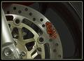
| 11/17/2003 02:39:53 PM | | | Photographer found comment helpful. |
| 11/16/2003 02:50:03 PM | Where did I put that bottle?by jfaulknerComment: [Critique Club]
The decision to fill the frame with cloud was a good one, and leaving a small amount of detail (birds etc.) in the foreground works well.
I do sense that this shot has a blue cast to it - probably due to the time of day. As a result, the clouds are toned and the sky doesn't have as much punch as it may have had when you looked at it. It would have been a good idea to either use a polariser, or simply a UV filter to block that haze. In post-processing you could try adjusting the levels to bring out more whiteness from the clouds - that may potentially make this shot even better.
As far as exposure is concerned, a deeper DOF would have been good. I'm guessing that you took this in program mode. The foreground does have interest, and could be sharper, and the land on the horizon is quite hazy and indistinct.
What lens focal length did you use here? I think that this one is a good candidate for a wide angle lens. What you could have done, and indeed can try in future, is to take the shot from a lower angle using a wider angle lens and smaller aperture. This would give more drama, and keep more the shot in focus. I'd also suggest going closer to the water's edge - that's the most dynamic part of the whole scene so you should try to make more of it. If shooting near breakwater, it's usually better to take the picture when the waves are receding as they have more interesting shapes and patterns at this point.
All in all, you have a good starting point here and this subject has a lot of potential - especially if you have an opportunity to go back and try out a few of these suggestions. Message edited by author 2003-11-16 21:51:09. | | Photographer found comment helpful. |
| 11/16/2003 02:38:52 PM | Stonewallby ladpupmoeComment: [Critique Club]
The choice of subject, and use of the lead-in is good. From a purely compositional perspective, I think that you are too close to the wall. I'd like to have seen the bottom of the wall through the whole shot. Alternatively, a lower angle focussed entirely on the boundary of the wall and pavement would have worked well for this challenge. The jagged lines of the telephone lines are a distraction here.
Because the nearest part of the wall is softer than the rest of the photo, my eye tends to be drawn away from it - and toward the telephone pole, which has no discernable detail and jagged edges (compression may be to blame here though). It would have been a better idea to have used a smaller aperture than f/8 - did you use program mode? - to achieve a much deeper depth of field and keep more of the wall in focus. I also have a D100 and use aperture mode almost exclusively as it gives me much more control over the outcome of the shot.
The light seems quite harsh here, given the hard edged shadows from the wall, and there is subsequently a large luminosity range between the sky and shaded part of the wall. The exposure on the wall is fine, but you have a completely white sky. The only effective way to remedy this in this situation is to take two exposures - one for the sky and one for the wall, and blend them later.
All in all, a good idea which is spoilt by the telephone poles and blown out sky. Message edited by author 2003-11-16 21:51:47. | | Photographer found comment helpful. |
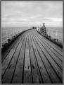
| 11/15/2003 04:09:15 PM | Path to the infinite sea...by BobsterLobsterComment: Originally posted by BobsterLobster:
If I made the boards vertical... the horizon would slope... are you sure you would want that?! ;) |
Hmmm, didn't think about that. I guess you could have 'fixed' it when taking the shot, but you may not have had quite the same composition. I have a software-controlled grid which I can overlay on the viewfinder when taking shots, and it helps in instances like this.
All in all it is a great shot though, and I do like the darker nearground (which could be added in PS but that would be cheating wouldn't it;)) These 'rules' are a bit too much sometimes, but that's another discussion... | | Photographer found comment helpful. |
Home -
Challenges -
Community -
League -
Photos -
Cameras -
Lenses -
Learn -
Prints! -
Help -
Terms of Use -
Privacy -
Top ^
DPChallenge, and website content and design, Copyright © 2001-2024 Challenging Technologies, LLC.
All digital photo copyrights belong to the photographers and may not be used without permission.
Current Server Time: 04/19/2024 11:51:14 PM EDT.
|