| Image |
Comment |
| 03/11/2010 11:45:02 PM |
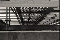
Undersideby npaselComment: I think this has potential. I just found the top beam distracting. Perhaps it needs to be cropped a little to remove the details at the top (so it matches the bottom elements uniformity) or maybe if you could have got enough depth of field to get the framing elements in focus as well as the rest of the image? |
 Photographer found comment helpful. Photographer found comment helpful. |
| 03/11/2010 11:41:57 PM |
Nature of Lightby AllenPComment: technically I think this is good and good composition but the contrast between the sharp shadows on the model's face and body against the blurred hand and object she is holding don't seem to sit well for me. Wondering if the intricate "busy-ness" of the shadows clashes with the blurred vagueness of the object? Still a well shot and composed photograph |
| Photographer found comment helpful. |
| 03/11/2010 11:37:24 PM |
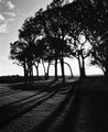
Treesby LMO366Comment: I think this has potential, I like the strong contrasts and the texture of the grass in the foreground but it feels a little unbalanced to me - the dark areas of the trees and the ground at the bottom right need something to balance them but the left of the photo doesn't do it. That is just me though! |
| Photographer found comment helpful. |
| 03/11/2010 11:31:27 PM |
FireWireby MAKComment: technically I think this is really well done but for me the result is sort of a cliche.
Nothing against Amnesty International but just it is a familiar icon so I found it didn't grab me as particularly striking or interesting... then again maybe Amnesty International copied your photo in which case it is their fault I found it cliche'd!
:) |
| Photographer found comment helpful. |
| 03/11/2010 11:26:07 PM |
shadow lifeby helen101Comment: I found the darker areas at the top (leaves and top of structure) and in bottom right corner unbalance the image. Also I didn't really feel much impact from this one - wondering if composition is a bit haphazard? For me if you stylize an image to make it abstract either you need a strong sense of composition/pattern or interesting shapes/textures (or both) for it to work.
Then again - others may have totally different perspective! |
| Photographer found comment helpful. |
| 03/11/2010 11:17:35 PM |
Teapotby dsp6860Comment: I found this image sort of jarred for me... I think the narrow depth of field just on the teapot surface perhaps?
The handle and base are blurred and the shadow merges into the teapot and is also blurred. I think I would have preferred it if it had more depth of field. Then again you may have deliberately done that - just it didn't work for me! |
| 03/11/2010 11:13:01 PM |
shadow bicla..by mjfdiasComment: I think has potential but for me I found the loss of focus in the table at the top a little off-putting and the position of the red bike in the middle of the photo kind of boring - wondering if cropping it so bike was in top half (remove the blurred part of table)would make it more interesting.
Then again that is just me! |
Home -
Challenges -
Community -
League -
Photos -
Cameras -
Lenses -
Learn -
Prints! -
Help -
Terms of Use -
Privacy -
Top ^
DPChallenge, and website content and design, Copyright © 2001-2024 Challenging Technologies, LLC.
All digital photo copyrights belong to the photographers and may not be used without permission.
Current Server Time: 04/23/2024 08:43:49 AM EDT.